In this blog we will learn how to create a Heatmap Chart in Open Source BI product Helical Insight. Heatmap chart is only present in “Grid Chart” category.
To create a Heatmap, you need at least one dimension in Rows and one dimension in Columns and a measure.
In this example:
- The dimension meeting_impact is placed in Rows.
- The dimension booking_platformis placed in Columns.
- Measure is sum_travel_cost
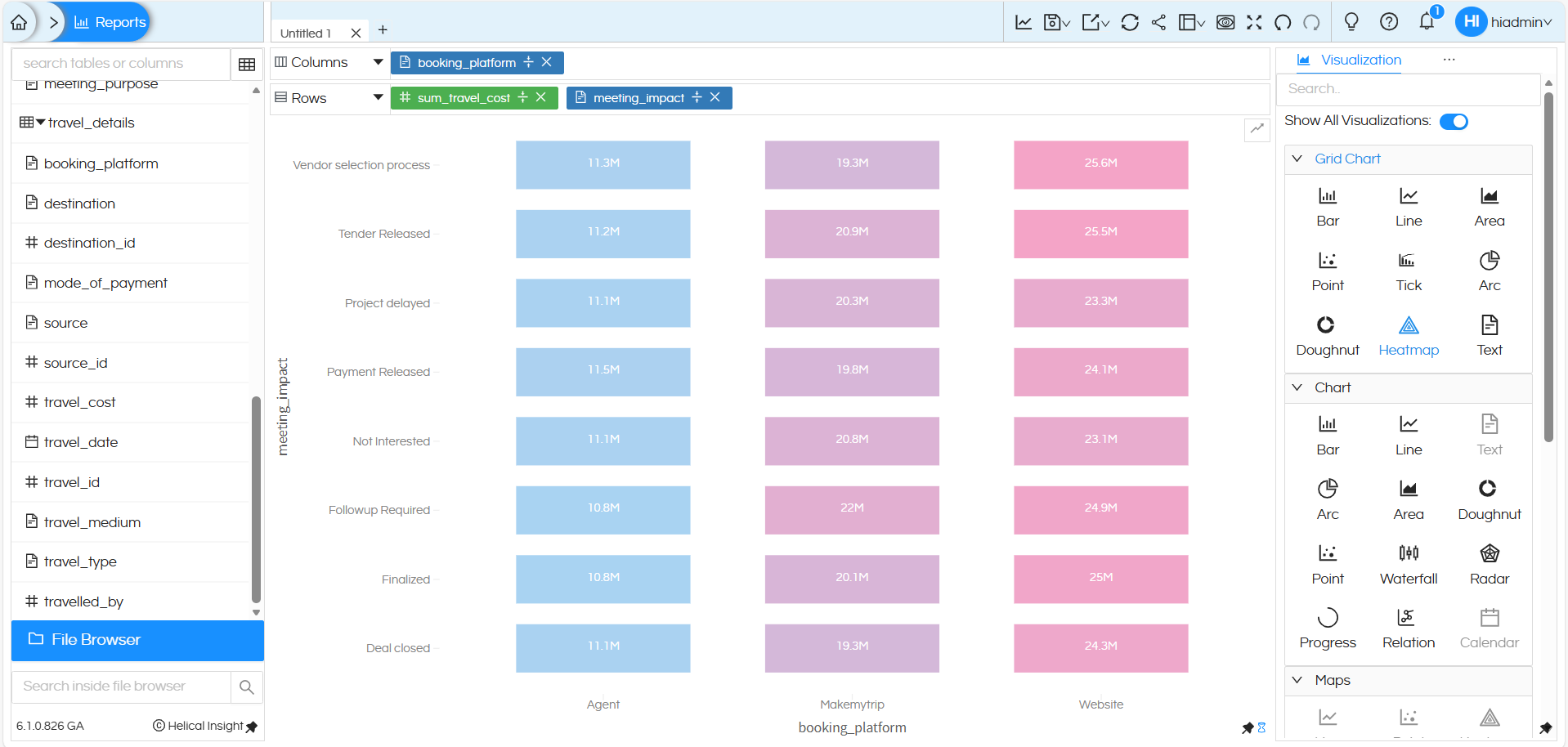
After placing these dimensions, selecting Heatmap from the Grid Chart section displays a matrix-style view where each cell represents the intersection of the row and column dimensions. The visual intensity (color/shade) helps users quickly identify patterns, concentrations, or gaps across categories,
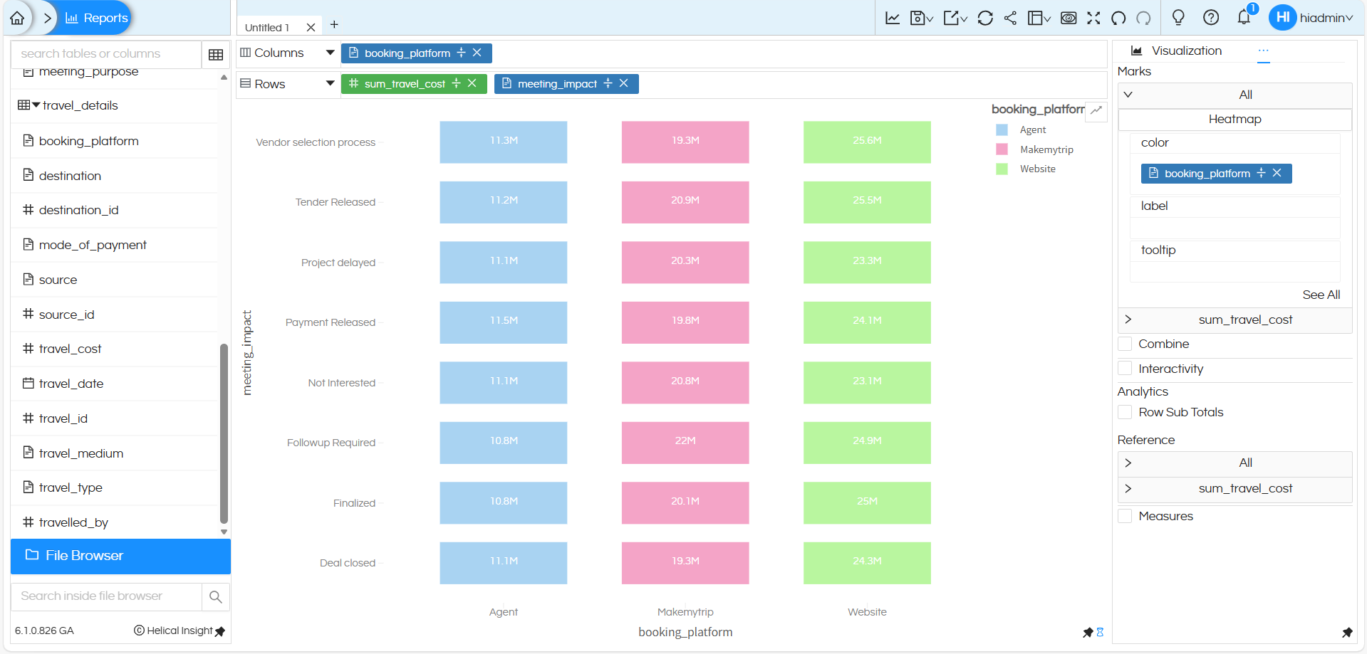
To enhance the analysis, the dimension meeting_impact is added to the Color option under the Marks section. Because of this:
- Each cell in the heatmap is color-coded by booking platform (Agent, Makemytrip, Website).
- Every colored block represents the association between an meeting_impact, a travel cost , and the booking platform.
- Users can quickly spot patterns, distributions, or dominant platforms across employees and payment methods.
There are many other customizations available such as color palette, labels, axis formatting, drill down, drill through, caching, etc. You can refer to our other blogs to learn more about these features.
Reach out on support@helicalinsight.com in case of any more questions.
