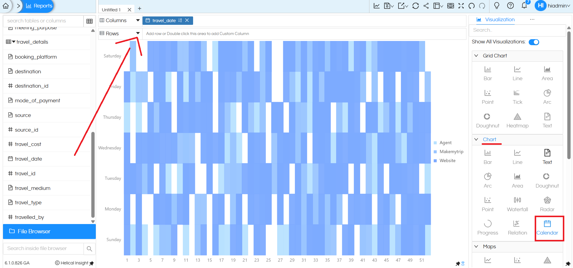
A new charting type, called as Calendar Chart, has been introduced in Open source BI Helical Insight. A Calendar chart helps you analyze measures (such as cost, sales, or counts) over time in a familiar calendar-style layout. To create this chart, add one date field (for example, travel_date) to either Columns or Rows, then select Calendar from the Chart section in the Visualization panel.
Layout
- Columns represent the day of the month.
- Rows represent the day of the week (Sunday to Saturday).
- Each cell corresponds to a specific date within the selected time period.
Cell Color (Heat Intensity)
- The color of each cell represents the aggregated measure value (for example, Sum of Travel Cost).
- Lighter shades indicate lower values.
- Darker shades indicate higher values.
- A color legend on the right shows the range (minimum to maximum) used for comparison.
Cell Labels
- The number inside each cell displays the actual aggregated value for that date.
- In this blog we have created a sample calendar chart which represents the Sum of Travel Cost for that day.
When to Use a Calendar Chart
Use a Calendar chart when:
- Your data is date-driven.
- You want to analyze daily performance.
- Visual pattern recognition (trends, peaks, busy days) is more important than precise side-by-side comparisons.
This chart makes it easy to quickly spot daily patterns, trends, and peak activity periods across a month or longer timeframe.
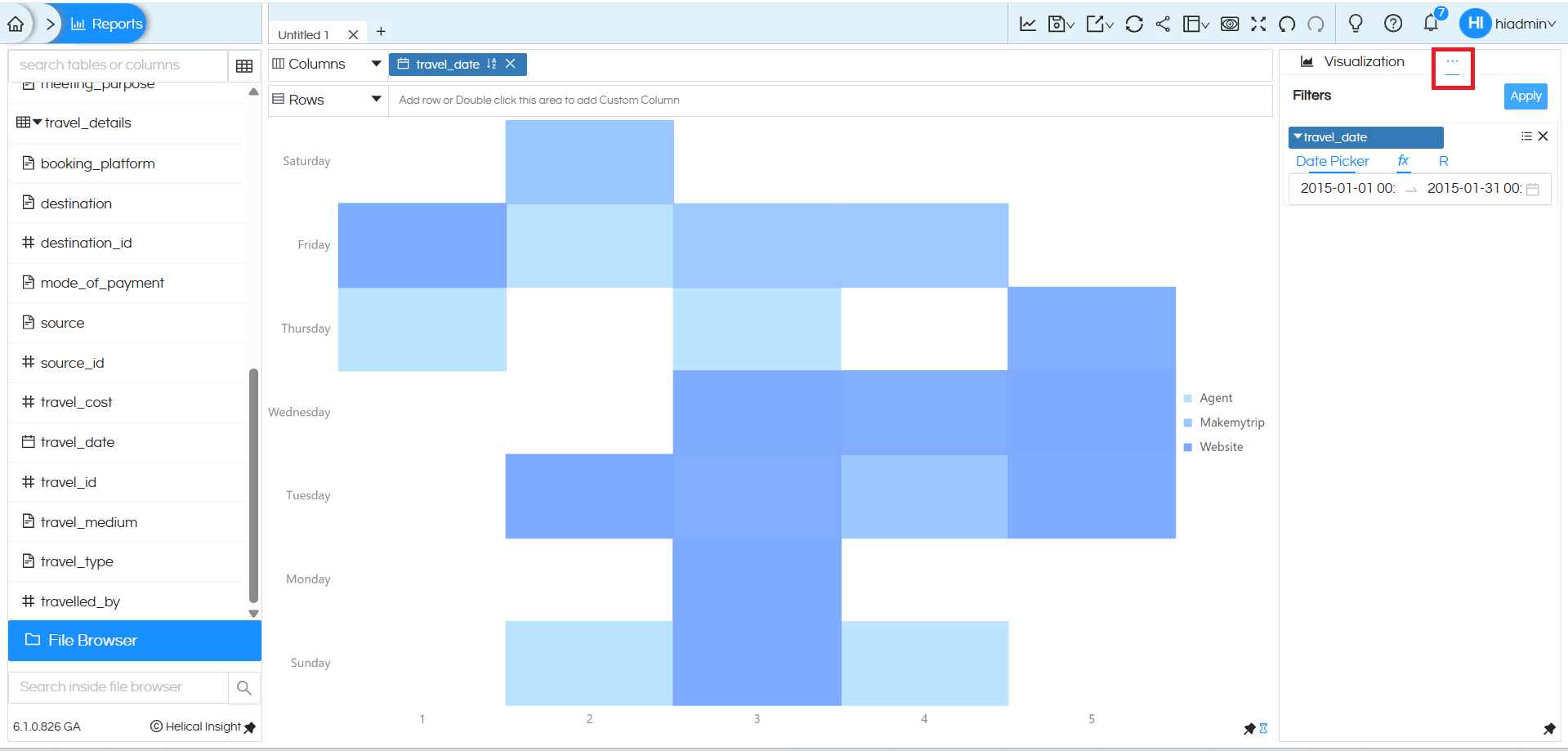
In this view, a date filter is applied to the Calendar chart to focus the analysis on a specific month.
Here, the travel_date filter is set using a Date Picker, with the range limited to one month. Because of this:
- The Calendar chart displays only the days that fall within the selected month.
- All cells, colors, and values are recalculated based on the filtered date range.
- This makes it easier to analyze monthly trends, identify busy or low-activity days, and compare patterns within that month instead of across a longer time period.
Using a month-level date filter with a Calendar chart is especially useful when you want a focused, period-specific view while still retaining the day-by-day visual pattern.
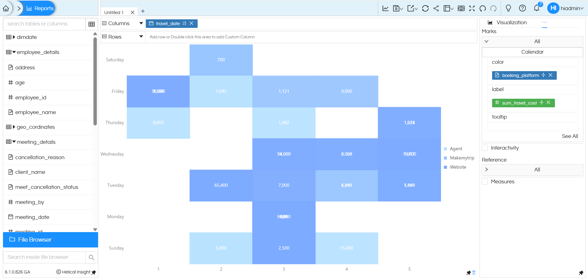
The measure (Sum of Travel Cost) is dragged and dropped into the Color shelf, which controls the heat intensity—lighter shades indicate lower values and darker shades indicate higher values, as shown in the legend. The same measure is also dragged and dropped into the Label shelf, so the actual aggregated value is displayed inside each cell. This combination helps users quickly identify daily patterns visually while still seeing exact values.
Reach out on support@helicalinsight.com in case of any more questions.
