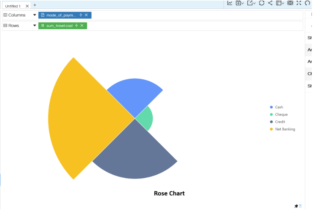
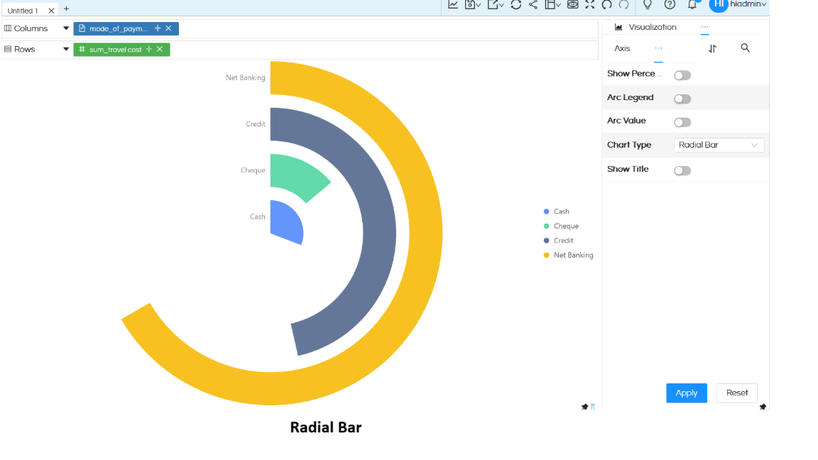
In this blog we will learn how to create a Radar Chart in Open Source BI product Helical Insight. A created Radar chart can also be converted into Rose Chart and Radial Bar chart.
A Radar chart is used to compare values across multiple categories in a circular layout, making it easy to identify patterns and variations.
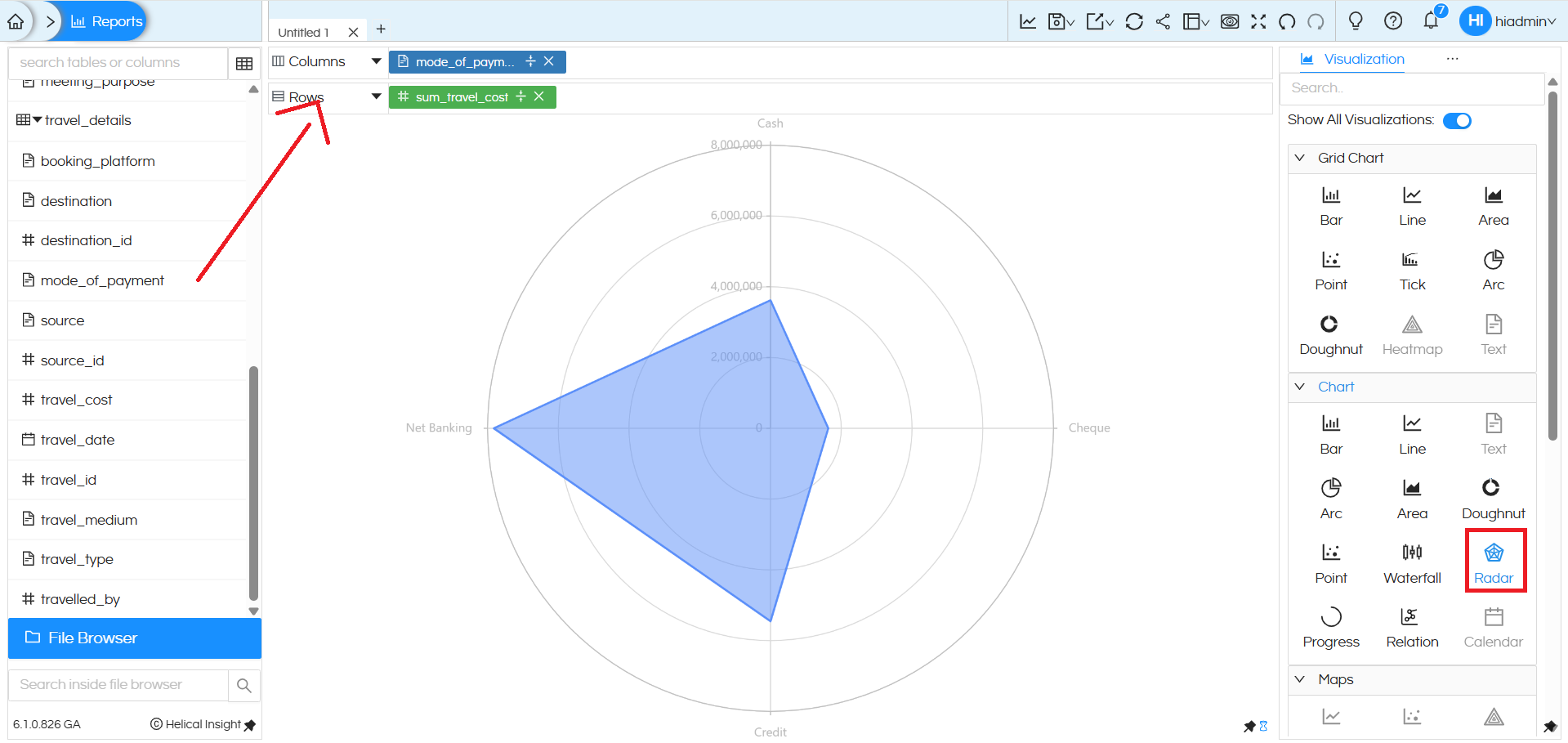
To create a Radar chart, you need one dimension and one measure:
- Place a dimension (for example, mode_of_payment) in the Columns section.
- Place a measure (for example, sum_travel_cost) in the Rows section, or vice versa.
Once these fields are added, select the Radar option from the Chart section in the Visualization panel. The chart plots each category of the dimension around the circular axis, and the distance from the center represents the measure value. In this example, the radar chart shows how travel cost varies across different payment modes.
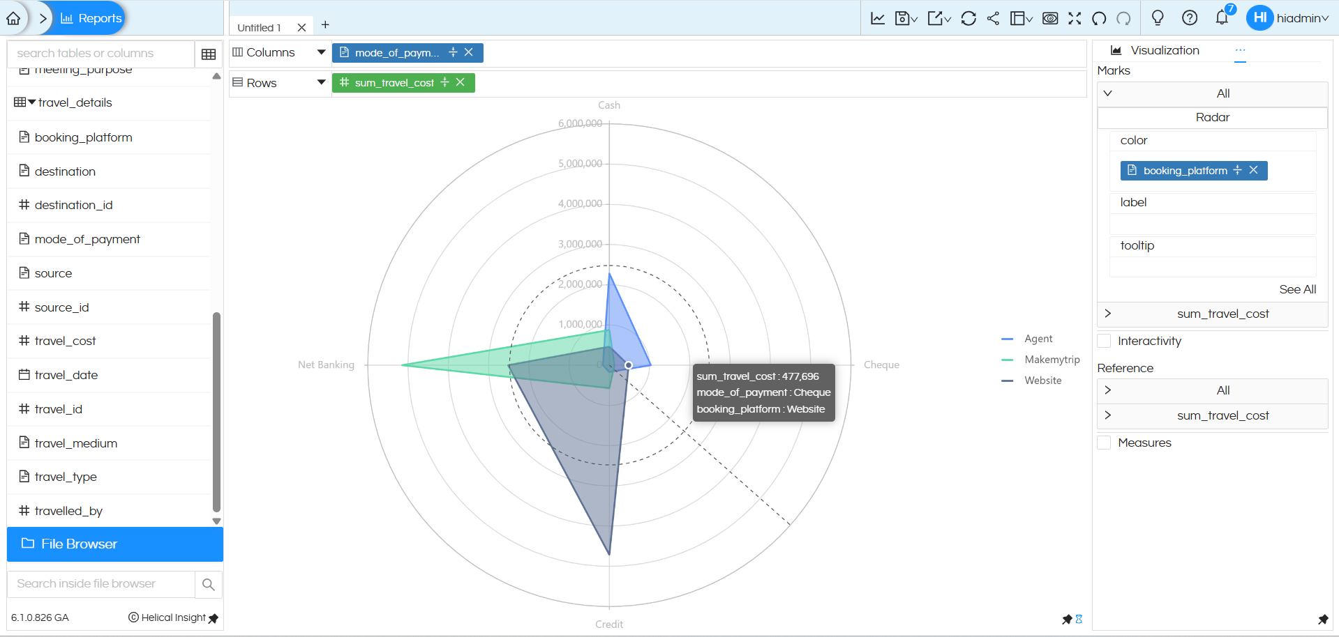
Additional features of Marks such as Color, Label, and Tooltip work the same way as in other charts. You can drag a dimension or measure into these options from the metadata fields to enhance comparison and readability (for example, using booking_platform in Color to display multiple radar shapes).
To learn more about Radial visualizations such as Radar charts, Rose charts, and Radial Bar charts, you can refer to this detailed Helical Insight guide: https://www.helicalinsight.com/usage-of-rose-charts-and-radial-bar-charts/
There are a lot of other customizations like color palette, data format, caching, axis, drill down, drill through etc which can also be used. You can refer to our other blogs to learn about the same.
Reach out to us on support@helicalinsight.com in case of any more questions.
