In this blog, we will learn how to create a Tick Chart in the Open Source BI product Helical Insight.
This chart is present only in “Grids Category” and not in “Charts” category. A Tick Chart is useful for comparing measure values across multiple categories in a simple and compact visual format. Instead of bars, it displays small tick marks to represent values, making it ideal when you want a clean comparison without heavy visual elements.
To create a Tick Chart, you need one dimension and one measure:
- Drag the dimension source into the Columns section.
- Drag the measure sum_travel_cost into the Rows section.
After placing these fields, click on Generate to render the chart. Then, from the Visualization panel on the right side, under the Grid Chart section, select the Tick option.
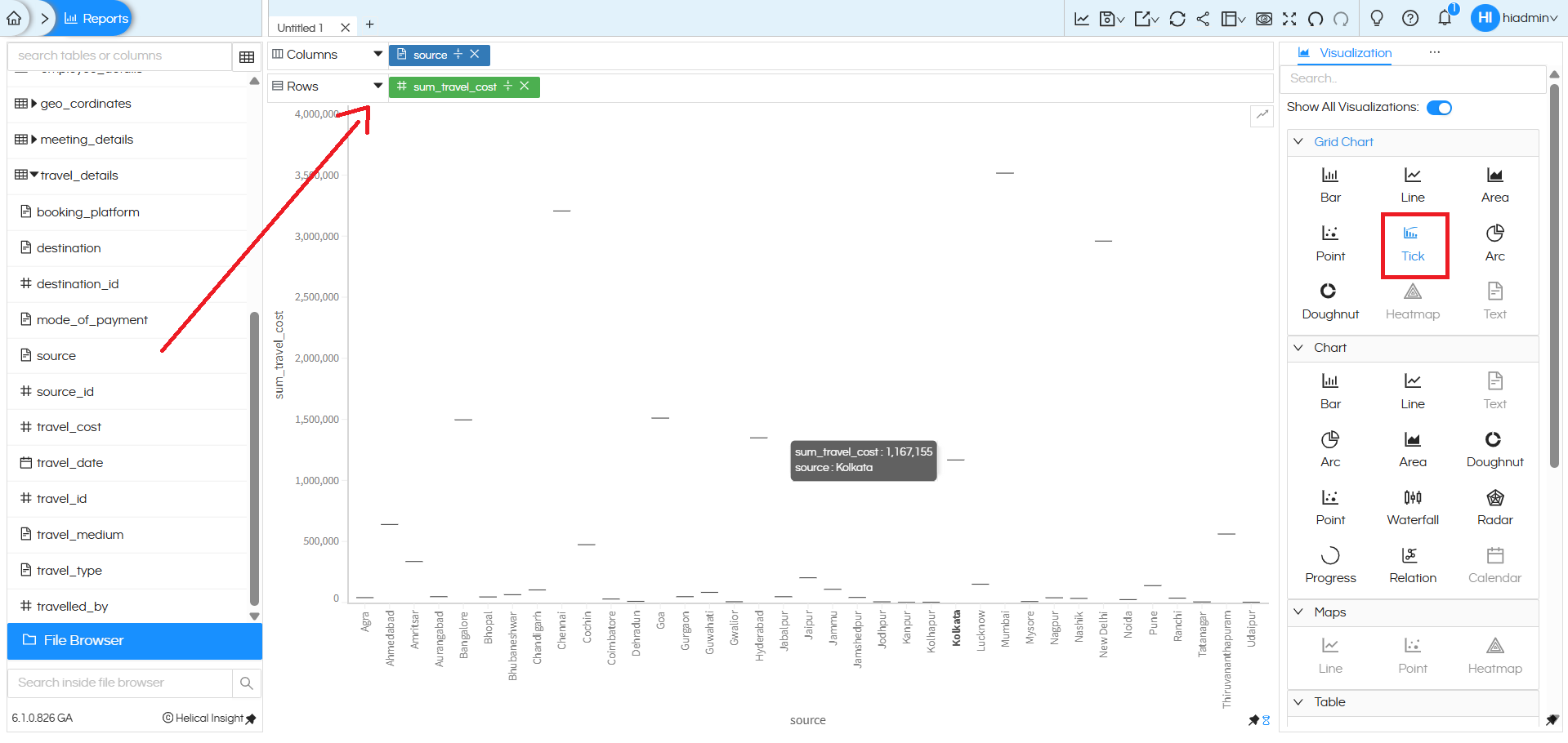
The chart will display each source category along the horizontal axis, while the vertical axis represents the sum_travel_cost. Each category is represented by a tick mark positioned according to its total travel cost.
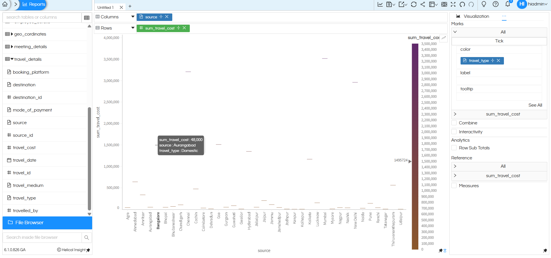
Additional features in the Marks section — such as Color, Label, and Tooltip — work the same way as in other charts. You can drag additional dimensions or measures into these options to enhance clarity and comparison.
For example:
- Drag booking_platform into the Color option to differentiate data visually.
- Use Label to display the exact sum_travel_cost values.
- Customize Tooltip to show detailed information when hovering over each tick.
Tick Chart created using Grid Chart:
Coming from Grid Chart category, you can have any number of dimensions and measures in rows and columns, and accordingly it creates a sort of matrix within which the Tick chart gets populated. Thus it is much more flexible.
Like in this below image, we have put two measures and it has created 2 set of tick charts.
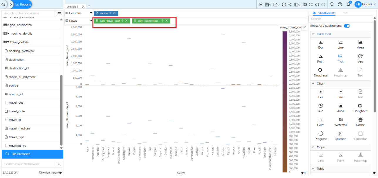
Each tick mark is positioned based on its corresponding measure value, allowing quick visual comparison across all sources. Since multiple measures are placed in Rows, Helical Insight automatically separates them into distinct panels within the same grid layout.
Color formatting can also be applied to enhance visualization. For example, applying color to sum_travel_cost helps highlight higher and lower values using gradient intensity, making it easier to identify variations at a glance.
There are many other customizations available such as color palette, labels, axis formatting, drill down, drill through, caching, etc. You can refer to our other blogs to learn more about these features.
Reach out on support@helicalinsight.com in case of any more questions.
