In this blog, we will learn how to create an Area chart in the Open Source BI product Helical Insight and understand the difference between the Chart and Grid Chart categories.
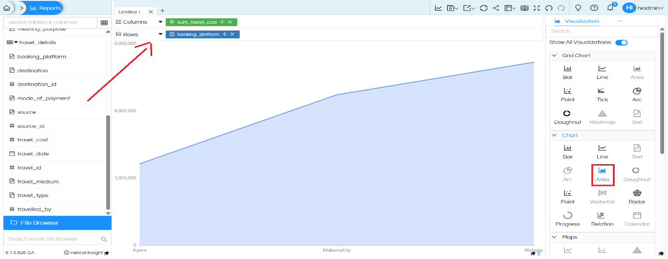
Area Chart created using “Chart” category
To create an Area chart, you need only one dimension and one measure.
For example:
- Drag the dimension booking_platform into the Rows or Columns section.
- Drag the measure sum_travel_cost into the opposite axis.
- Click on the Area option under the Chart section in the Visualization panel.
Once selected, the Area chart displays a filled region under a line, showing how total travel cost changes across booking platforms.
After creating the basic Area chart, add the dimension Branch to the Color option under the Marks section.
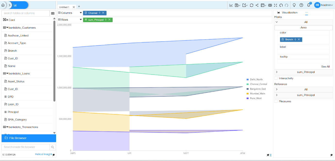
Once Branch is added to Color, the single filled area automatically converts into a stacked area chart. Each colored region now represents a different branch (Delhi_North, Chennai_Central, Bangalore_East, Mumbai_Main, Pune_West).
The X-axis displays the Channel (IMPS, UPI, NEFT, ATM), while the Y-axis represents sum_Principal. Each colored layer shows how much principal amount is contributed by a particular branch across different channels.
Limitations of Area Chart created using “Chart” Category:
The Area chart created using the Chart section supports only:
- One dimension
- One measure
If additional dimensions/measures are added, it will not support multi-level grouping. Therefore, it is best suited for simple trend analysis.
Area Chart created using “Grid” chart category
The Grid Chart Area option provides more flexibility and supports multiple dimensions. An area chart created using Grid chart category is highly flexible. It can allow users to drag any number of dimensions in both rows and columns, and accordingly it creates a sort of matrix within which the donut chart gets populated. Thus it is much more flexible.
In this example, an additional dimension meeting_purpose is added along with booking_platform, while sum_travel_cost remains as the measure. This creates a grid-style Area chart.
Each grid panel represents a booking platform, and within each panel, the Area chart shows how travel cost varies across different meeting purposes. This allows multi-dimensional analysis in a structured layout.
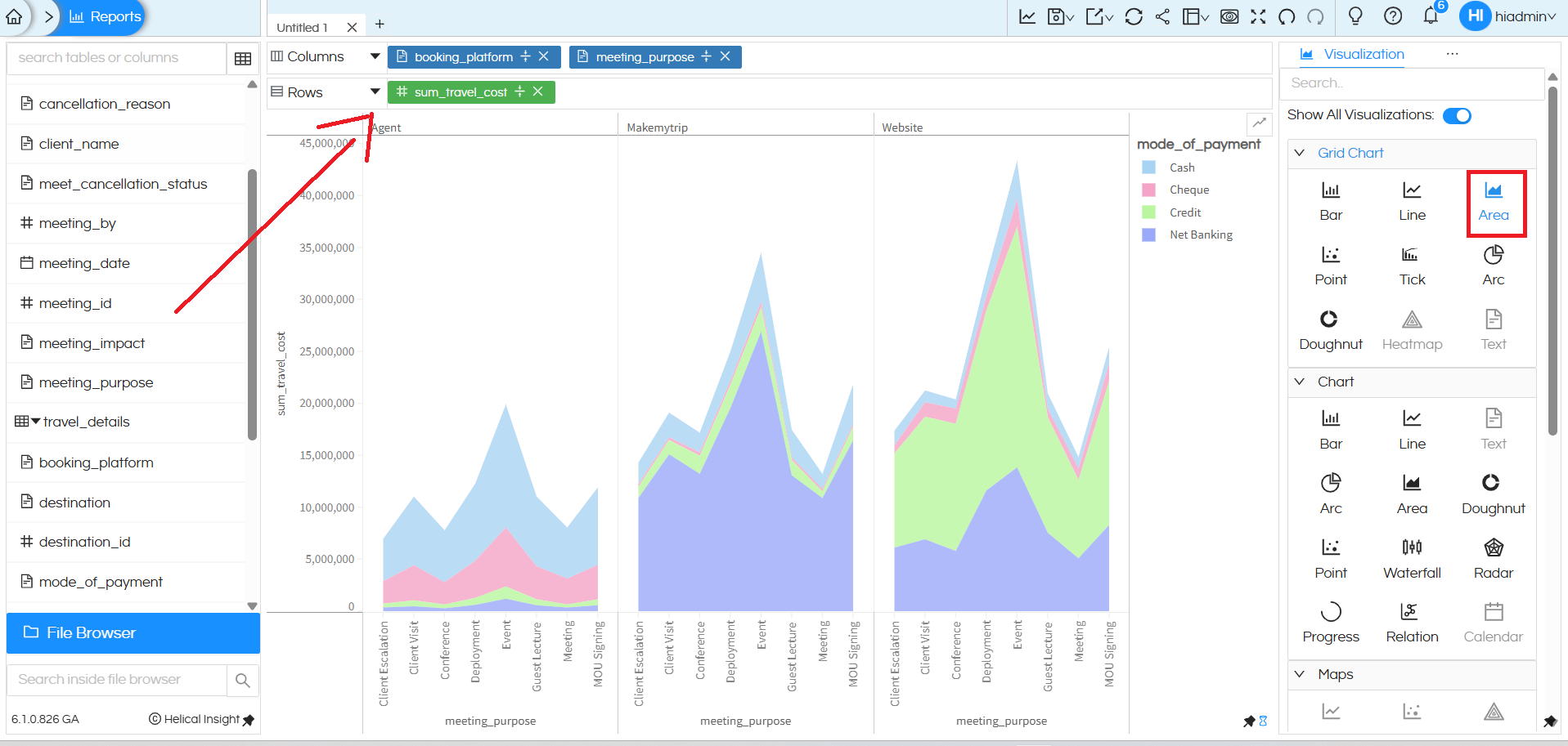
For advanced reporting and sub-chart creation, the Grid Chart Area option should be used.
When to Use an Area Chart
Area charts are best used to communicate overall trends rather than individual values. They work especially well when visualizing progression across categories or time.
There are three main types of Area charts:
- Standard Area Chart: Used to compare quantitative progression over time or categories. Suitable when displaying one or multiple data series.
- Stacked Area Chart: Used to show part-to-whole relationships, highlighting how each category contributes to the total.
- 100% Stacked Area Chart: Best for showing percentage distribution across categories, where the total value is not the focus but proportional contribution is.
Helical Insight provides built-in Area chart options. You can connect to a database, drag and drop columns, apply filters, and visualize the data directly in the browser. Further customizations can be done using CSS, HTML, and JavaScript, such as modifying colors, hover effects, gridlines, axis labels, headers, and more.
This created stacked Area chart can be converted into Grouped area chart (wherein each color instead of stacking with each other will be present next to each other) you can refer to this blog. We have also explained how to convert this stacked area chart into 100% stacked area chart.: https://www.helicalinsight.com/selecting-the-type-of-bar-charts-in-helical-insight-5-0/
There are a lot of other customizations like color palette, data format, caching, axis, drill down, drill through etc which can also be used. You can refer to our other blogs to learn about the same.
Reach out on support@helicalinsight.com in case of any more questions.
