In this blog, we will learn how to create Waterfall chart in open source BI product Helical Insight.
A Waterfall chart is a type of visualization used to show how an initial value is incrementally increased or decreased by a series of contributing factors, leading to a final total. It is commonly used in financial and performance analysis to understand how individual components contribute to an overall value.
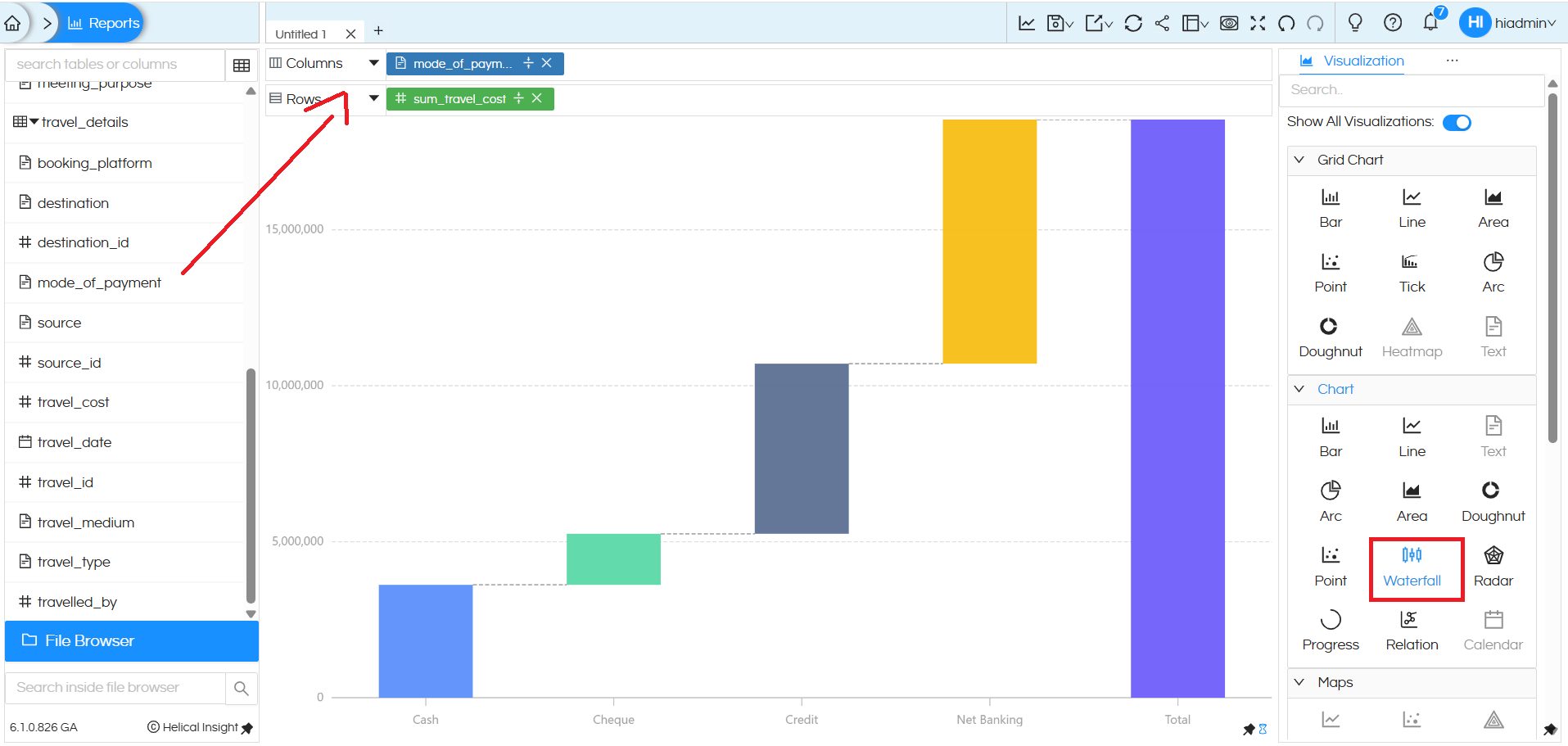
To create a Waterfall chart, only one dimension and one measure are required. In this example, the dimension mode_of_payment is placed in the Columns section, and the measure sum_travel_cost is placed in the Rows section. After adding these fields, select the Waterfall option from the Chart section in the Visualization panel. The chart then displays how each payment mode (Cash, Cheque, Credit, Net Banking) contributes step by step to the final total, making it easy for users to understand the impact of each category on the overall travel cost.
There are a lot of other customizations like color palette, data format, caching, axis, drill down, drill through etc which can also be used. You can refer to our other blogs to learn about the same.
Reach out to us on support@helicalinsight.com in case of any more questions.
