4th February 2026: We’re happy to release our Open Source BI Helical Insight version 6.1.0.826 in February 2026. In this blog, we are going to explain all the new features that have been introduced with our newer version.
Backend technology upgrade
-
Java:From version 6.1.0.826, we have upgraded Helical Insight to Java 25, which has the latest LTS (Long Term Support).
-
Tomcat Upgrade: Further, Helical Insight by default comes with Tomcat. The same was previously on Tomcat 9 which has been upgraded to Tomcat 10 from version 6.0. With the latest release, we have upgraded to Tomcat 11.
-
Similarly, all other 3rd party libraries like hibernate, spring, maven etc have also been upgraded.
Data Sources
-
Multiple JDBC URL Formats Support: In this version, we’ve updated our JDBC configuration capabilities to support multiple database URL patterns, like backslash semicolon etc formats that are used by certain databases. Many databases support multiple URL formats, This can be accessed and configured through Advanced Options and you will get a drop down option allowing you to select which kind of URL it should create.
-
Postgress JDBC Driver: The latest release automatically includes the most up-to-date PostgreSQL JDBC driver, reducing setup effort and ensuring seamless PostgreSQL database connections.

Reports
-
UI UX Simplicity: In the previous versions, to create certain visualizations multiple clicks and steps were required like selecting visualization, going to Marks, clicking drop down etc. We’re working on simplifying the specific UI/UX to enable creating visualizations with single/fewer clicks.
From the latest released version, you are able to create Visualizations with less number of clicks or even, with a single click. This is more prominent for use cases like KPI cards, trend charts, and widget cards.
-
Chart Hover Details: In the updated version, when you hover over any visualization, you can now see how many measures and dimensions are required for that visualization.
-
Enable/Disable Chart: Based on the number of measures and/or dimensions that you drag, visualizations that do not meet the required number of measures or dimensions criterion are automatically disabled, thus elevating the user experience and avoiding any confusion.
-
Trend Card Properties: When you create a trend card, in this version, more properties (Prefix and Position) have been added. Once the visualization is selected and when you go to card properties, you can see the newly added properties.


Trend prefix by default is “vs” which can be changed as per your requirement and the position can be selected as center or start or end.
-
Card Subchart Sizing: In the earlier versions, subcharts within card visualizations appeared very small, making them harder to understand. With the latest update, subcharts are present in full container size and are made responsive, thus improving the readability. When you export the report as well, the subcharts now appear in a larger size , thus are easier to read and understand.
-
OpenStree Map support: Earlier, map visualizations required access to Mapbox Pro, which is a paid charting engine. Users had to purchase and configure a separate license within Helical Insight.
With the latest update, we’ve added support of OpenStreetMaps (OSM) as well, that can be configured and used as well, allows users to create map visualizations. Click here to learn how to enable Openstreemap.
-
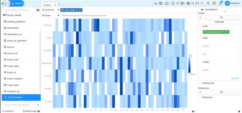
Calendar Chart: A new charting option, Calendar visualization has been added in the latest release. This enables easy date-wise comparisons, to analyze patterns and trends across days at a glance.


Canned Reports
-
Elements: Along with older elements like Image, Text, Line etc more element support options have been added like Table, Cross Tab and Chart are added in the latest update.


i) Table: Allows users to present data in a simple, structured tabular format by directly selecting the Table component. This enables users to organize data into rows and columns easier. This supports displaying multiple fields together, helping users view complete information in one place. In a single report, you can also put multiple Tables and each Table can get data from different SQLQuery.
Click here to learn more about usage of Table component and its properties description.

There are various configuration options available for Table element which can be configured from the property pane appearing on the right side of the canvas. Here, the user can selects the fields for the table, fields for table column etc.,

ii) Cross Tab: The Cross Tab element allows users to view data in a multi-dimensional, matrix-style format. Now a cross tab can be easily created in a report by directly dragging the Cross Tab element onto the canvas and giving respected rows and columns.
Click here to learn more about usage of Crosstab component and its properties description.

The cross tab has various configuration options like what fields to be selected and what fields can be applied as rows or columns or measures etc., User can select the fields as per their requirement from the property pane.

iii) Chart: The Chart element enables users to represent data visually using various chart types by directly selecting the element. This helps making insights easier to understand and interpret.
Click here to learn mroe about usage of chart component and its properties description.

There are various configuration options available for chart element where you can select the type of chart to be used, category, value etc. These are available in the property pane on the right side of the canvas, once the element is selected.
-
Single select option UI Change: In canned report,the single select option is now displayed as a radio button (similar to what we have in adhoc designer and dashboard) thus making the UX consistent across all modules. Earlier, in canned report both single-select and multi-select options used the same interface, which could be confusing.
This helps improve consistency in the UI and makes selection behavior more easier to understand.
-
Report Properties: In the Canned Reports module, we’ve introduced Report Properties option that allows users to edit and configure report-level settings. These properties control the overall behavior, layout, export behaviour and runtime of a report by defining parameters such as spacing between rows/columns, header/footer settings, enable/disable pagination, caching options. The report properties can be seen in the Property Pane on the right side of the canvas, making them easy to access and modify while designing reports.

A set of default properties is already defined and can be easily toggled or adjusted based on specific requirements.


In addition, users can add and configure their own settings through user-defined Properties, offering greater flexibility and control over how reports are structured.
This is the module that allows to create Paginated multi pager pixel perfect document kind of canned reports like bank statements, salary slips, invoices etc. Canned Reporting module was introduced in our Version 6.0 and we’ve been working on enhancing and adding new capabilities in the module.

Print Framework
In the Canned Reporting module, users can already define paper orientation (Landscape or Portrait) and paper size at the report level, and the layout is exported or printed accordingly.
We’ve now working on adding this capability to allow chart (ad-hoc report) and dashboard exports to follow specific orientation and size settings.
For now these settings have to be configured from the backend, and the selected orientation and paper size are applied consistently across all charts/dashboards. This ensures better control over export layouts and output formatting.
Also, we’re actively working toward making these settings fully UI-driven, thus for each dashboard and chart you can specify what export settings it should use.
Bug Fixes
- Date range picker at the dashboard level in free float mode was not working earlier and it is fixed now.
- In the Trino Database connection, when multiple dates was used at the filter level, there were few issues showing which has been fixed now.
- Minor bugs across various modules (dashboard designer, report designer, Canned reports, data sources) have also been fixed.
Please reach out on support@helicalinsight.com in case of any questions, POC, demo or further questions. Register and download for free from here.
