In this blog we will learn how to create a Point Chart in Open Source BI product Helical Insight. A point chart can also be converted into bubble chart.
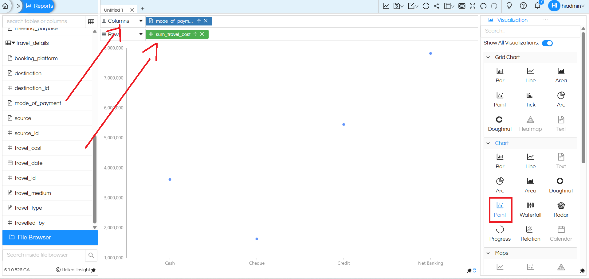
To create a Point chart, you need one dimension and one measure.
In this example:
- The dimension mode_of_payment is placed in the Columns section.
- The measure sum_travel_cost is placed in the Rows section.
After placing these fields, select the Point option from the Chart section in the Visualization panel.

The chart then displays individual data points, where each point represents a category of the dimension, and its position on the Y-axis indicates the corresponding measure value. Point charts are useful for simple comparisons and spotting variations or outliers across categories.
Converting Point Chart into Bubble Chart (Using Size)
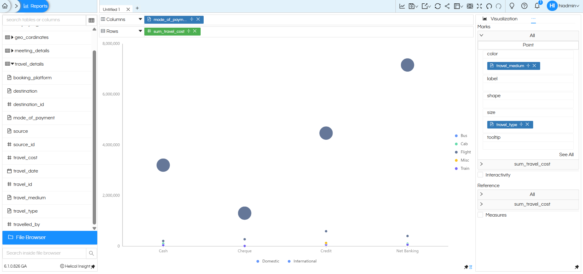
In the example shown, the dimension travel_type (Domestic and International) is added to the Size option and travel_medium is added to Color in the Marks section.
Once a field is added to Size:
- The simple points expand into circles (bubbles).
- The size of each bubble represents the value distribution of the Size field.
- Larger bubbles indicate higher aggregated values, while smaller bubbles represent lower values.
- The information is also reflected in the Tooltip when hovering over the bubble.
Now the visualization represents multiple layers of information:
- X-axis → mode_of_payment
- Y-axis → sum_travel_cost
- Color → travel_medium
- Size → travel_type (Domestic / International)
This effectively converts the Point chart into a Bubble Chart, enabling richer multi-dimensional analysis while keeping the chart clean and intuitive.

Point/Bubble Chart Created using “Chart” Category:
A Point /bubble chart created using chart category can have one dimension in the columns, one measure and a dimension/measure in the colors section.
It will not be able to support multiple dimensions in rows and columns.
Point /Bubble Chart created using Grid Chart:
A Point/bubble chart created using Grid chart category is highly flexible. It can allow users to drag any number of dimensions in both rows and columns, and accordingly it creates a sort of matrix within which the Point/bubble chart gets populated. Thus it is much more flexible.
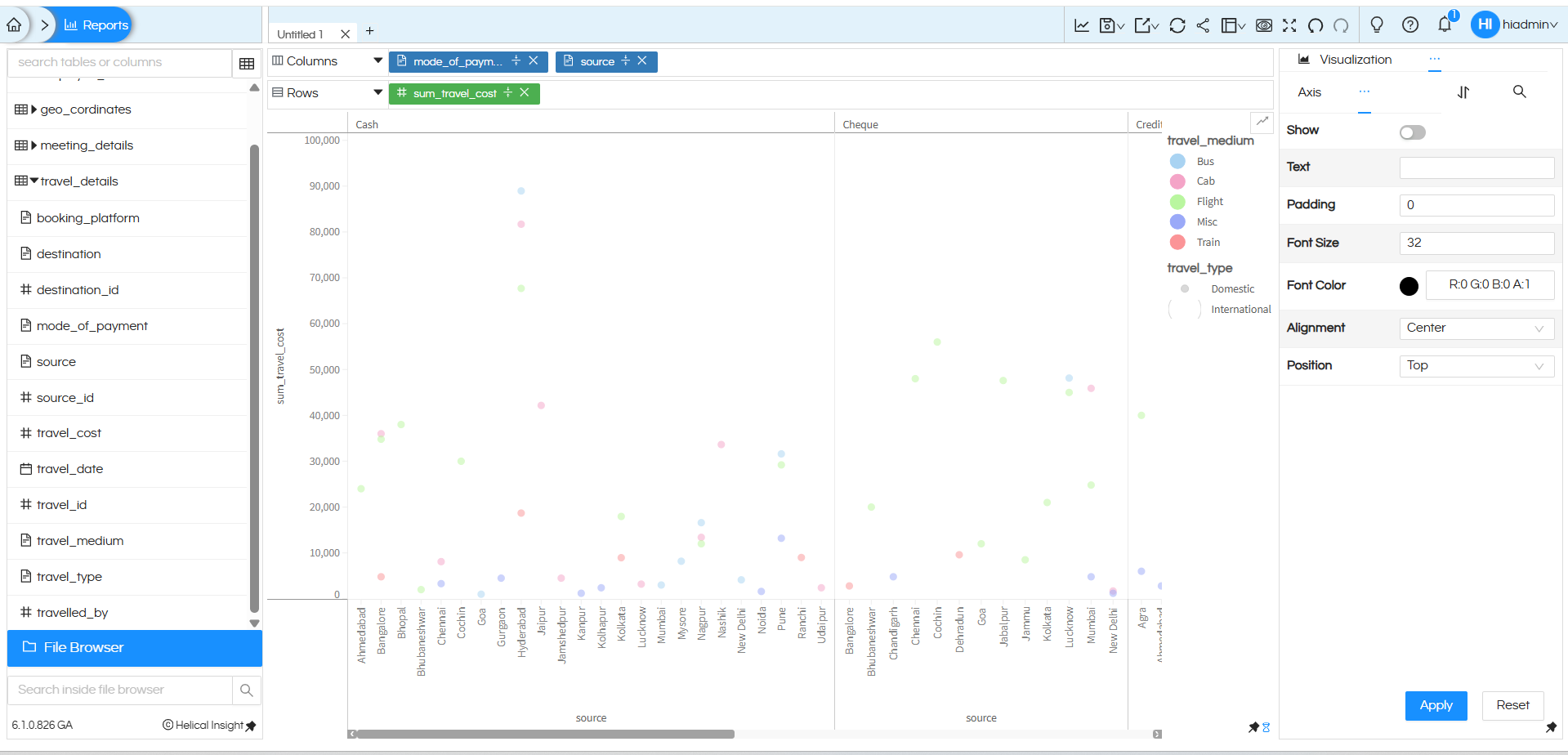
In this example, additional dimensions such as mode_of_payment and source are added along with the measure sum_travel_cost, and the Grid Chart Point option is selected.
Here, mode_of_payment and source are placed in the Columns section, and sum_travel_cost is placed in the Rows section. After selecting the Point option from the Grid Chart section in the Visualization panel, the system generates a grid-style point chart.
This creates a layout where the chart is divided into separate panels based on mode_of_payment (Cash, Cheque, Credit, etc.). Within each panel, points are plotted for different source values on the X-axis, and the Y-axis represents the total travel cost.
In this example:
- The dimension travel_medium is added to the Color option in the Marks section.
- The dimension travel_type is added to the Size option.

There are many other customizations available such as color palette, labels, axis formatting, drill down, drill through, caching, etc. You can refer to our other blogs to learn more about these features.
Reach out on support@helicalinsight.com in case of any more questions.

