C3 is JavaScript library which builds on top of D3. D3 is also JavaScript library used to make complex visualisations. D3 is too advanced, often we just want to add a simple graph to a webpage to show some statistics.
C3 allows us to do that without knowing all the complexity of D3 by wrapping up into a simple API. C3 provides a variety of APIs and callbacks to access the state of the chart. By using them, you can update the chart even after it’s rendered.
Below is demo of how to create simple chart in C3.
To set a C3 to your webpage you need three things:
- D3 JavaScript file
- C3 JavaScript file
- C3 stylesheet file
You can choose solution to link to external services which host these files for you.
<!-- These belongs to the HTML file where you want C3 to work - put these lines into your <head> tag -->

<script type="text/javascript"src="//cdnjs.cloudflare.com/ajax/libs/d3/3.4.11/d3.js"></script>

<script type="text/javascript"src="//cdnjs.cloudflare.com/ajax/libs/c3/0.1.29/c3.js"></script>

<linkhref="//cdnjs.cloudflare.com/ajax/libs/c3/0.1.29/c3.css"rel="stylesheet"type="text/css">
Now we need to choose an element in our HTML page to which the chart will bind. It only means that we will specify, where we want the chart to be displayed. We can do this by adding an ID called chart. The element can be empty as well as it can contain other things, it does not even need to be a div.
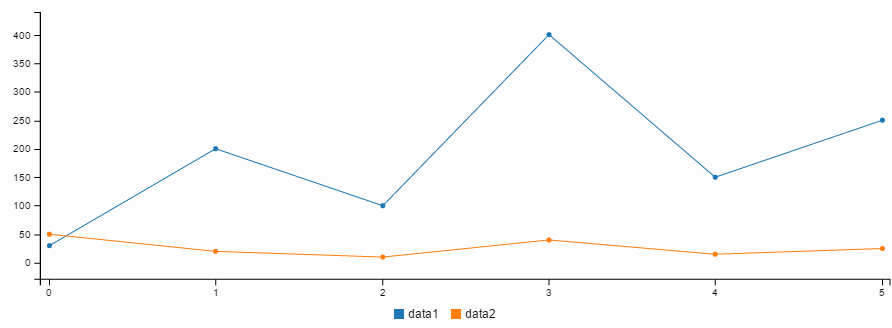
<divid="chart"></div>Then comes the actual code of chart. Below I have shown the code for generating line chart.
var chart = c3.generate({

bindto: '#chart',

data: {

columns: [

['data1', 30, 200, 100, 400, 150, 250],

['data2', 50, 20, 10, 40, 15, 25]

],

type: 'line'    //if the type of chart is not mentioned then by default it will generate line chart.

}

});
Then, you will see the chart:
There are several options to customize the chart and you can see them below:
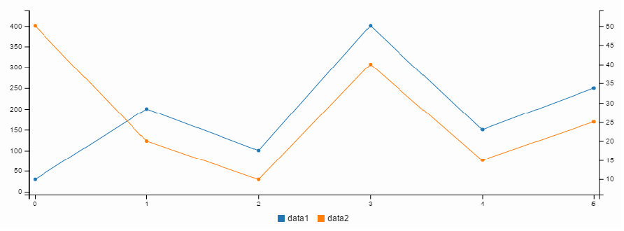
Additional Axis
var chart = c3.generate({

bindto: '#chart',

data: {

columns: [

['data1', 30, 200, 100, 400, 150, 250],

['data2', 50, 20, 10, 40, 15, 25]

],

axes: {

data2: 'y2'// ADD

}

},

axis: {

y2: {

show: true// ADD

}

}

});
Then, the chart will be like this:
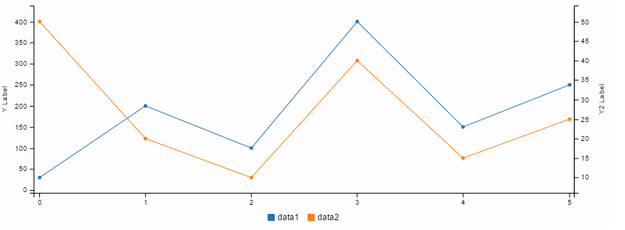
Show axis Label
var chart = c3.generate({

bindto: '#chart',

data: {

columns: [

['data1', 30, 200, 100, 400, 150, 250],

['data2', 50, 20, 10, 40, 15, 25]

],

axes: {

data2: 'y2'

}

},

axis: {

y: {

label: { // ADD

text: 'Y Label',

position: 'outer-middle'

}

},

y2: {

show: true,

label: { // ADD

text: 'Y2 Label',

position: 'outer-middle'

}

}

}

});
Then, the chart will be like this:
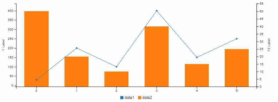
Change chart type
var chart = c3.generate({

bindto: '#chart',

data: {

columns: [

['data1', 30, 200, 100, 400, 150, 250],

['data2', 50, 20, 10, 40, 15, 25]

],

axes: {

data2: 'y2'

},

types: {

data2: 'bar'// ADD

}

},

axis: {

y: {

label: {

text: 'Y Label',

position: 'outer-middle'

}

},

y2: {

show: true,

label: {

text: 'Y2 Label',

position: 'outer-middle'

}

}

}

});
Then, the chart will be like this:
We can use APIs to load data, unload data, show/hide data


