In this blog we are going to learn how to create an Arc/Pie chart inside Open Source BI product Helical Insight.
To create a pie chart (Arc chart) in Helical Insight, follow these steps:
- Drag a measure (for example, travel_cost) from the table on the left panel.
- Drop the measure into Rows or Columns.
- Click on Generate to render the chart.
- In the Visualization panel on the right side, scroll to the Chart section.
- Select the Arc chart option.
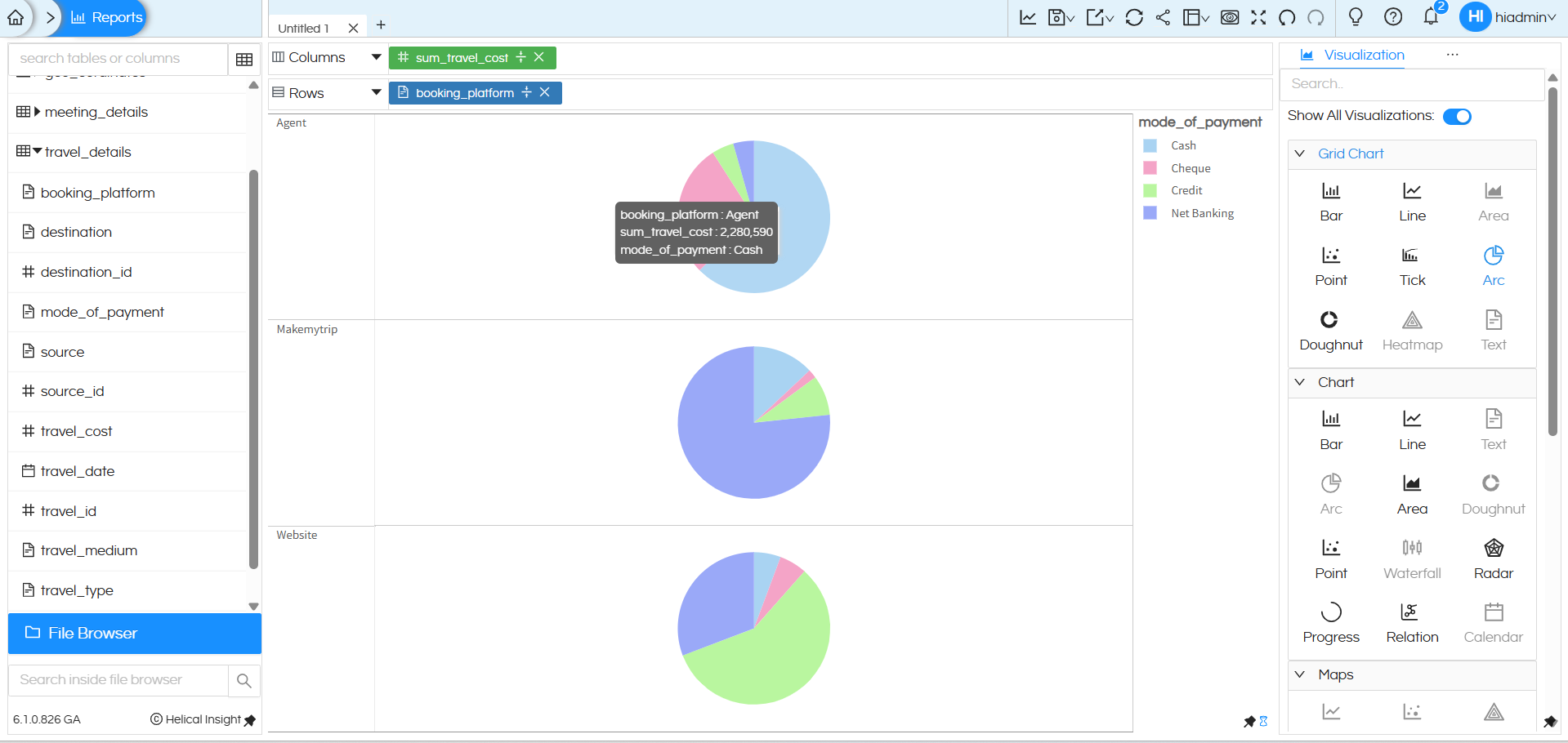
In my case, I dragged the travel_cost column from the travel_details table into Rows. After clicking Generate and selecting the Arc chart, Helical Insight displays the total travel cost as a ARC chart.
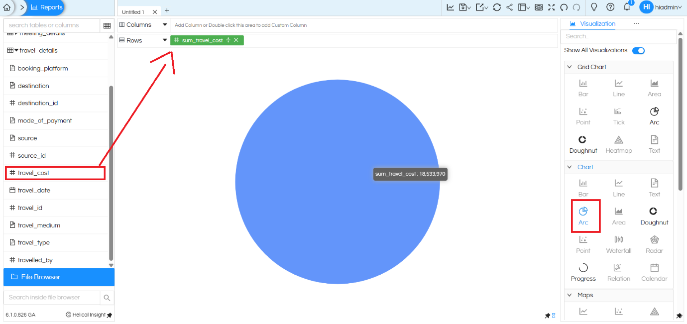
In this Arc (Pie) chart, the total travel cost is represented as a single ARC when only the measure is added.
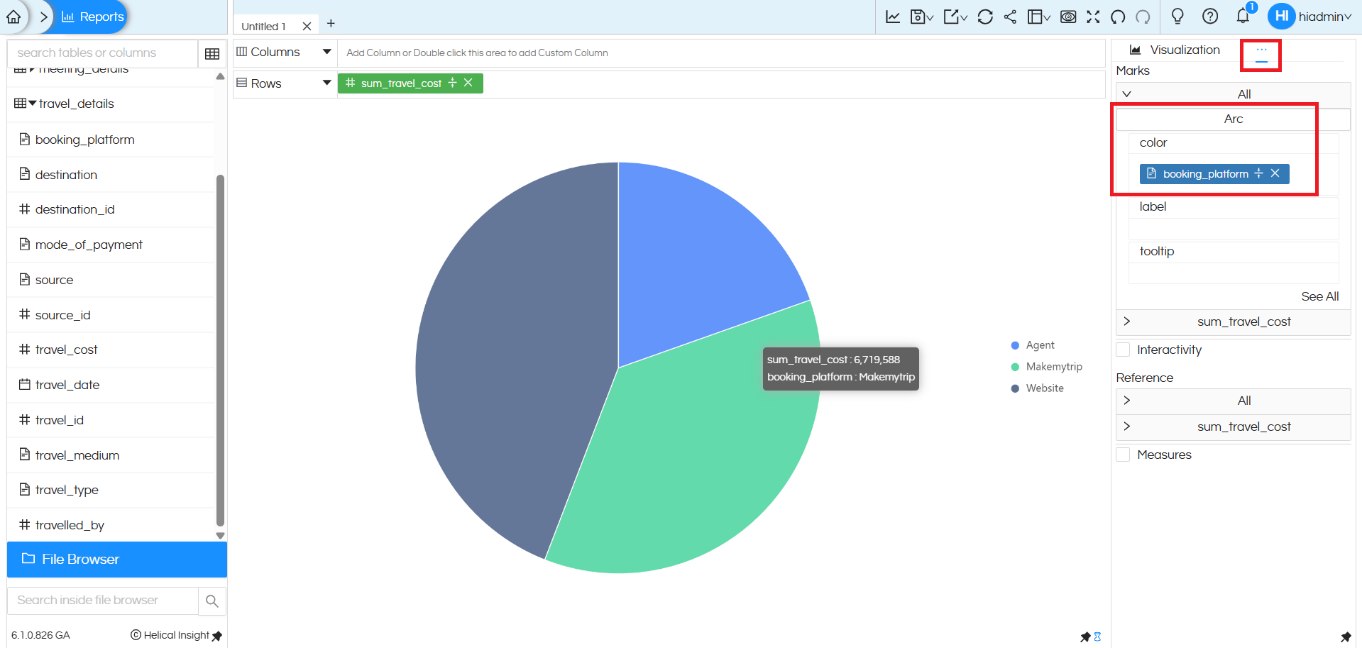
To segregate the ARC into multiple parts, we add a dimension to the Color shelf.
In this example, the booking_platform column is added to the Color option under the Marks section. You can add any other field
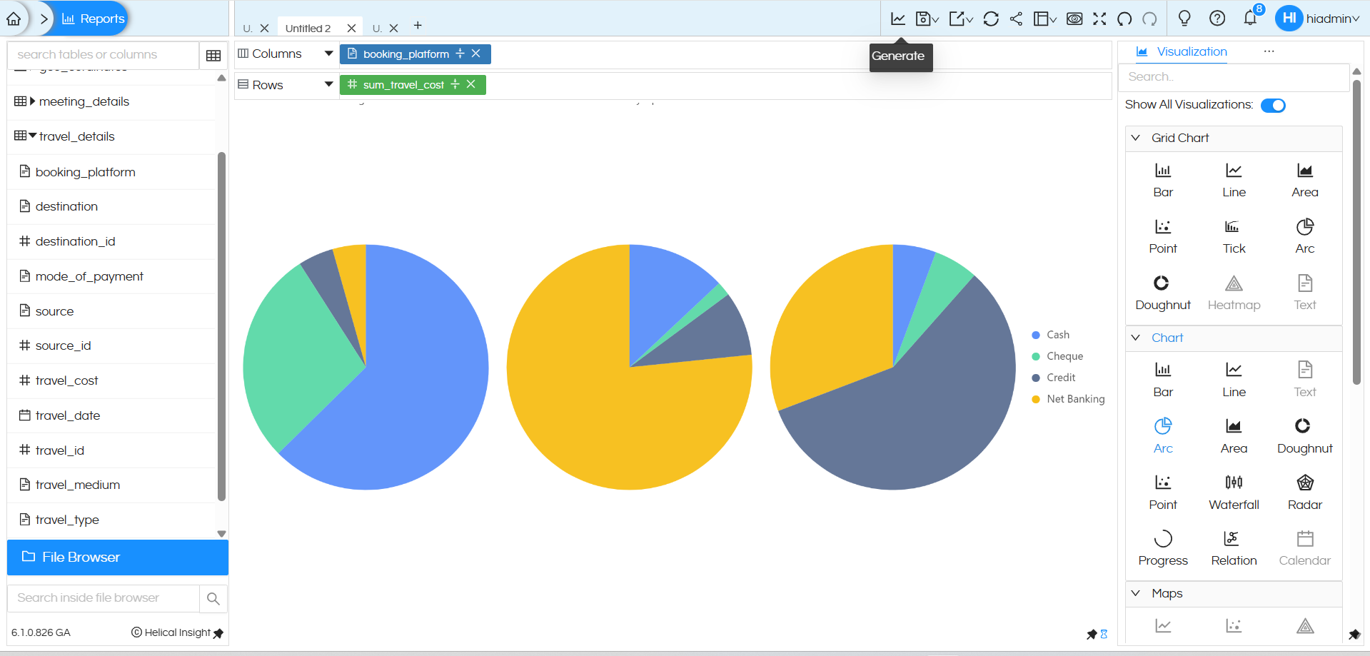
By adding a dimension in Columns, the Arc (Pie) chart automatically changes from a single aggregated view to a segregated comparison view. When booking_platform is added to the Columns section, the chart splits into multiple Arc (Pie) charts, one for each booking platform (Agent, Makemytrip, Website). At the same time, adding mode_of_payment to the Color option in the Marks section further divides each Arc into colored slices, showing how the travel cost is distributed across payment modes within each platform. This makes it easy for users to compare patterns at a glance and gain deeper insights from the same data.
Donut Chart created using “Chart” category:
A donut chart created using chart category can have one dimension in the columns, one measure and a dimension/measure in the colors section.
It will not be able to support multiple dimensions in rows and columns.
Donut chart created using “Grid” chart category:
A donut chart created using Grid chart category is highly flexible. It can allow users to drag any number of dimensions in both rows and columns, and accordingly it creates a sort of matrix within which the donut chart gets populated. Thus it is much more flexible.
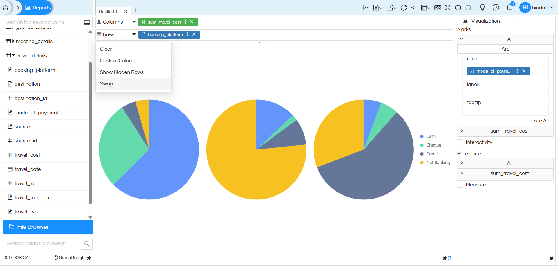
After applying Swap in this example, the chart layout changes: instead of displaying multiple Arc (Pie) charts side by side (horizontally), the visualization automatically converts into a grid-style Arc (Pie) chart arranged along the vertical axis. Each booking platform is now displayed one below the other, making it easier to compare distributions vertically while still retaining the same measure and color based segmentation.
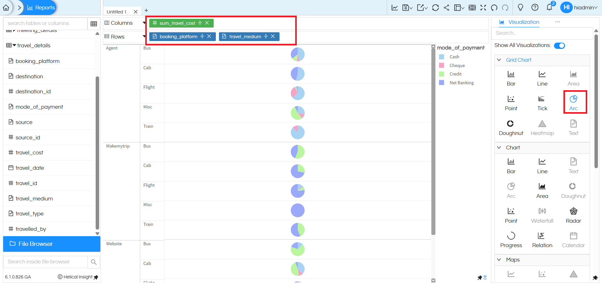
In this view, multiple dimensions are added, which further segregates the Arc (Pie) chart into a detailed grid layout. Here, booking_platform and travel_medium are placed in the Rows section, while sum_travel_cost remains as the measure. As a result, the chart is broken down platform-wise and then medium-wise (Bus, Cab, Flight, Train, etc.). For each combination, a separate Arc (Pie) chart is displayed, with colors representing the mode of payment. This layered arrangement enables users to analyse how travel cost is distributed across booking platforms, travel mediums, and payment modes in a single consolidated view, making comparisons easier and more intuitive.
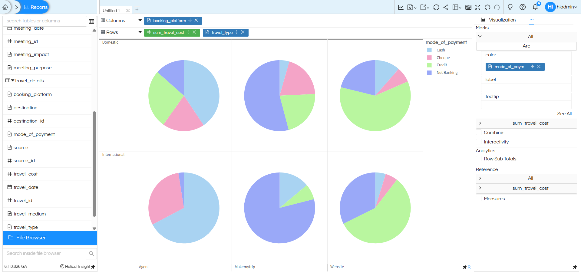
The above image represents a Grid-style Arc (Pie) chart in Helical Insight where multiple dimensions and one measure are combined to create a matrix view of donut charts. Here, booking_platform is placed in Columns, while sum_travel_cost and travel_type are placed in Rows, forming a structured layout. The visualization is categorized into Domestic and International travel types (shown row-wise), and each booking platform (Agent, Makemytrip, Website) is displayed column-wise. Additionally, mode_of_payment is added to the Color section under Marks, which divides each pie into colored slices such as Cash, Cheque, Credit, and Net Banking. As a result, every cell in the grid represents the travel cost distribution for a specific travel type and booking platform combination, allowing users to compare payment patterns clearly across different categories in a single consolidated view.
You can further enhance your Arc chart by applying additional properties such as displaying percentage values, labels, and formatting options., drill down drill through etc. There are separate blogs/tutorials explaining the same.
Further, Helical Insight also supports customizations on Arc/Pie charts, making it easier for users to interpret data at a glance. For detailed steps on how to show percentages directly on pie slices, refer to this official Helical Insight guide: https://www.helicalinsight.com/percentage-on-arc-pie-or-donut-chart/
Reach out on support@helicalinsight.com in case of any more questions.
