The charting engine which we are by default providing with Helical Insight Community Edition is D3 and C3 charts. Being a BI framework we allow you the flexibility to add any sort of javascripting charting engine.
In this article we will cover how you can customize the look and feel of these default charts to match your requirement.
In the template folder we are having separate VF files for every chart type. By default the VF files provided has basic configuration but user can open the VF files to modify or add configurations as per requirement. We will be showing how to add some configurations like rotating the axis, show/hide labels, change color etc.
You can refer to C3 charts link for more detailed understanding.
Example: We will see how to change the color of the Bar chart created using BarChart.efwvf file.
- Create the report (using the ‘Template folder’ link ).
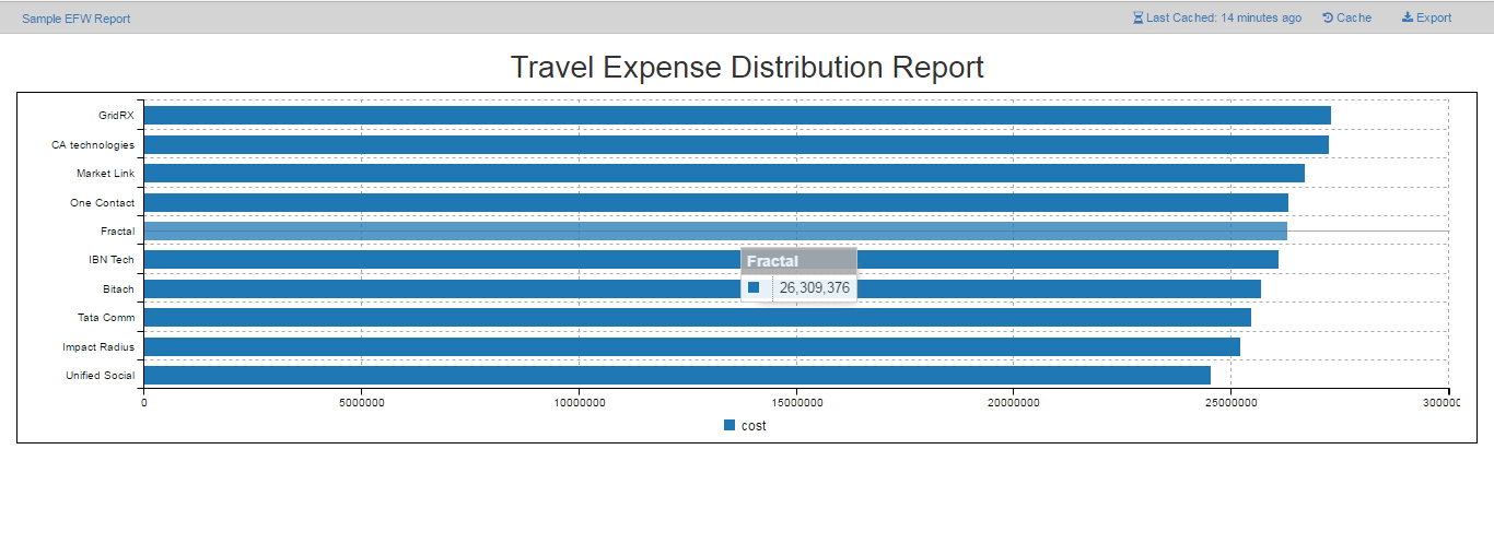
- Run the report to see the generated report (like the one shown below):-

Example 1: Lets change the color of the bar to green (#00ff00). We need to add ‘color’ configuration in the ‘BarChart.efwvf’.
- Open the file ‘BarChart.efwvf’ inside the ‘Template Folder’ and look where we have generated the chart using the following code snippet.
- Save the ‘BarChart.efwvf ’file and now run the ’Sample EFW Report’ to see the color change.
var chart = c3.generate({
    bindto: '#chart_1',
    data: {
        json:data,
        type : 'bar',
        keys:{
            x:'client',
            value:['cost']
        },
    },
    - - - - - -
    - - - - - -
});   //C3.generate is closed
In the above snippet, we need to add the ‘color’ key inside ‘data’ where we will specify the data ‘cost’ to have a particular color say green (#00ff00). See the snippet below:
var chart = c3.generate({
    bindto: '#chart_1',
    data: {
        json:data,
        type : 'bar',
        keys:{
            x:'client',
            value:['cost']
        },
        colors: {
            cost: '#00ff00' // Give the data name ‘cost’ and the specify the color ‘#00ff00’
        },
    },
    - - - - - -
    - - - - - -
});   //C3.generate is closed

Example 2: Changing the position of legend.
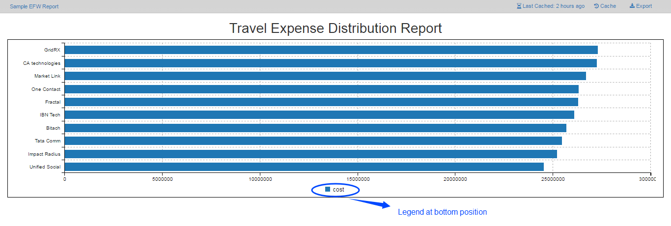
- By default legend position is ‘bottom’. See the image below.
- In the ‘BarChart.efwvf’, see where we have defined ‘legend’ key.
- Now, we will be changing the configuration of the legend, see the following code snippet for the same.
- Save the file and run the report to see the change.
- Save and run the report to see the legend being hide.

var chart = c3.generate({
	bindto: '#chart_1',
	data: {
		json:data,
		type : 'bar',
		keys:{
			x:'client',
			value:['cost']
		},
	},
	legend: {
		position : 'bottom', //Specify position for the legend
		show: true       //To show/hide the legend
	},
        - - - - - - - - - - - - -
        - - - - - - - - - - - - -
        - - - - - - - - - - - - -
});
var chart = c3.generate({
	bindto: '#chart_1',
	data: {
		json:data,
		type : 'bar',
		keys:{
		        x:'client',
			value:['cost']
		},
		legend: {
			position : 'right', //Position now changed to right.
			show: true       //To show/hide the legend
		},
                - - - - - - - - - - - - -
                - - - - - - - - - - - - -
                - - - - - - - - - - - - -
        }
});

You can also hide the legend by giving ‘Show: false’ in the legend key as following:
var chart = c3.generate({
	bindto: '#chart_1',
	data: {
		json:data,
		type : 'bar',
		keys:{
			x:'client',
			value:['cost']
		},
	},
	legend: {
		position : 'right', //Position now changed to right.
		show: false    //Set to false to hide the legend
	},
        - - - - - - - - - - - - -
        - - - - - - - - - - - - -
        - - - - - - - - - - - - -
});

Example 3: Rotation of X Axis ticks.
- See the axis configuration that we have done in the axis key inside c3.generate. By default the chart is rotated by giving ‘Rotated:true’. See the following snippet.
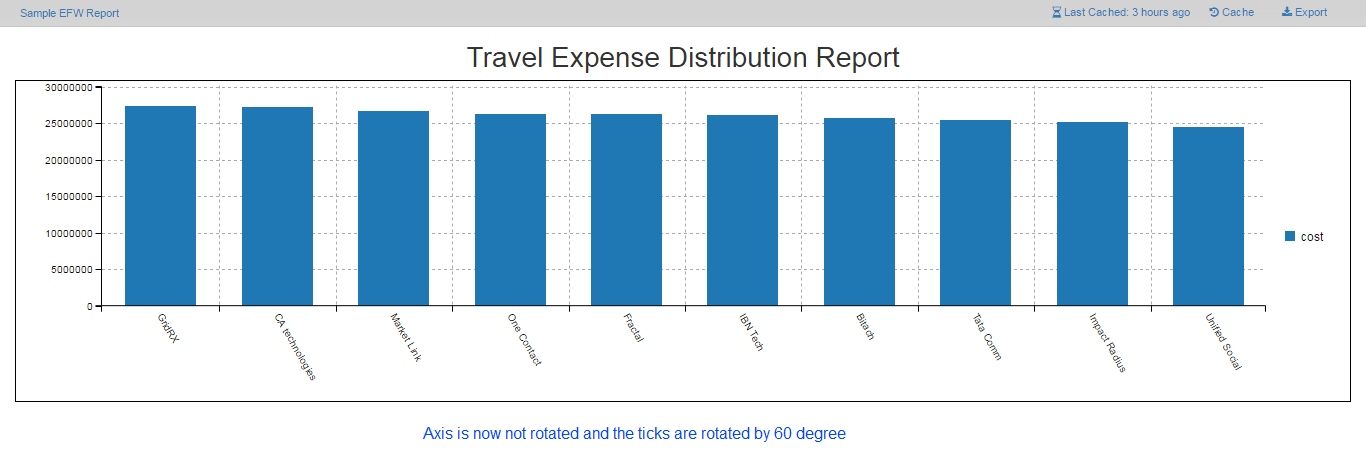
- Change the configuration from ‘rotated:true’ to ‘rotated:false’ and the angle by which the tick is to be rotated from ‘30’ to ‘60’.
- Save the file and run the report.See the image below.
var chart = c3.generate({
    - - - - - - - - -
    - - - - - - - - -
    axis: {
        x:  {
            type: 'category',
            tick: {
                rotate: 30
            }
        } ,
        rotated: true // By default it is rotated true
    },
    - - - - - - - - - - - -
    - - - - - - - - - - - -
});
var chart = c3.generate({
    - - - - - - - - -
    - - - - - - - - -
    axis: {
        x:  {
            type: 'category',
            tick: {
                rotate: 60// Give the angle by which the tick is to be rotated
            }
        },
        rotated: false// By default it is rotated true
    },
    - - - - - - - - - - - -
    - - - - - - - - - - - -
});

In addition to the properties given in the ‘.EFWVF’, you can also add other properties which are supported by the charting library used to create the particular chart(in our case C3 charting library).
To incorporate other properties like adding label to the axis bar chart , refer the link C3 charts.
With reference to the link given above, we will be showing how we can add other properties(in this case axis labels) to the ‘.EFWVF’ file.
To add labels to the axis on bar chart, follow the below steps:-
- Open the ‘BarChart.efwvf file inside the ‘Template folder’
- Look where we have generated the chart object.
- Inside the chart object,we have defined axis key.
- There are 2 axis defined for x and y axis .
- Add label inside the axis key for x axis
See the code snippet below for example
var chart = c3.generate({
- - - - - -
- - - - - -
axis: {                                      // Giving axis configuration
	x: {                                 // Giving axis configuration for X-axis
	type: 'category',
	tick: {
		rotate: 60
	       },
label: {
		text: 'client',              // Give the text you want to appear as label
				position: 'outer-center'     // Give the position for the label
		                          // inner-right : default
					  // inner-center
					  // inner-left
					  // outer-right
					  // outer-center
				          // outer-left
	         }
	   } ,
	rotated: false
     },
Save the file and run the report to see the label on x axis (see the image below)

