In this blog, we will learn how to implement row banding in the canned reporting module of Open Source BI helical Insight. Row Banding is implemented to enhance the readability and visual clarity of tabular data.
It helps users easily differentiate between consecutive rows by applying alternate colour shading (banded rows) in the report’s data section.
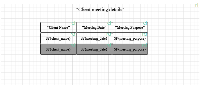
1. Duplicate the same field in the report layout where you want to have row banding. If there are multiple fields all those fields will be duplicated.
¬
For example in the below image we can see that the 3 fields are all duplicated and we have given it a background color.
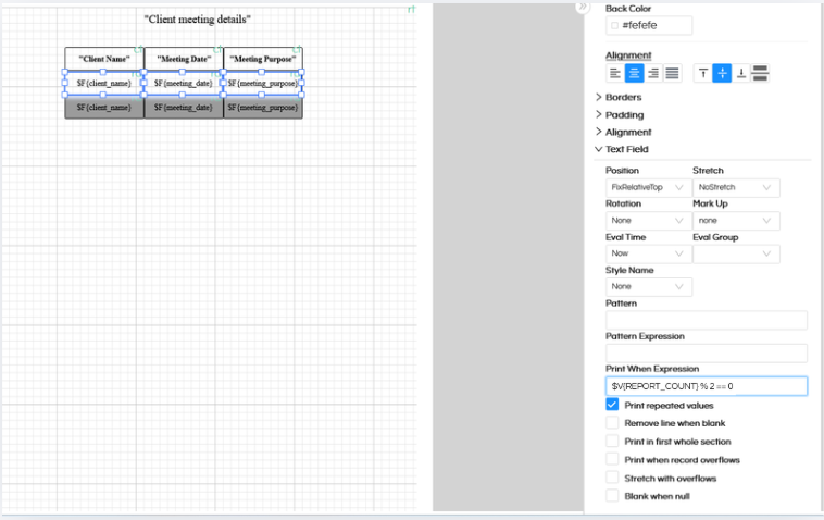
2. For each duplicated field, use the Print When Expression property to control visibility and apply background color based on the row number:
For the top even rows:
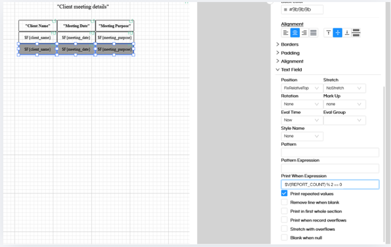
$V{REPORT_COUNT} % 2 == 0
For this first one which are even, we are having white background color, hence this is even row and it will have white background color.
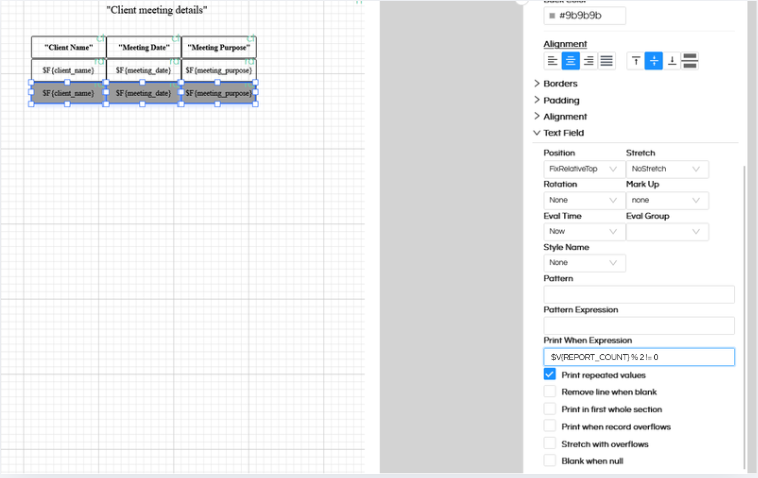
For odd rows:
$V{REPORT_COUNT} % 2 != 0
For this second one which are odd, we are having gray background color, hence this is odd row and it will have gray background color.
3. The two fields are placed on top of each other in the layout, ensuring alternate coloring of rows. If they are not perfectly aligning with each other it might give you this kind of error “Please check component placement hierarchy for the highlighted component(s)”
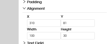
Sharing the screenshots for reference. To ensure that they are pixel perfect in alignment with each other, the other method could be that you can use Alignemnt option. Click on alignment option and understand the X Y Width Height of each component which is on even position, exactly the same should be setup for Odd position components also.
To learn more about Alignment and its usage, click here.
Reach out on support@helicalinsight.com for any more questions. You can also make use of https://forum.helicalinsight.com/for any questions.
