Starting from Open Source BI Helical Insight 6.1.0.826 GA onwards, the Chart component in the Canned Report module allows users to visualize query data using Bar and Arc charts, we are in the process of adding more charting options as we progress further. This component enables report designers to use fields and visualize in the canned reporting along with specifying configurations as well. Users can configure chart properties such as labels, themes, colors, and render type to present data in a clear and meaningful visual format within reports.
Steps to create a Chart visualization in Canned Reporting:
-
Create a data source connection
Refer the following documentation for this step https://www.helicalinsight.com/data-sources-page-overview-in-canned-reporting/
-
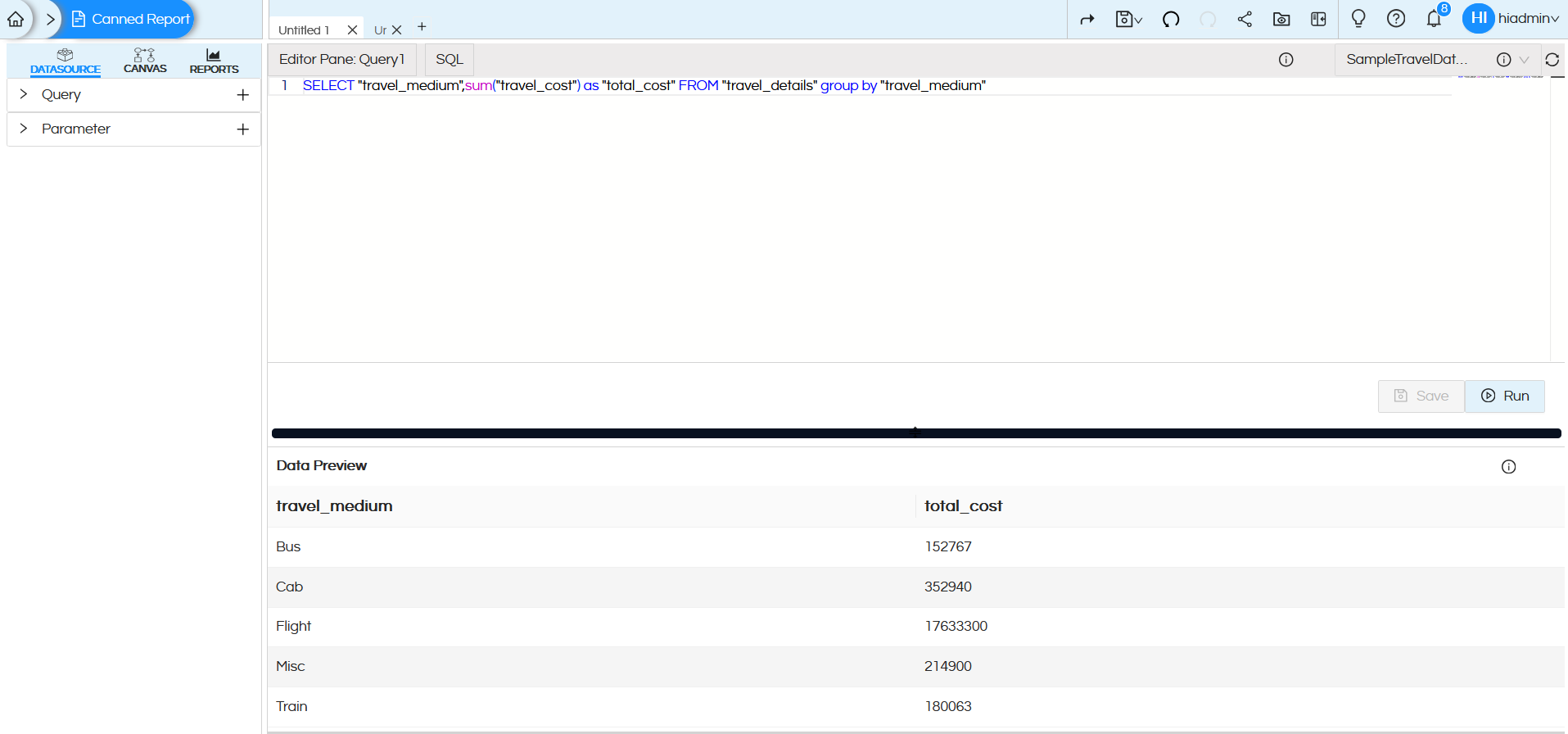
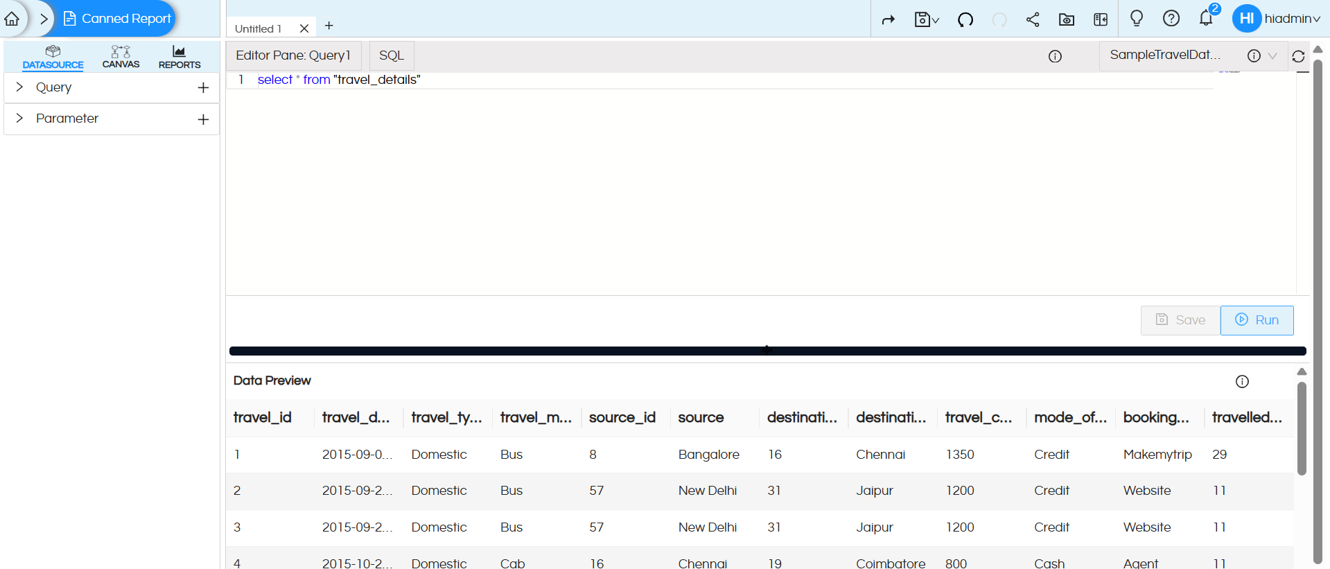
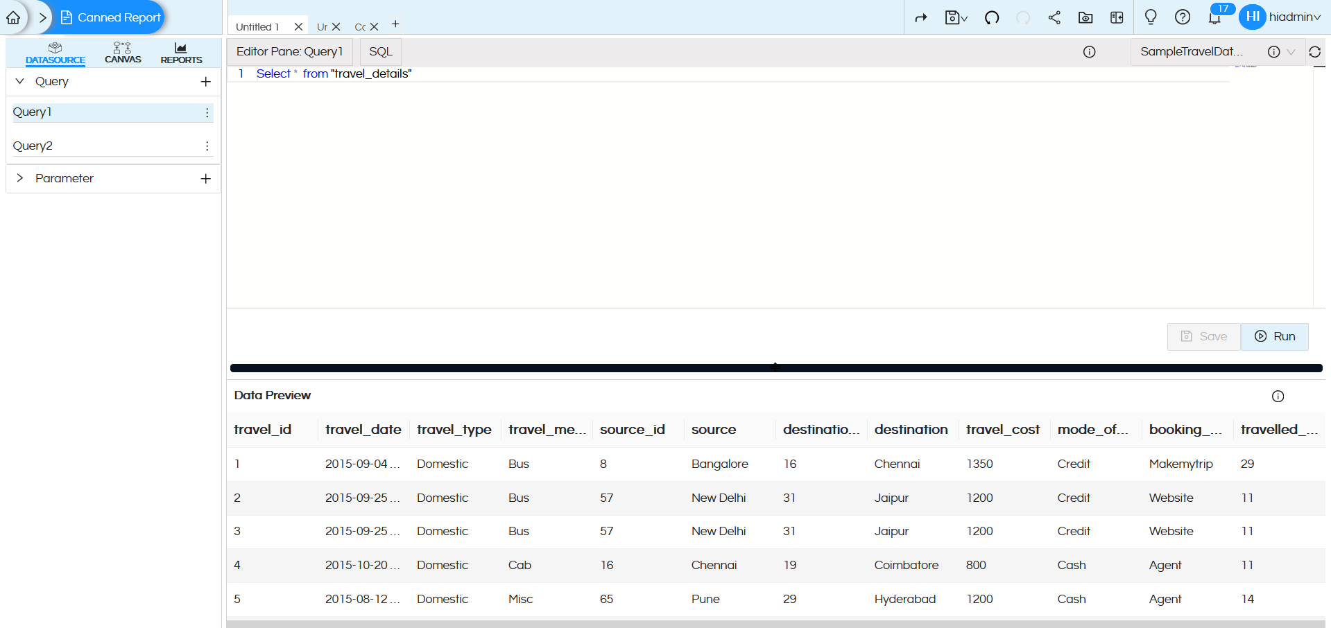
Once the datasource connection is created, select the connection and write the SQL query. Click on Save and Run to execute the query
The first 10 records of the result set will be displayed in the Data Preview section, this is helpful to understand whether the data being fetched from the SQL is correct or not.
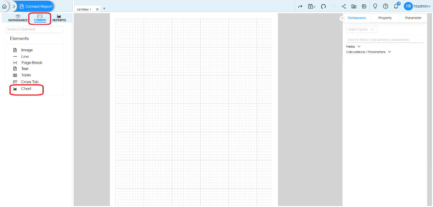
- In the CANVAS tab, you will find the Chart component under the Elements list
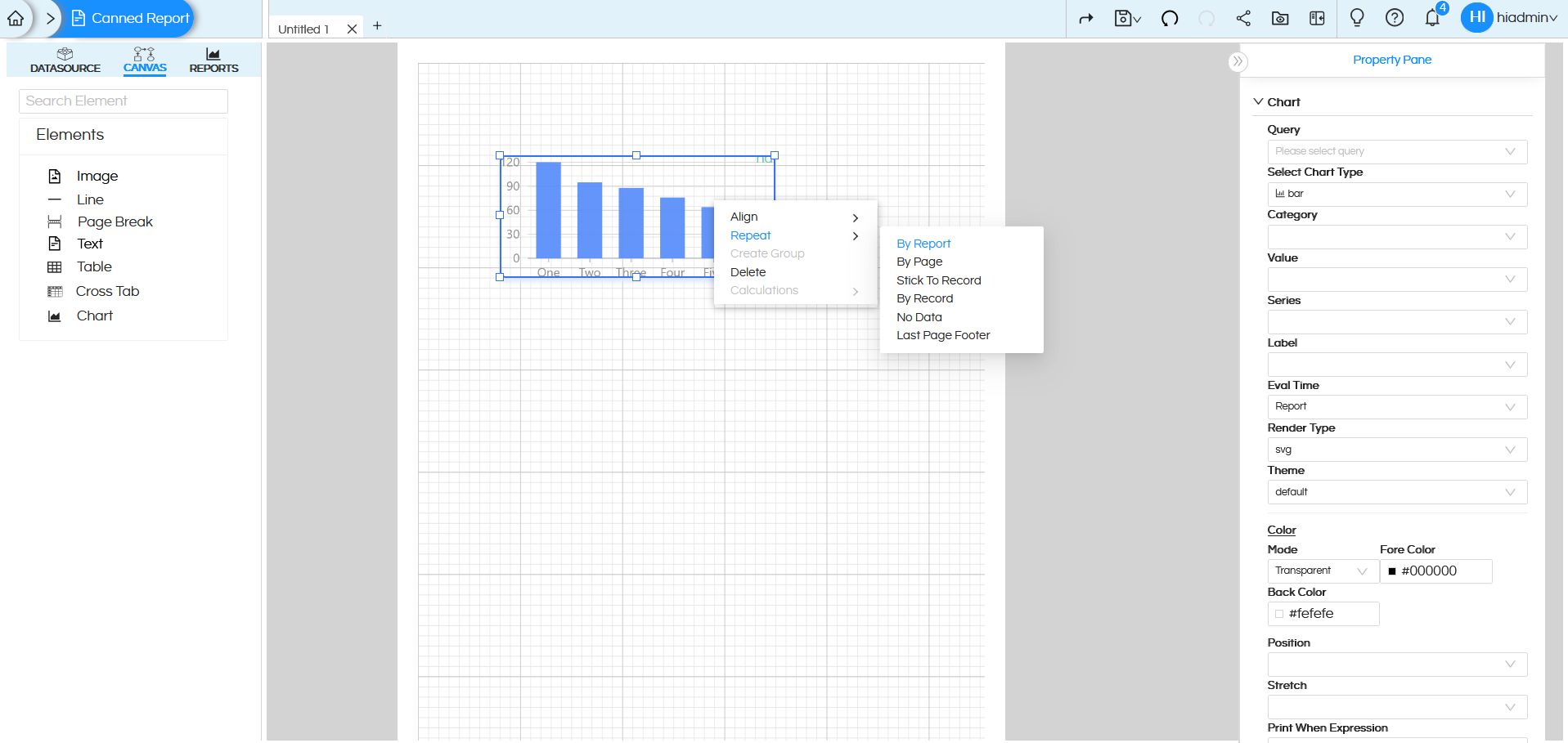
- Drag the Chart component onto the canvas, then right-click on it and select the ‘Repeat‘ option. In most of the cases, it will be ‘By Report‘
-
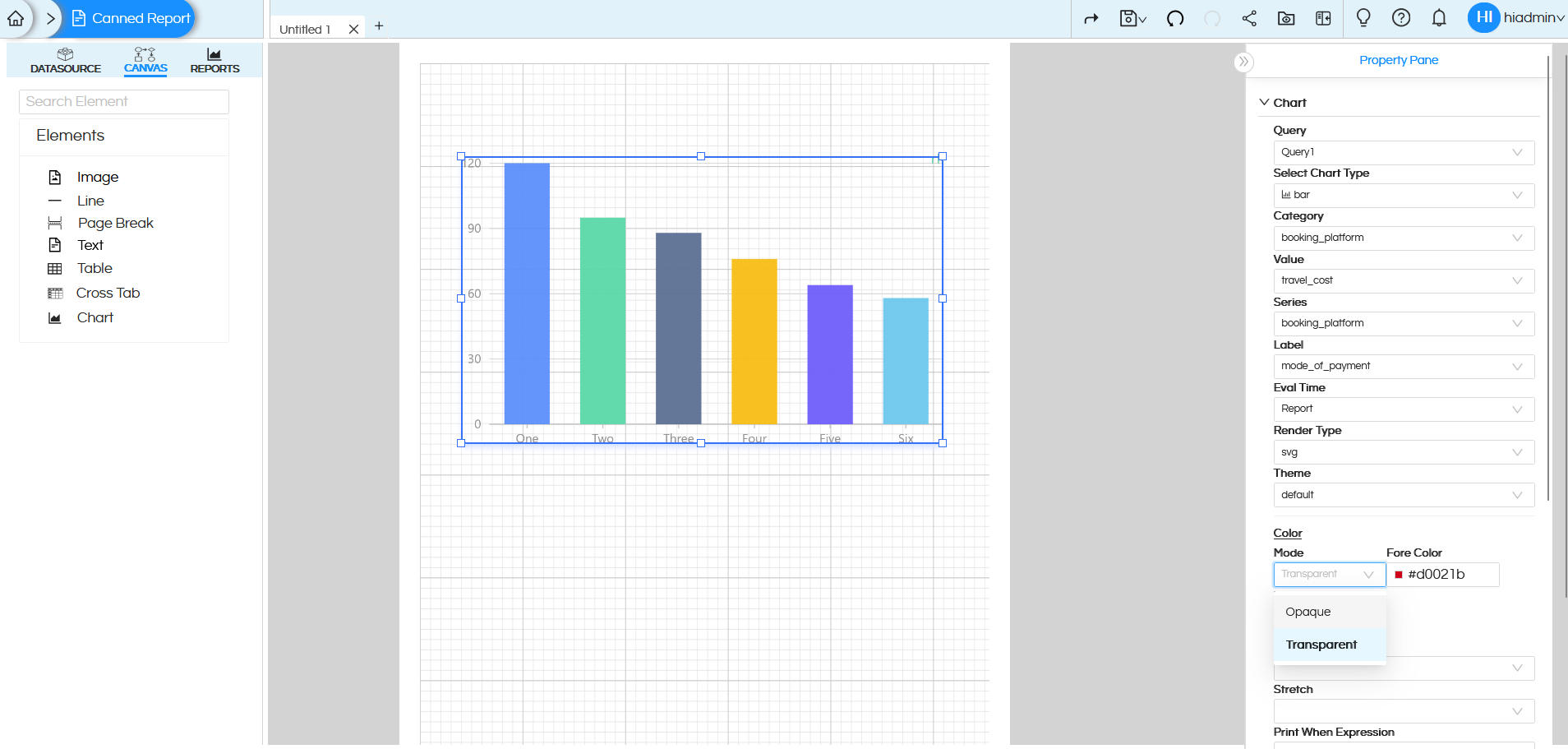
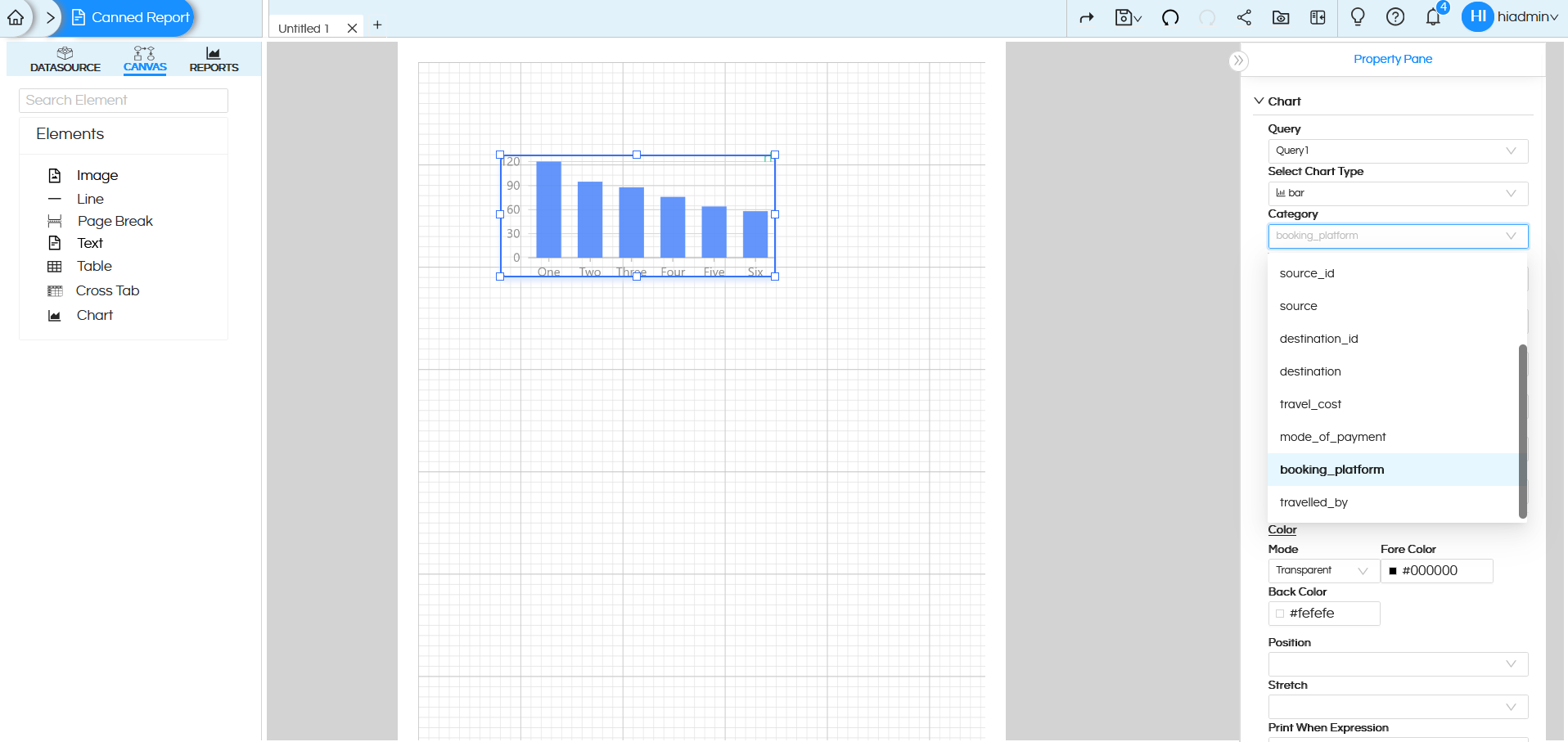
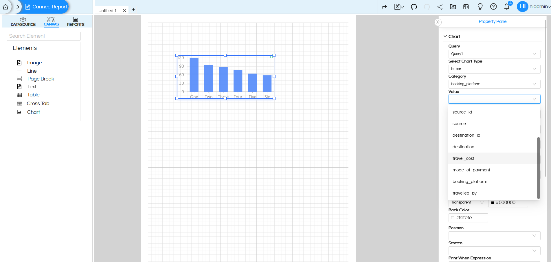
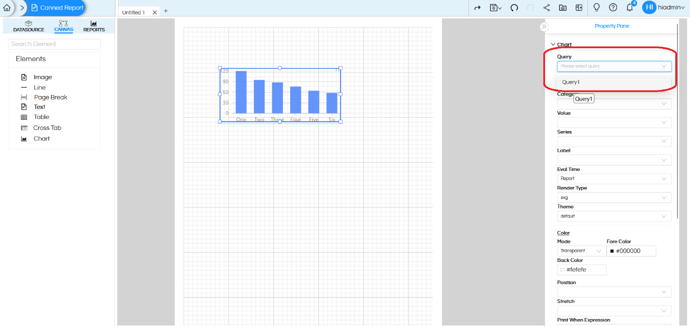
Click on the Chart component. On the right side, you will see the Chart configuration options/Properties.
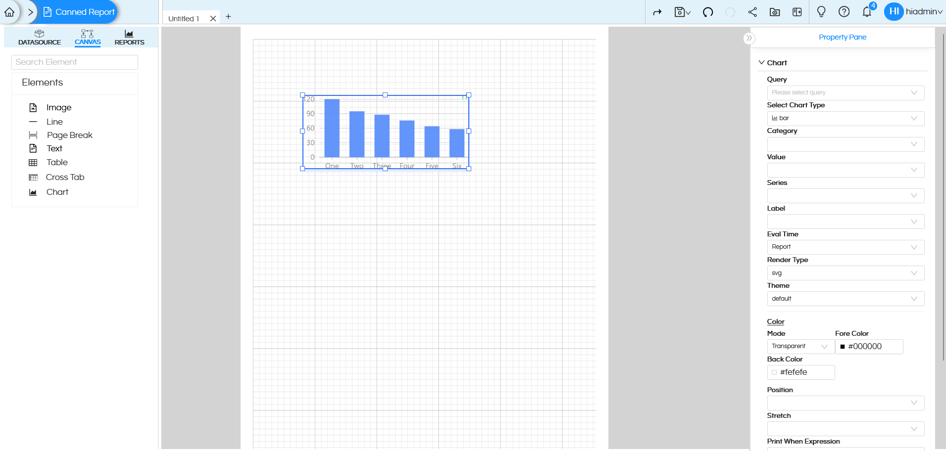
-
Query
Purpose: Specifies the data source for the Chart.
How it works: You can select a query (like Query1) which will provide the data for the Chart. -
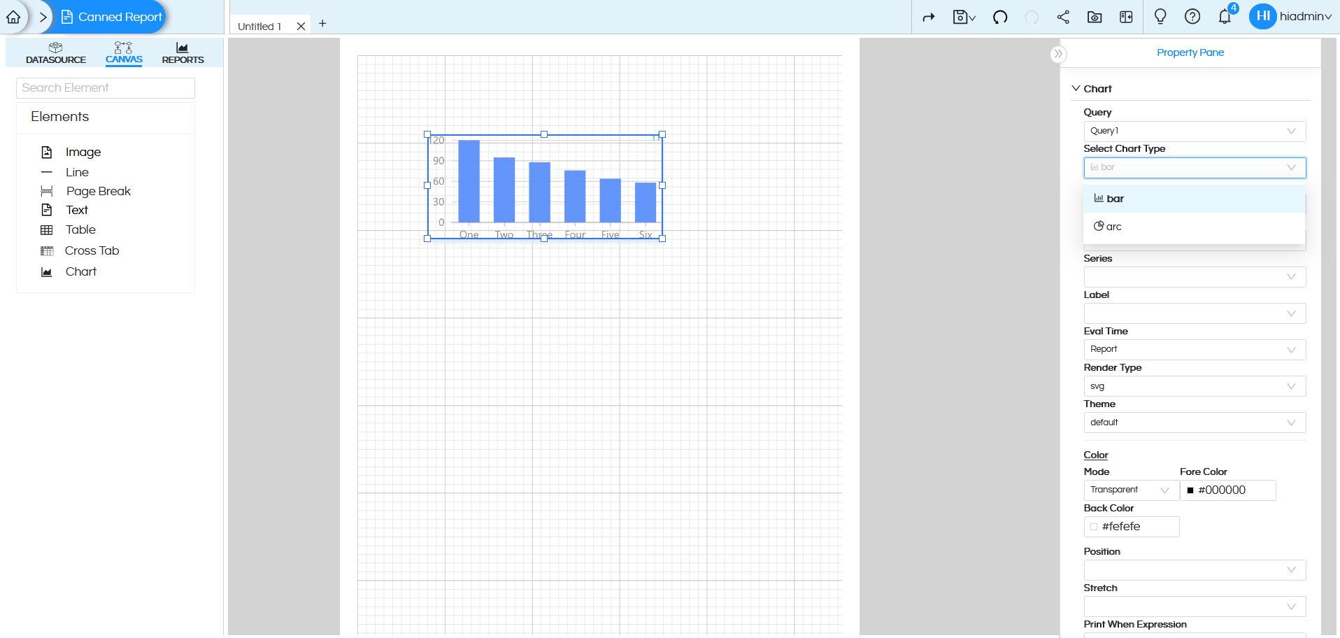
Select Chart Type
Specifies the kind of visualization used to render the data.
We have two types of charts as of now i.e: bar, arc.
Let us select bar and examine the configurations available under it in detailBar Chart:
-
Category
Specifies the field used for the horizontal (category) axis of the chart. This field typically contains dimension or categorical data, such as names, labels, or groups, which are displayed along the X-axis.
Let us select booking_platform as Category -
Value
Specifies the field used for the vertical (value) axis of the chart. This field usually contains measure or numeric data, which determines the height of the bars in the chart.
Let us take travel_cost as Value -
Series
Specifies the field used to assign colors dynamically to the chart elements based on data values or categories. This helps visually distinguish between different groups or highlight variations within the data.
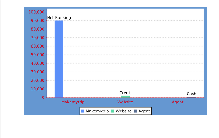
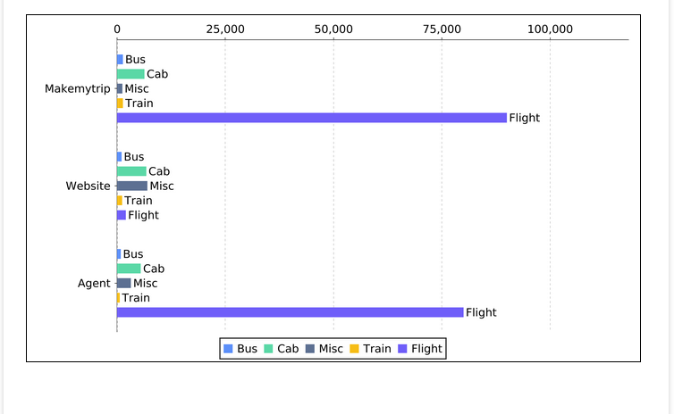
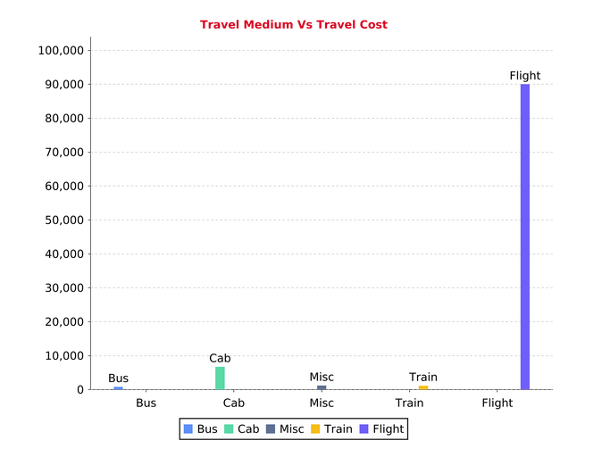
Select travel_medium from the dropdown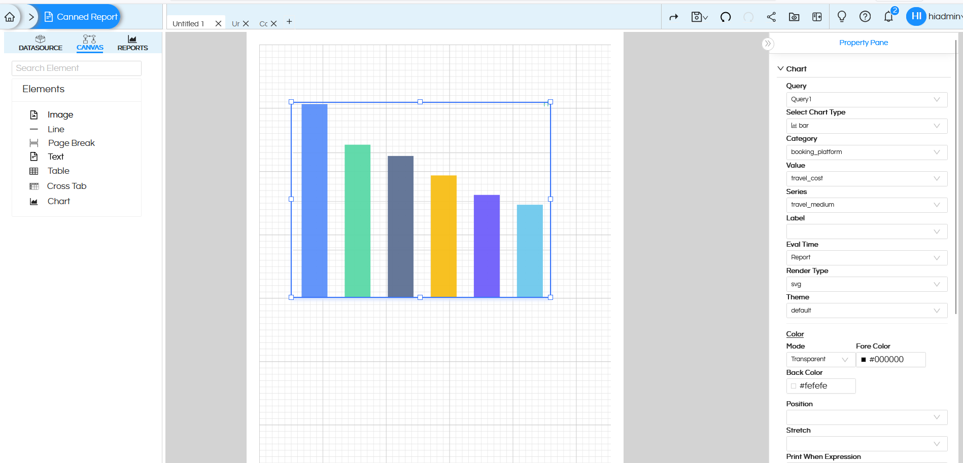
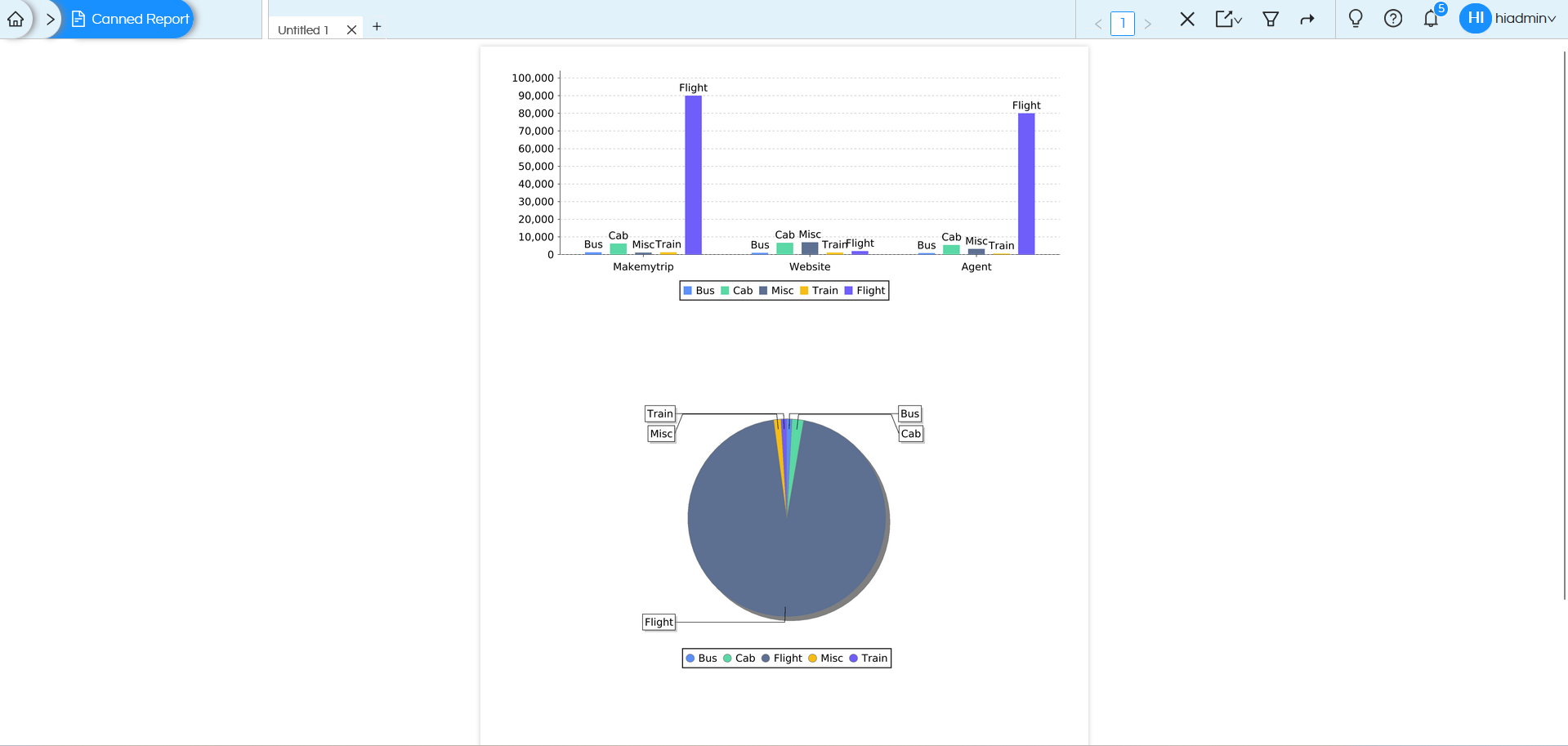
When we preview, we get the result as shown in the below:
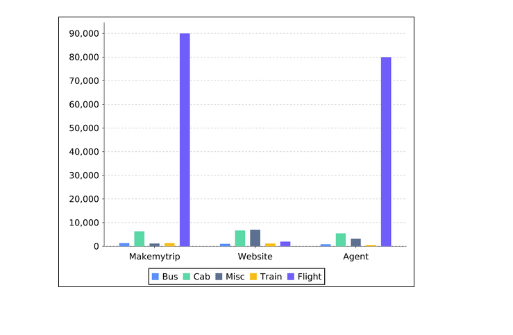
We can see that different colors are applied to the bars based on the field “travel_medium”. It has created sort of Grouped Bar Chart. We can even put the same field “booking_platform”.
-
Label
Specifies the field used to display labels on the chart, such as category names or data values. Labels provide direct context on the chart elements, making the visualization easier to understand without relying solely on axes or legends.
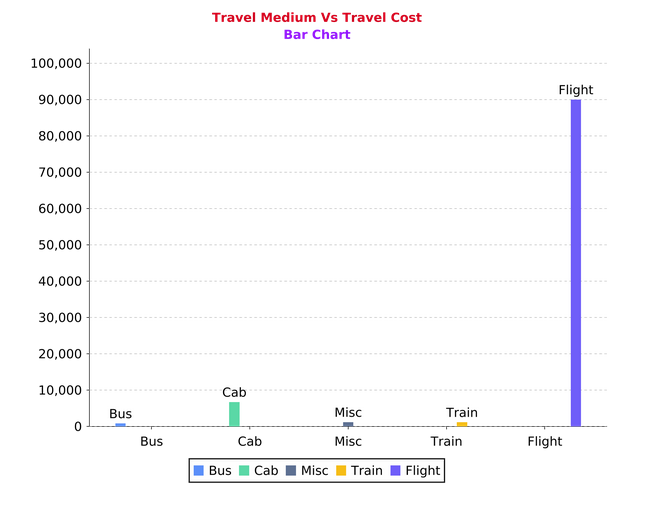
Select mode_of_payment under Legend, then we will get the result like this when we preview: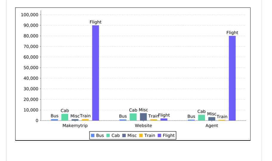
We can see the legends on the top of every bar.
-
Eval Time
Specifies when the expression associated with this element is evaluated during report generation.
This is useful when the displayed value depends on data that is available only at a specific stage of report processing.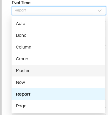
- Auto
Automatically determines the evaluation time based on the element’s context and usage.
Recommended when no specific evaluation timing is required. - Now
Evaluates the expression immediately when the element is processed.
Suitable for values that do not depend on future data. - Band
Evaluates the expression when the current band is processed.
Useful when the value depends on data within the same band. - Column
Evaluates the expression at the end of the current column.
Commonly used in multi-column reports. - Page
Evaluates the expression at the end of the current page.
Useful for page-level totals or summaries. - Group
Evaluates the expression when the associated group ends.
Ideal for displaying group totals or aggregated values. - Report
Evaluates the expression after the entire report is generated.
Useful for values that require processing all data rows, such as grand totals shown on the first or last page. - Master
Evaluates the expression after the master report is fully processed.
Typically used in reports containing sub reports.
- Auto
-
Render Type
Specifies how the chart is rendered in the report output. This option controls the rendering format of the chart, such as whether it is drawn as a graphic or rendered as an image or SVG.
-
Theme
Applies a visual theme that controls the chart’s overall style and appearance.
-
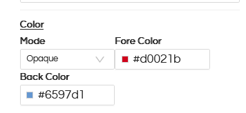
Color
Use this to apply color to the component.
In color we have sub categories:- Mode: Specifies whether the background of an object is transparent or opaque
- Fore Color: The foreground color of the object, such as font line etc.
- Back Color: The backgournd color of the object
Let us take an example. Select Mode as Opaque, Add any color in Fore Color and Back Color section.
-
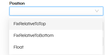
Position
- FixRelativeToTop: Chart stays fixed relative to the top.
- FixRelativeToBottom: Chart stays fixed relative to the bottom.
- Float: Chart moves freely and can be placed anywhere.
-
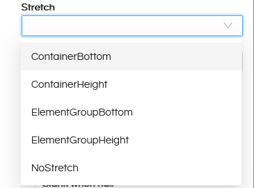
Stretch
Purpose: Specifies the graphic element stretch behaviour when the report section is affected by stretch.
- ContainerBottom: Stretches the element vertically so that its bottom aligns with the bottom of the container.
- ContainerHeight: Stretches the element to match the full height of the container.
- ElementGroupBottom: Stretches the element so that its bottom aligns with the bottom of its element group.
- ElementGroupHeight: Stretches the element to match the full height of its element group.
- NoStretch: The element does not stretch at all.
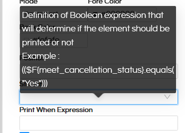
- Print When Expression
Specifies a Boolean condition that determines if the element appears in the report.
- Print Repeated Values
Purpose: Allows suppressing the repeating values for the dynamic elements such as text field and image fields and to fully customize the behaviour of the static elements like line and static texts.
- Remove Line When Blank
Purpose: Removes the Chart if there is no data.
- Print in First Whole Section
Purpose: Prints the Chart only at the start of a section (useful in multi-section reports).
- Print When Record Overflows
Purpose: The element will be printed when the record overflows to a new page or a new column
- Stretch with Overflow
Purpose: Allows the text field to stretch downwards in order to display all its text when it doesn’t fit in the defined text field height
- Blank When Null
Purpose: If a field is NULL, it shows as blank instead of printing NULL.
-
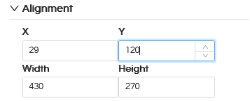
Alignment
Purpose: Controls the Chart alignment
- X-position: Distance from the left side in pixel
- Y-position: Distance from the top in pixel
- Width: Width of the Chart component in pixel
- Height: Height of the Chart component in pixel
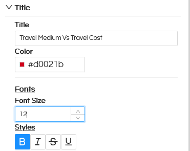
- Title
The main heading displayed at the top of the chart that describes what the chart represents. You can customize its Color, Font size, and font style.
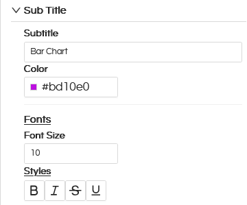
- Sub Title
Purpose: Secondary text displayed below the title that provides additional context or further explains the data. You can customize its color, font size, and font style.
-
Legend
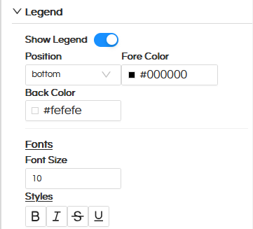
Show Legend
Toggles the visibility of the legend in the chart.Position
Specifies the location of the legend within the chart area (for example, top, bottom, left, or right).Fore Color
Defines the foreground color of the legend, including text, symbols, and other visible elements.Back Color
Specifies the background color of the legend area behind the text and symbols.We can even customize its font size and font style using Font Size and Styles option.
-
Label
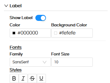
Show Label
Toggles the visibility of the label in the report output.Color
Specifies the color used to render the label text.Background Color
Defines the background color behind the text.Font
Specifies the font settings used to render the label text, including font family, font size, and font styles (Bold, Italic, Strikethrough, and Underline). -
Color
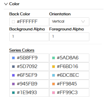
Back Color
Defines the background color behind the chart area.Orientation
Defines how colors are oriented or applied within the visual element (for example, vertical or horizontal).If we change the orientation, instead of a horizontal bar chart we can create a vertical bar chart.
Background Alpha
Controls the transparency level (alpha) of the background color.Foreground Alpha
Controls the transparency level (alpha) of the foreground color.Series Colors
Defines the colors used for each data series in the chart. Colors are applied in order to visually distinguish multiple series. -
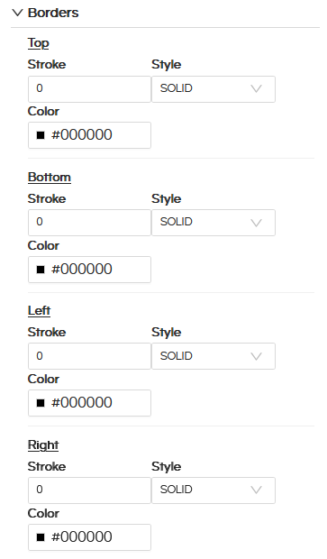
Borders
Purpose: Configure various border for the Chart like border style, border color.
-
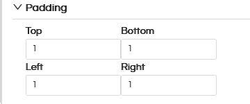
Padding
Purpose: We can configure padding for the Chart and hence the chart will render leaving that much padding within that frame.
Arc Chart
In the below part of the blog we have covered how to create a pie/arc chart.
In Select Chart Type, the arc option provides configuration settings similar to the bar chart.
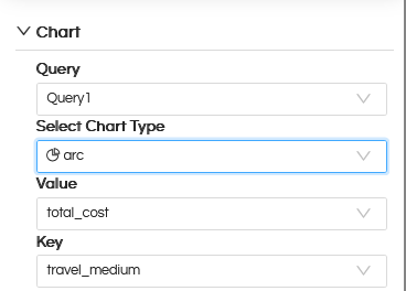
Value
Select a numeric field whose values are used to calculate and render the size of each arc (slice) in the chart.Key
Select a field used to categorize the data and assign colors dynamically to each arc, helping distinguish different data values or categories.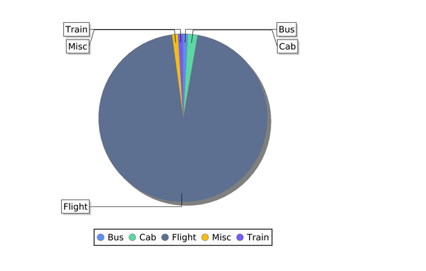
Here we have taken Value as travel_cost and Key as travel_medium. The result is as shown as above.
Note
The Arc chart supports the same configuration options as the Bar chart, including styling, colors, labels, legend, and interaction settings. -
Category
-
Query
Adding Multiple Charts in the report:
Each Chart component requires a dedicated query. A single query can be bound to only one chart; therefore, a separate SQL query must be created for every additional chart used in the report. In this report we created two Charts (bar and arc).
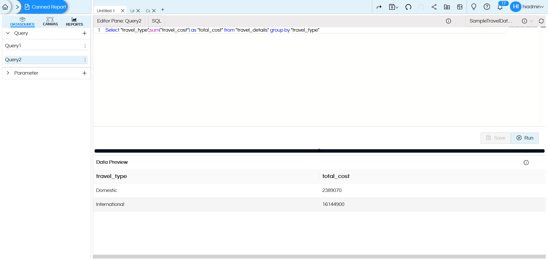
Using Query2, create an arc chart (as explained in the creation process above). When we preview the report, we get the result shown below.
Reach out on support@helicalinsight.com in case of any more questions.
