Depending upon needs we may have to use a Grid Chart some times. When there are a lot of comparisons to be made. Think of it as if we have to compare total_cost, based on multiple criteria like per mode_of_payment, per booking_platform, per client, and we want to see that split as per meeting_purpose. Let us try to create it in steps. A grid chart, based on what we have dragged in rows and columns, will accordingly create that many cells which will work together as visualization. Currently the grid chart is having various kind of sub-visualizations as well as customization options which we would be explaining in the below document.

Basic Implementation

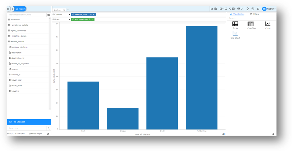
Let’s try with example, with metadata already created (from our sample database). Drag/add these two fields (one each to Rows and Column section): mode_of_payment and travel_cost. By default, mode_of_payment will be Group By and travel_cost will be aggregate function Sum.

Grid chart for this report will look like below. As expected, it should be a single visualization (default is bar chart) with mode_of_payment with comparative scores calculated from sum of total_cost.

Visualization Grid Chart

In a similar way more and more fields can be added on rows and columns and accordingly more and more grouping as well as subcharts will get created. X axis grouping is happening (any level is possible) and Y Axis will create sub charts.

Visualization Grid Chart

Marks Options

Let us see what all options do we have with this grid chart report. Select ‘Marks’ menu from the right pane menu. If it is not displayed on screen, click on meatball menu icon to see more options.

Visualization Grid Chart

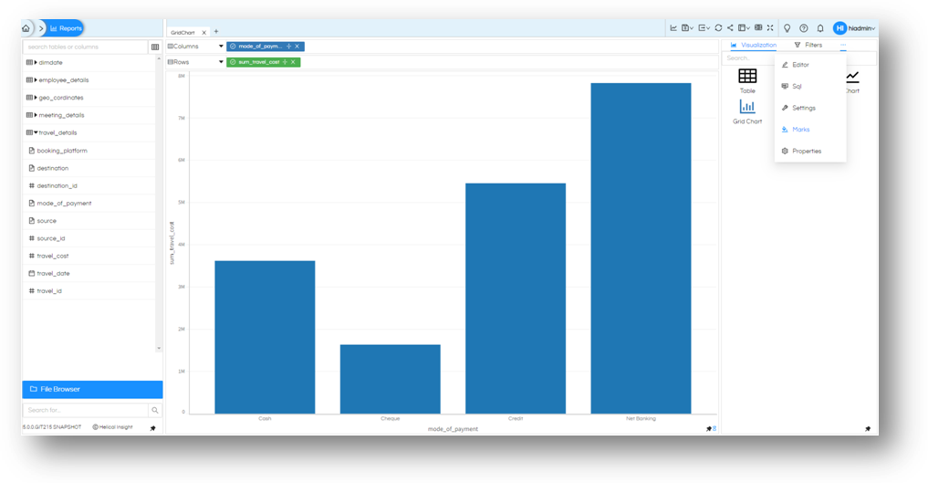
Once you are on ‘Marks’ menu you will see an option of All, expand it.

Visualization Grid Chart

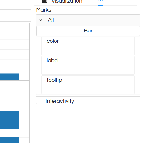
You will see Bar is selected and there will be couple of options with this bar chart like colour label and tooltip.

Click on Bar to see what other charts can this be converted into: Arc ( or pie chart), Area, Bar (default selected), Doughnut, Heatmap, Line, Point, Tick. Choose the chat type you want, and its options will be reflected. Note that in order to generate Heatmap atleast one dimension should be in both rows and columns.

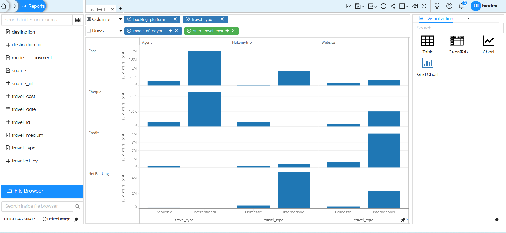
Let us chose Doughnut, for now. In colour add booking platform. (You can drag and drop the field here, otherwise right click on the field, Add to Marks and select color). Once done, click

Visualization Grid Chart

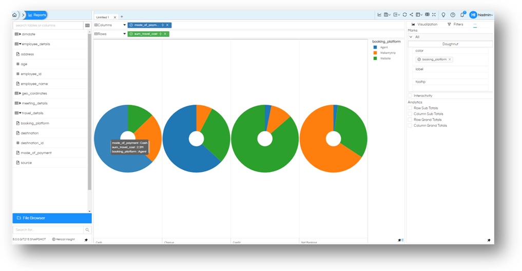
Now we have for each of mode_of_payment, a split of cost based on booking_platform.

Based on what you need you can not only customize, but also apply an additional level of split to your charts and make it more useful.

Based on the kind of chart selected these customization options are different which we are explaining below. Some of these customizations will even work for Table and Crosstab chart also. In many of these customizations only one field can be dragged and used at a single time, not more than that.

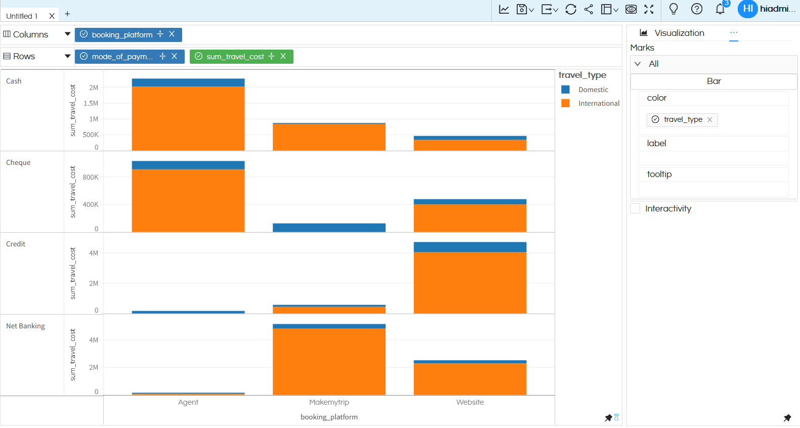
Color: You can drag a dimension or measure and based on that the color breakup will happen in the selected visualization. Like as shown below the bar chart is showing the split based on the field dragged. The color feature will not work in case of heatmap.

Visualization Grid Chart

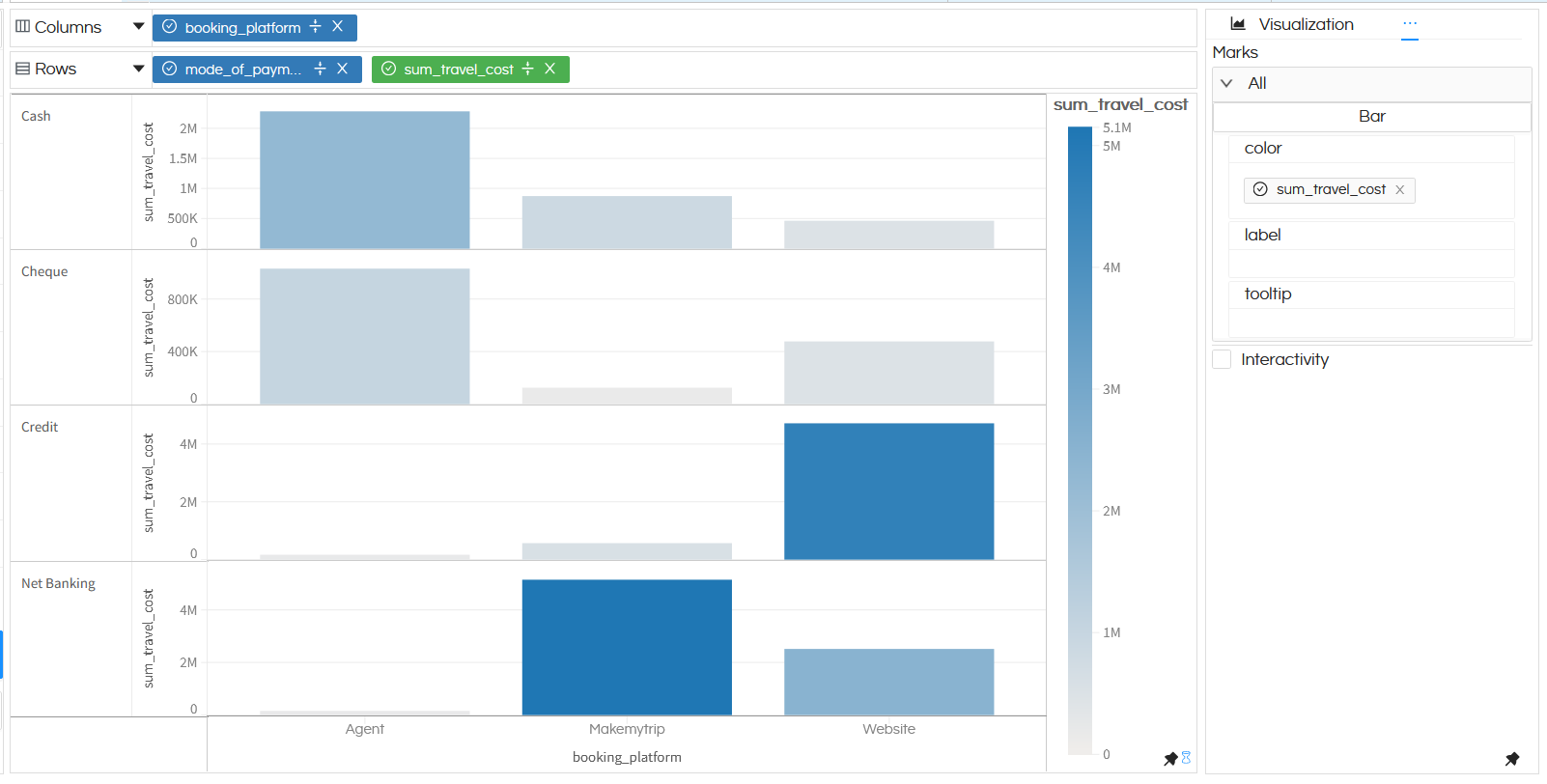
Also in below we have dragged the cost of travel in color, so the color intensity is changing based on the cost of travel.

Visualization Grid Chart

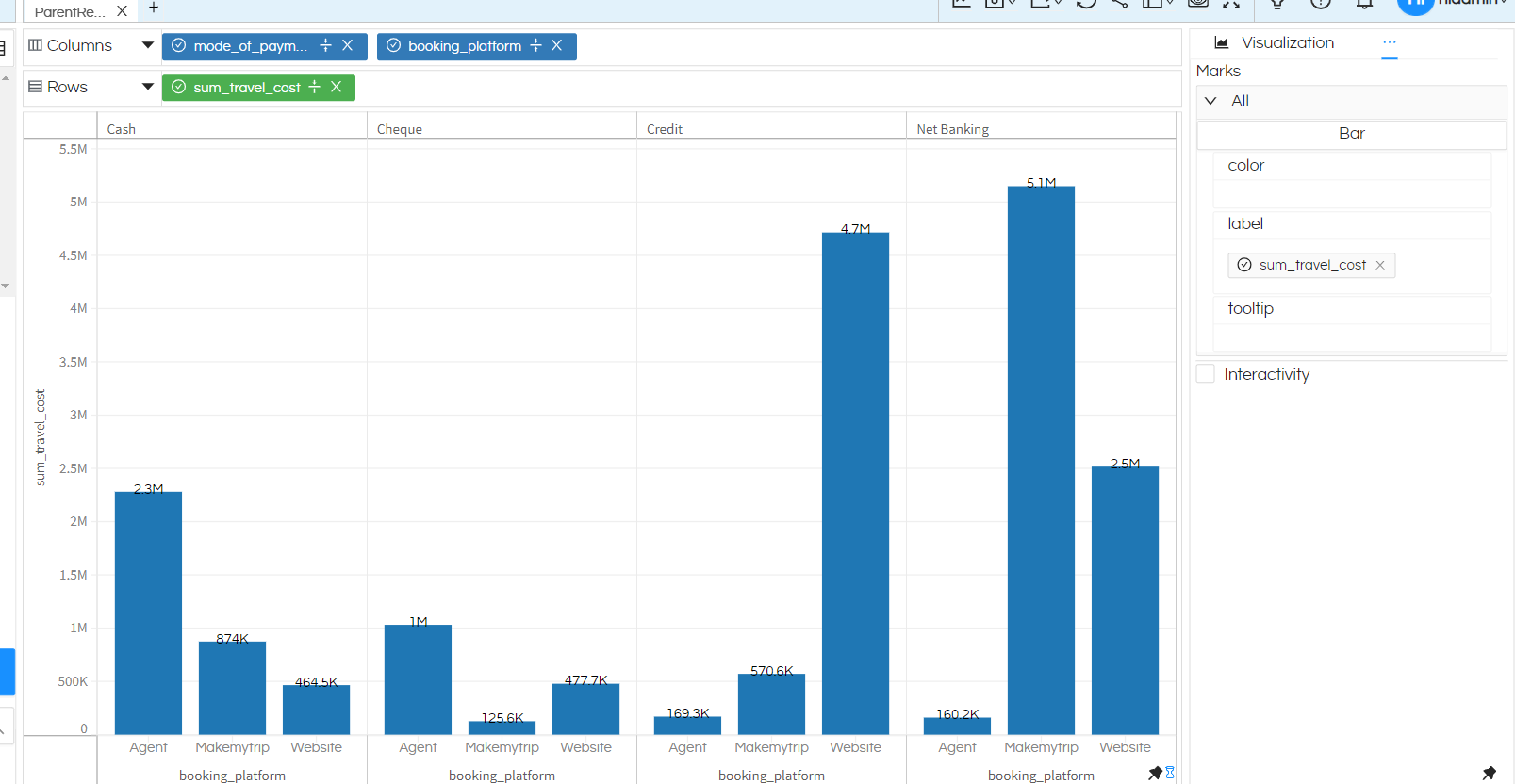
Label: Any field from the metadata (dimension or measure or from the selection area) can be added to make that as a label. Generally the field on which aggregate function is applied is most commonly used to be shown as label. Refer to an example below.

Visualization Grid Chart

Tooltip: In a similar way any field from the metadata (dimension or measure or from the selection area) can be added to make that as a label. This feature is still under development. Generally by default on the tooltip it shows the X axis Y axis and the aggregate value. With this feature additional fields can also be shown here.

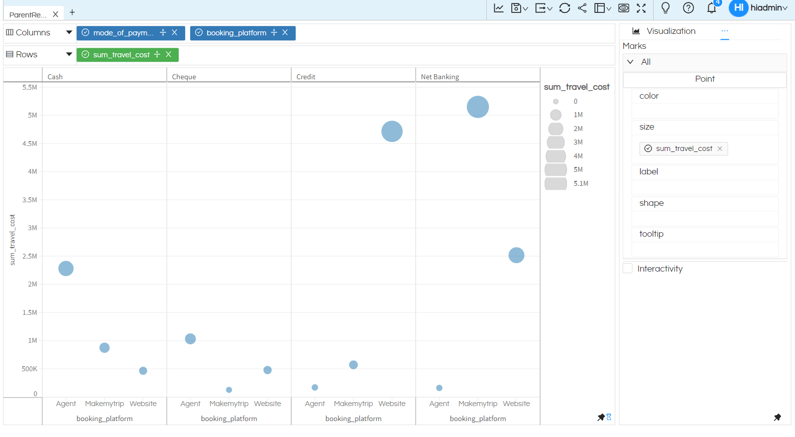
Size: When we are using Point chart then size customization can also be used. The size of the points can be changed based on the dragged dimension or measure.

Visualization Grid Chart

Visualization Grid Chart

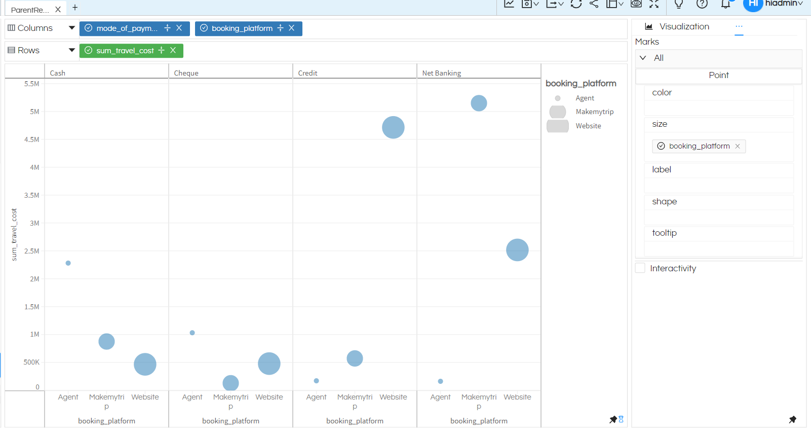
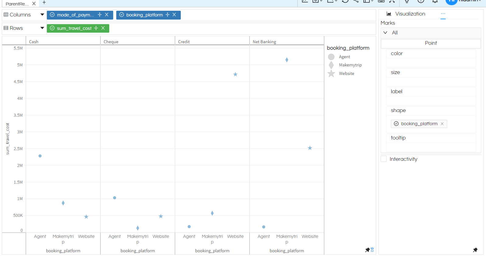
Shape: For point chart, further we can even have segregation of these points based on different shape based on whatever field we drag here. In case of shape only a dimension can be dragged here.

Visualization Grid Chart

Text: From Helical Insight version 5.0 Build 1083 onwards in crosstab one more option is introduced which is called as Text. In this case it creates a grid with actual numbers/text in the grid instead of any visualization like bar, line etc

Visualization Grid Chart

When “Text” is selected then in the Marks one more option appears called “Text”. It is important to specify what text we would like to show in the visualization. Like in below case since we want to show “sum_travel_cost” the same measure is also dragged here as well. You can drag dimensions or measures in this placeholder

Visualization Grid Chart

And when generated it creates Text Grid visualization like the below.

Visualization Grid Chart

Concluding:

  • We need at least one field in each (Rows and Column section) to have started with it. Preferably at least one of them a measure for preparing the chart.
  • All values (even if passed individual values from SQL query and shown on table as individual values) will be aggregated. Default: all text (dimensions) will be grouped, all numeric (measures) will be a sum, unless this was specified differently.
  • The chart is prepared a space for all combinations of ‘Dimensions’ compared against values of ‘Measures’ (Just like in cross tab).
    • If there is no data exist for some combinations of dimension, it will leave a blank space for that chart.
    • If there are no measures, (just dimension in both Rows section and Column section) the height of bars will be same for all existing combination.
  • The chart is sorted by default on all dimensions and measure. If you want to apply sorting differently, please use the sorting options in the columns and rows.
  • Various kind of sub chart can be selected from Marks, there are more customization options using “Marks” for the created visualization.

Thank You,
Helical Insight

Helical Insight’s self-service capabilities is one to reckon with. It allows you to simply drag and drop columns, add filters, apply aggregate functions if required, and create reports and dashboards on the fly. For advanced users, the self-service component has ability to add javascript, HTML, HTML5, CSS, CSS3 and AJAX. These customizations allow you to create dynamic reports and dashboards. You can also add new charts inside the self-service component, add new kind of aggregate functions and customize it using our APIs.
Helical Insight, via simple browser based interface of Canned Reporting module, also allows to create pixel perfect printer friendly document kind of reports also like Invoice, P&L Statement, Balance sheet etc.
If you have a product, built on any platform like Dot Net or Java or PHP or Ruby, you can easily embed Helical Insight within it using iFrames or webservices, for quick value add through instant visualization of data.
Being a 100% browser-based BI tool, you can connect with your database and analyse across any location and device. There is no need to download or install heavy memory-consuming developer tools – All you need is a Browser application! We are battle-tested on most of the commonly used browsers.
We have organization level security where the Superadmin can create, delete and modify roles. Dashboards and reports can be added to that organization. This ensures multitenancy.
A first-of-its-kind Open-Source BI framework, Helical Insight is completely API-driven. This allows you to add functionalities, including but not limited to adding a new exporting type, new datasource type, core functionality expansion, new charting in adhoc etc., at any place whenever you wish, using your own in-house developers.
It handles huge volumes of data effectively. Caching, Pagination, Load-Balancing and In-Memory not only provides you with amazing experience, but also and does not burden the database server more than required. Further effective use of computing power gives best performance and complex calculations even on the big data even with smaller machines for your personal use. Filtering, Sorting, Cube Analysis, Inter Panel Communication on the dashboards all at lightning speed. Thereby, making best open-source Business Intelligence solution in the market.
With advance NLP algorithm, business users simply ask questions like, “show me sales of last quarter”, “average monthly sales of my products”. Let the application give the power to users without knowledge of query language or underlying data architecture
Our application is compatible with almost all databases, be it RDBMS, or columnar database, or even flat files like spreadsheets or csv files. You can even connect to your own custom database via JDBC connection. Further, our database connection can be switched dynamically based on logged in users or its organization or other parameters. So, all your clients can use the same reports and dashboards without worrying about any data security breech.
Our application can be installed on an in-house server where you have full control of your data and its security. Or on cloud where it is accessible to larger audience without overheads and maintenance of the servers. One solution that works for all.
Different companies have different business processes that the existing BI tools do not encompass. Helical Insight permits you to design your own workflows and specify what functional module of BI gets triggered