Grid table is similar to crosstab view. In this blog we are going to learn how to create a crosstab/pivot (Grid Table) kind of report within Open source BI product Helical Insight.
Generally, the output of SQL in a tabular format is not very optimal information to understand and put to use. If we are dealing with textual information we need to represent information from one column against another column to have a comparative analysis. Grid Table visualization is designed for that purpose. It is very much the same as crossTab with slight changes.
Basic Grid Table
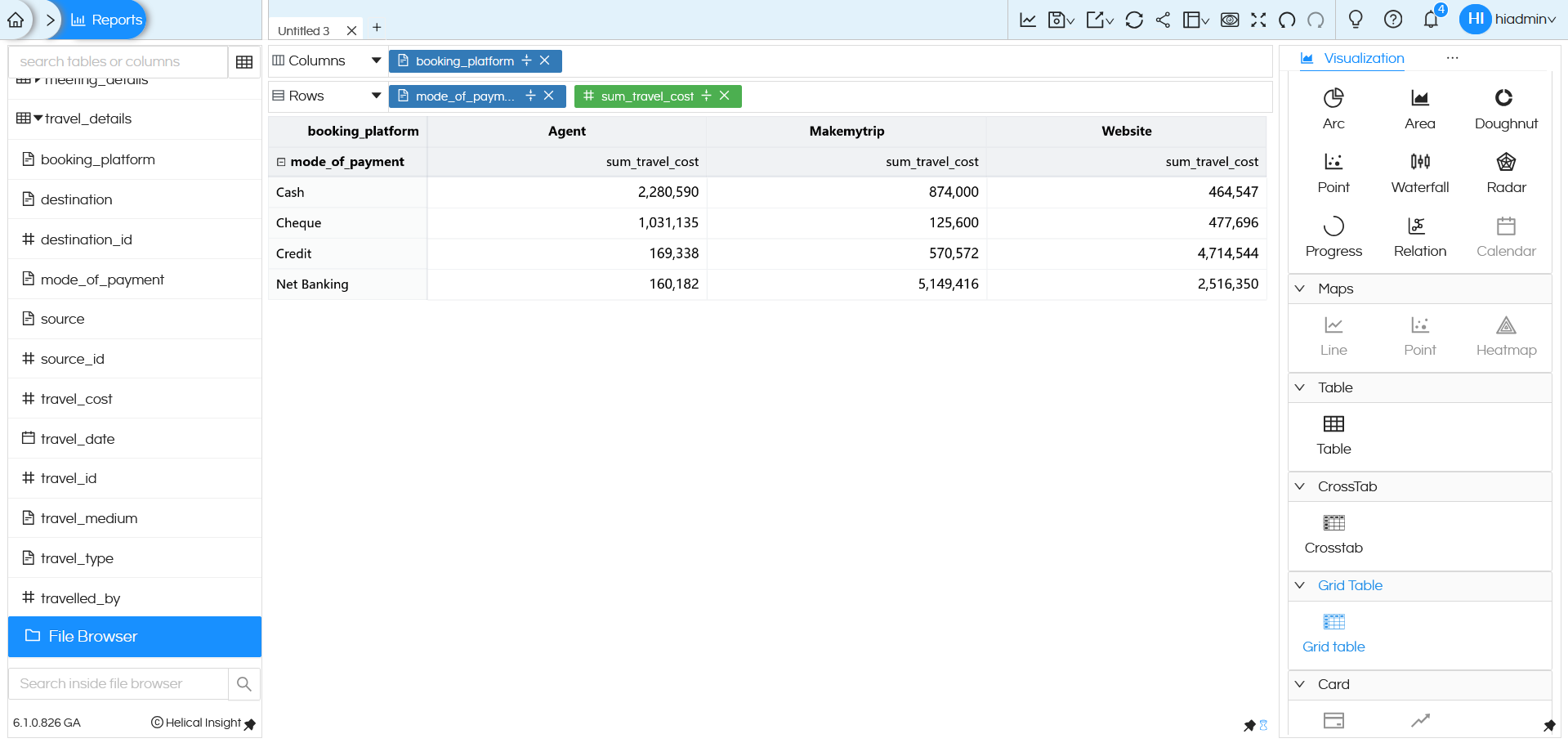
Let us just drag a field total_cost in Columns, mode_of_payment in Rows and select Grid Table in Visualization from the panel to the right.
(Note: There should be atleast one measure in Columns and one dimension in Rows)

Muliple fields
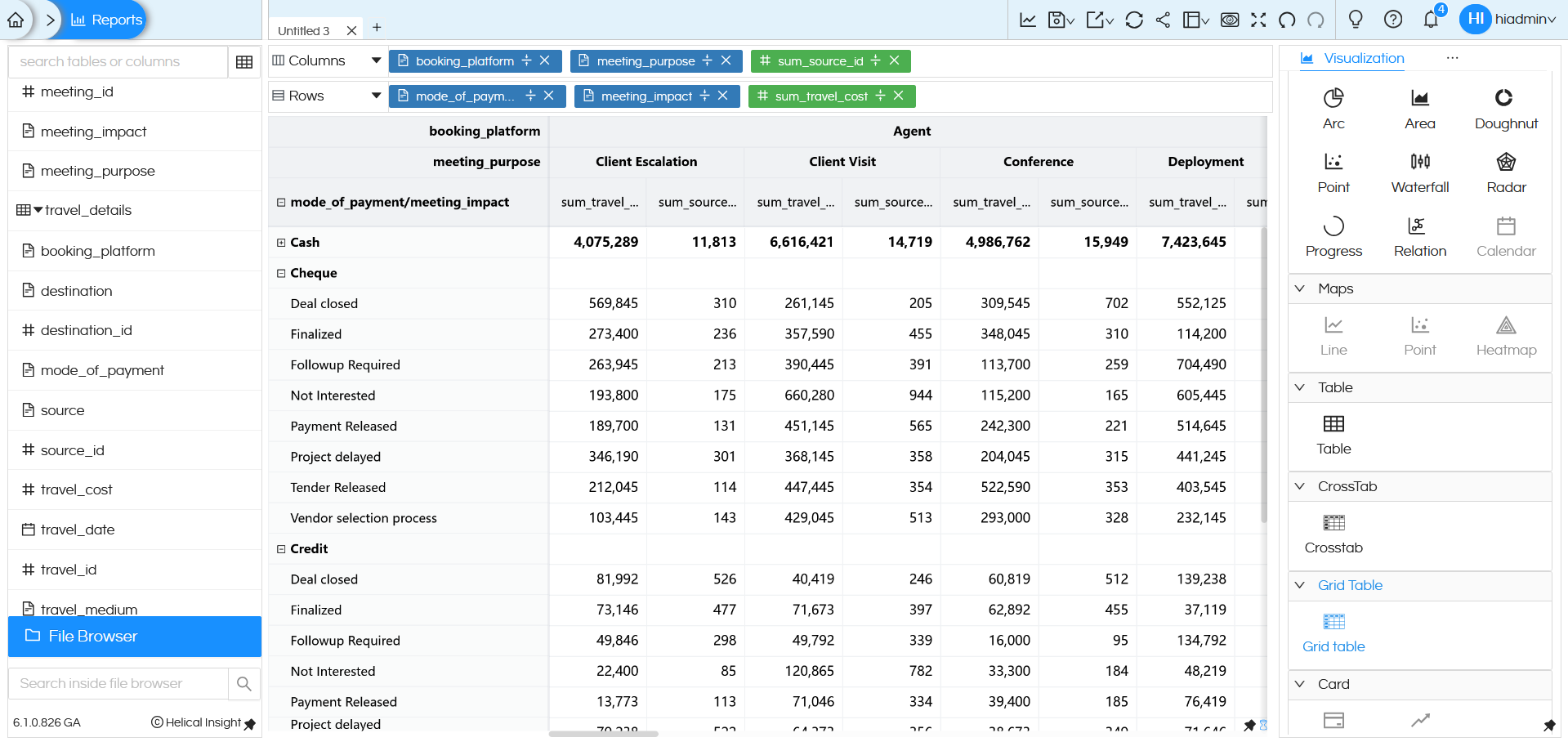
This chart is best when used with multiple level of dimensions where we need to analyze information across multiple factors. Let us drag booking_platform into Columns and mode_of_payment into Rows along with sum of total_cost (in either Columns / Rows) and generate the report.
You will see the split of total_cost of travel per booking_platform, per mode_of_payment. What dimension you drag in column forms the column of Grid Table, whatever dimension you drag in rows forms the rows of the Grid Table and measures forms the values section.
Grid Table visualization is not limited one dimension on Columns / Rows/measures. You can add up couple of more dimensions and more measures to the mix (as per your needs) and generate the report
We have added meeting_purpose and meeting_impact as dimension and count of source_id as a measure.

You will see that we have split of the measures as per the dimension. Both the measures are running as two columns, and the dimensions are nested as per the sequence in Columns or Rows respectively.
Once you are on the chart, you can also collapse Columns/rows and focus on the data you need.
You can Collapse Columns/rows by clicking on the small minus sign(-) at starting of text values.

Here we can see that the Row value Cash is collapsed and sign changed to plus(+).
Once you are on the chart, you can also resize the columns / rows. Resizing one will adjust all other Rows/ Columns accordingly.
Marks
Based on your screen size on the panel to the right, there are more options to this Visualization. If you do not see Marks on the list, you may click on the meatball icon and select Marks.
Just like a table, we have the option to color or size the information based on one of the fields.

Let us use mode_of_payment for Color and generate the report again.

Similarly, the size of text can be controlled the same way, let us add trave_cost to size. In both color and size right now we have dragged dimensions, in any of them you can drag dimensions or measures based on the requirement.
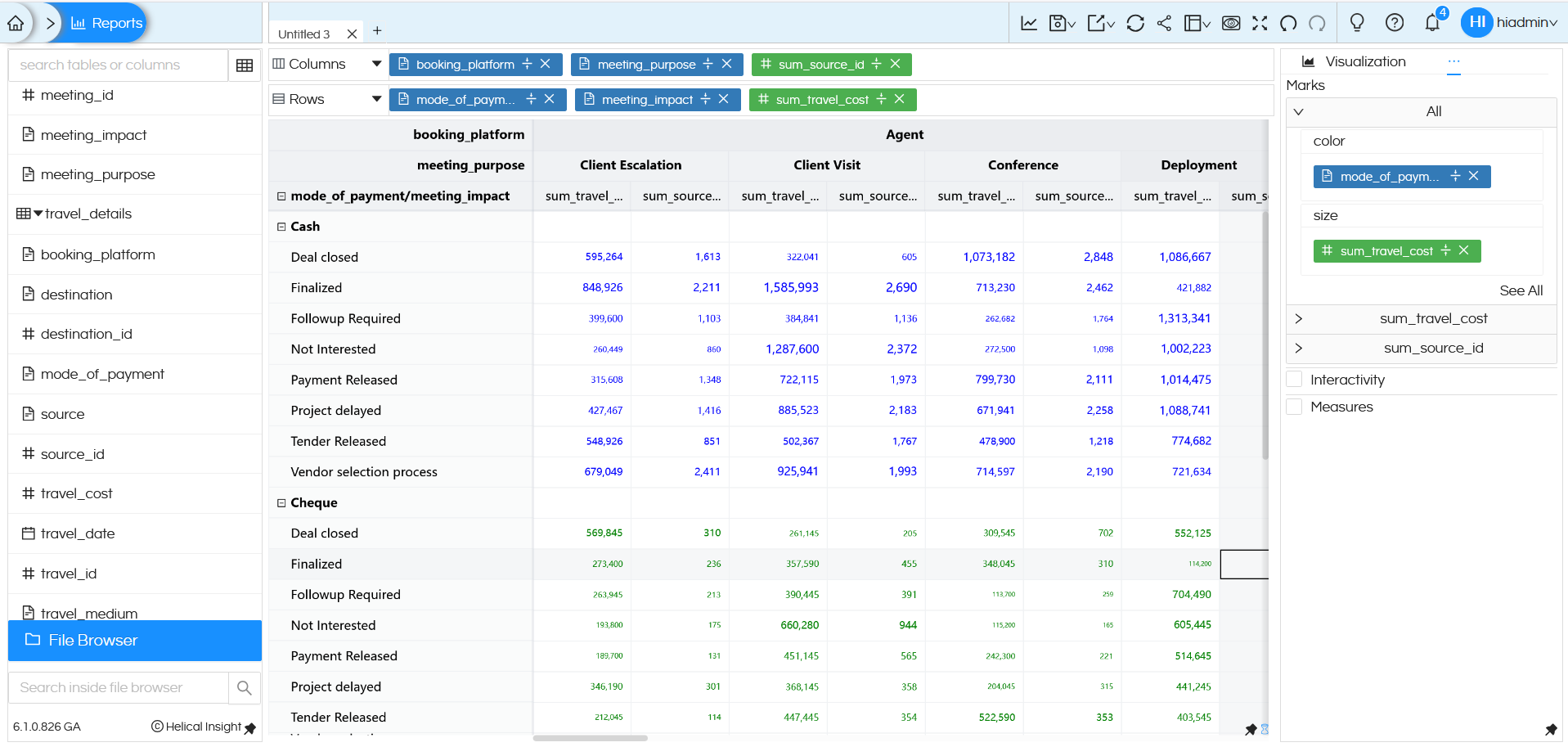
Based on your needs you can use these Marks options for better understanding of data.
NOTE: Grid Table has one good feature which can allow to resize the width or height. You can use your mouse (like shown in the image below) and resize it. This can help with readability. However this resizing happens temporarily only, it is now saved. Hence if you again refresh the page, it will open in default mode only.

There are a lot of other functions like drill down, drill through, formatting, look and feel etc, which we have covered in other blogs. There are also some customizations which works only for Crosstab which can be read here : https://www.helicalinsight.com/crosstab-properties/
Reach out to us on style=”color:blue;”support@helicalinsight.com in case of any more questions.
