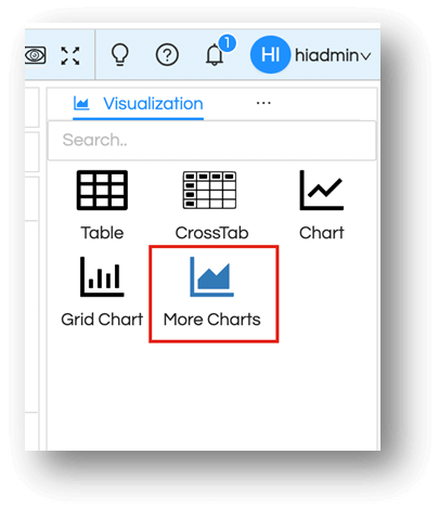
In this blog we will learn about category More Charts visualisations pane and its customisations. More charts aFor Progress chart, we need a measure in rows or columns. It will generate chart with 100 percentage.lso give you charting options like Grid Chart but like a normal chart, not in the form of a grid kind of charts. Further More Charts also can allow you to create word cloud and card widget also additionally.
NOTE: Treemap, Waterfall, Radar, Progress (with options of Ring chart, Gauge Chart and Bullet chart) have been added from version 5.2.1 onwards in Helical Insight Enterprise Edition.
1. How to prepare Charts
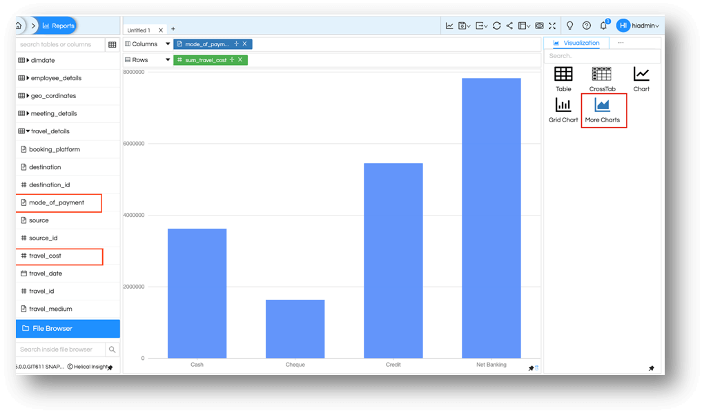
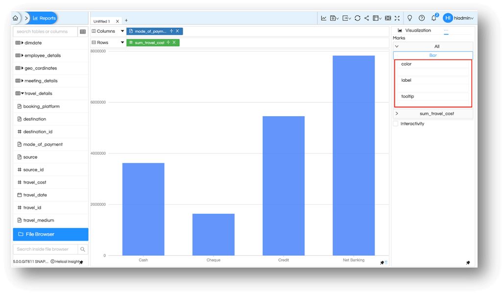
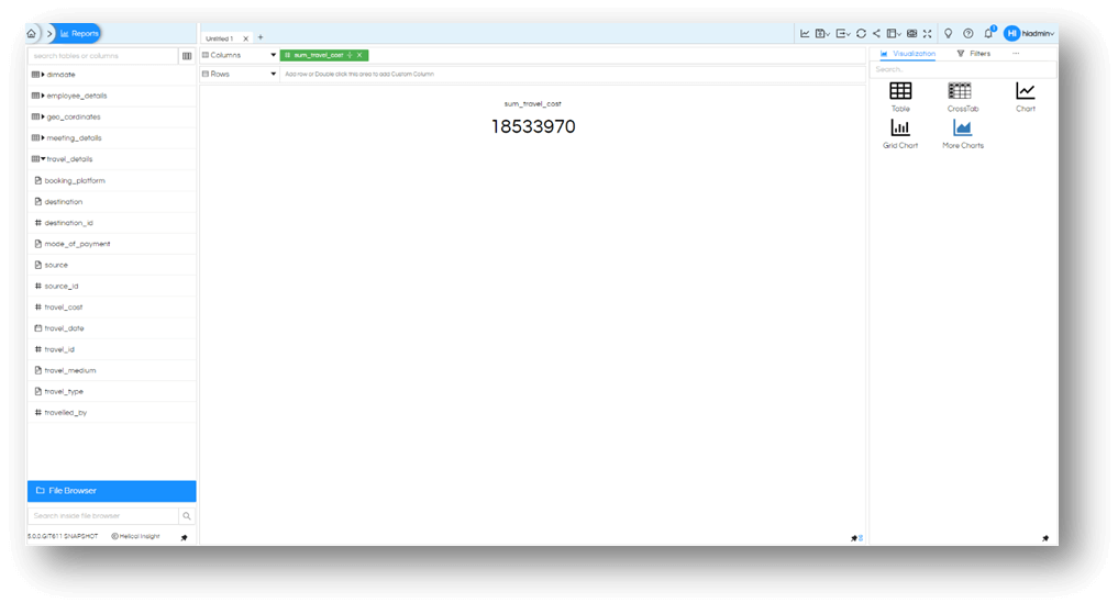
Let’s select a measure like travel_cost and dimension like mode_of_payment into rows and columns and then select More Charts from visualisation pane. By default, you will see a bar chart is generated.
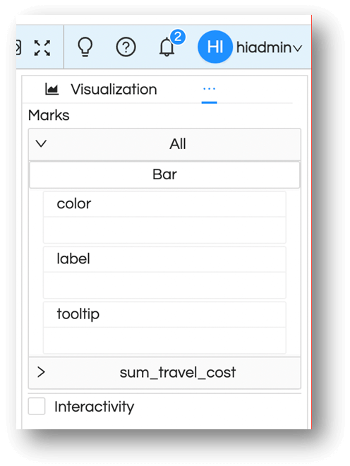
2. Marks option
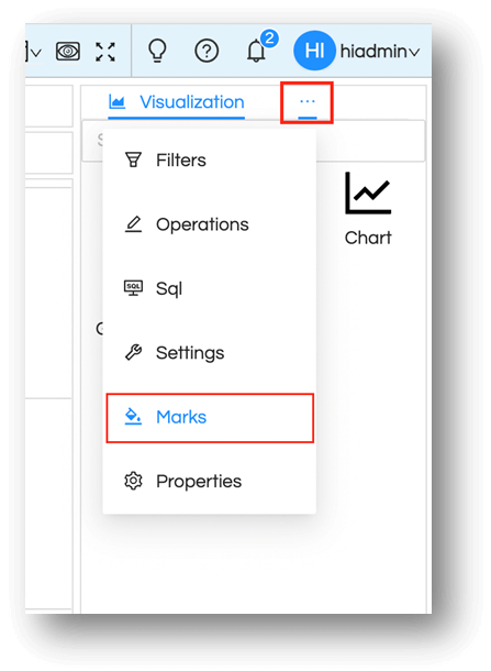
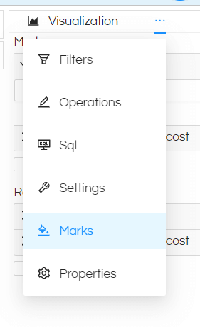
To select other charts and representations for category More Charts, then select this meatball icon on the top right. from the menu list, select Marks.
To see all the possible charts Expand All.
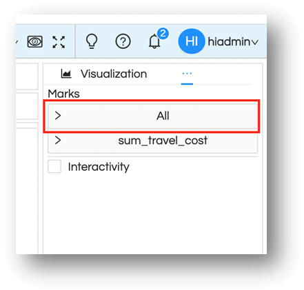
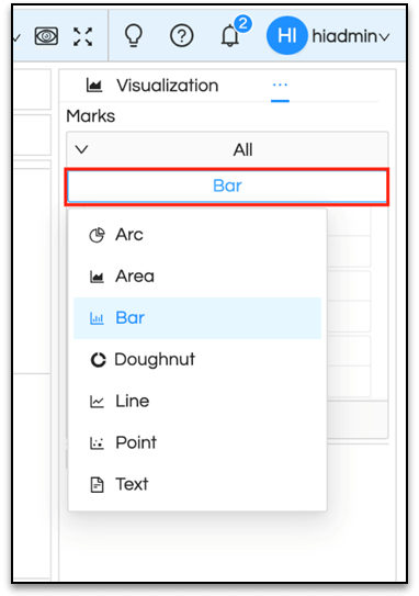
You will notice the Bar is selected by default and that is what is picked up while applying the visualization.
Click on Bar to see the other options available based on the current field selection
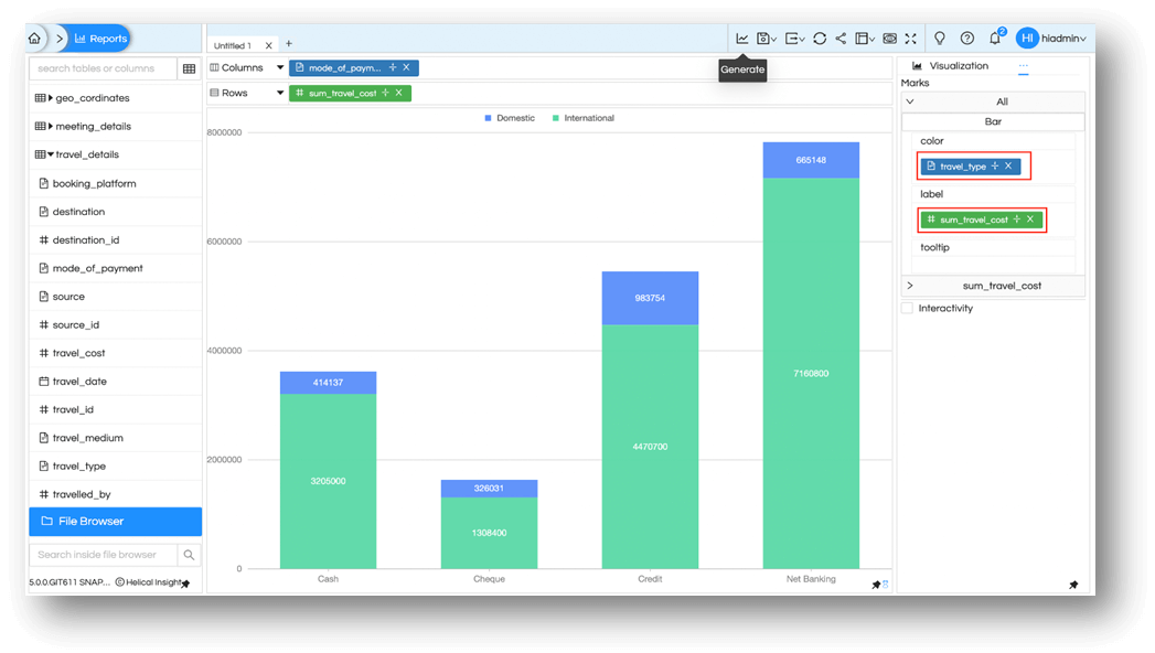
Marks menu can also be used for other purposes on the selected chart. Based on your needs you can add information on the charts with the given possible options. (Please note that these options are dependent on the type of chart that you select.) For our example, we have a bar chart and we see options to add fields to color, label or tooltip.
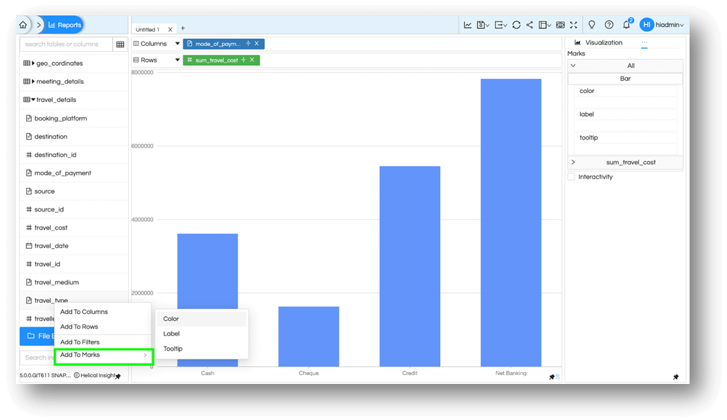
You can drag needed field or use them via right-click menu on those field. Here in the example below travel_type is selected to be added to Color as shown in the image below.
Now the bar chart will split as a stacked bar chart based on the based on cost breakup of travel_type. Further let’s add travel_cost to the label as well and generate the chart.
3. Some more types of charts
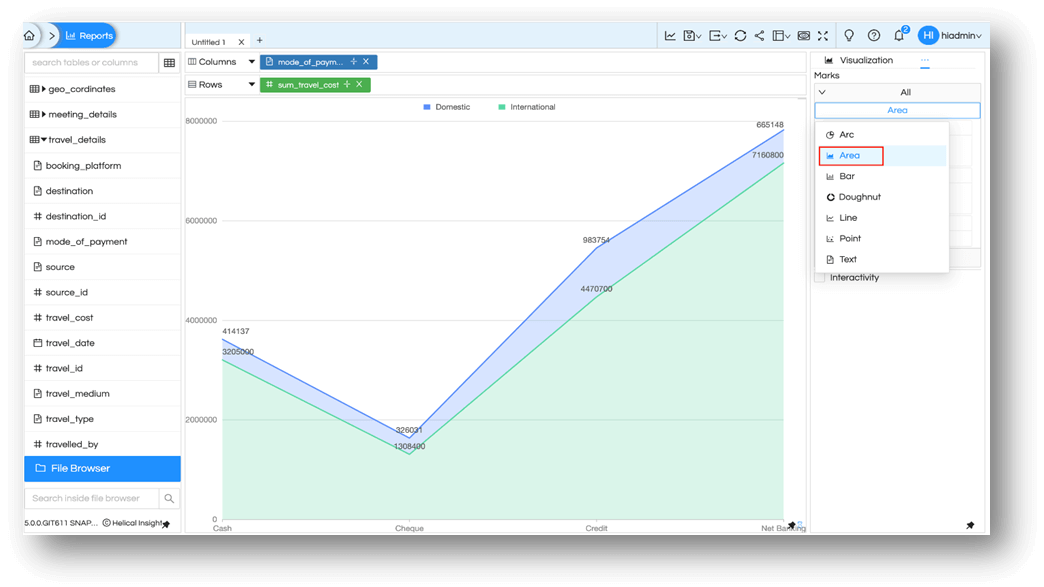
You can use these features as per your needs. Let us now look at some more charts available in Marks menu. Click on Bar and select Area. And the fields which were part of color and label will continue to create their impacts.
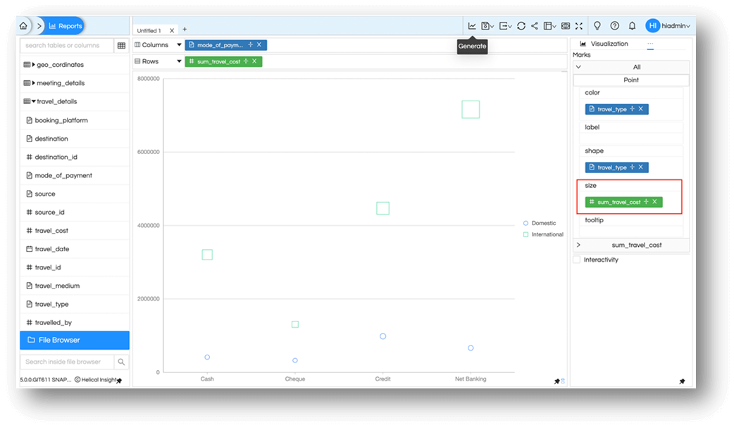
Some of the charts may have different options. For example let us select point chart. we have additional 2 parameters of shape and size . So for shape, if we choose any field in shape and then generate , then it will give different shapes for each value in data point. If we have a field in size and then generate the report again, then it will give size to each point according to it value.
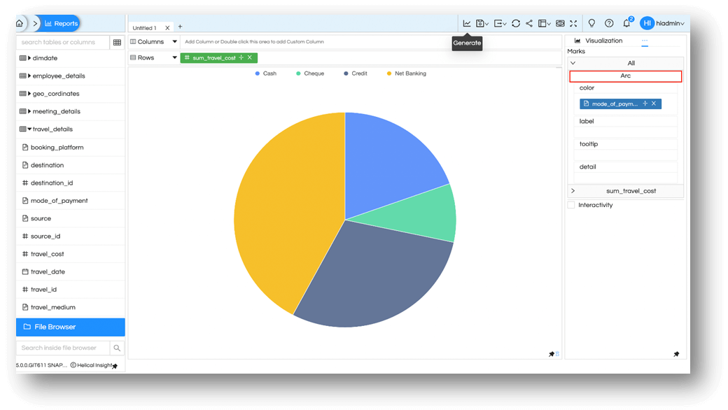
For charts like Arc and Doughnut chart, we need a measure in rows or columns. It will generate a single pie or doughnut chart. To split the chart based on certain criteria, a field can be added to Color. For example , mode_of_payment.
4. Cards and Mini Charts
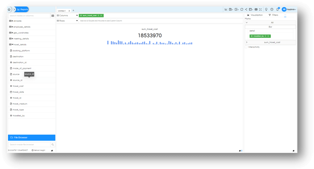
Besides usual axis charts or unidimensional charts, More Charts also offers Cards and Mini Chart options. If you have a single measure in the selected field. You can create a single value card.
We can further make this as a mini chart by adding a dimension or measure to detail in Marks option and generate the card again. You’d now notice the value has now a breakup based on the field selected. You can choose from Bar, Line or Area in the mini chart.
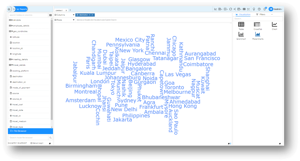
5. Word Cloud
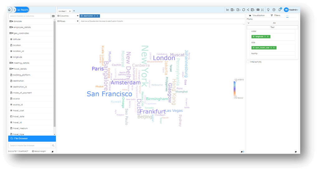
Just like the Card, instead you opt for choosing the dimension in the selected field and select More Chart. It will give you an exciting Word Cloud of all the values in that field. For example, let us prepare the word cloud of all cities that we have trips to.
Just like other any other chart lets get more details in this and color the cities based on its location. All cities in wester part of the world with different color and easter cities in different color. All we need is to add longitude to the color field
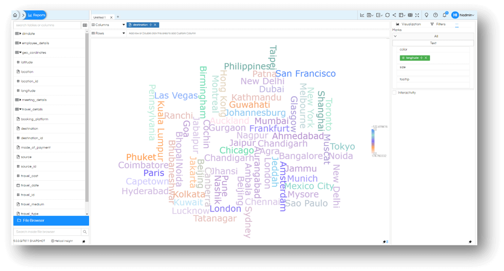
You can similarly size cities based on travel_cost it generated to.
Now you know a bit more of More Charts. Use it to make few more exciting reports and use them on dashboards
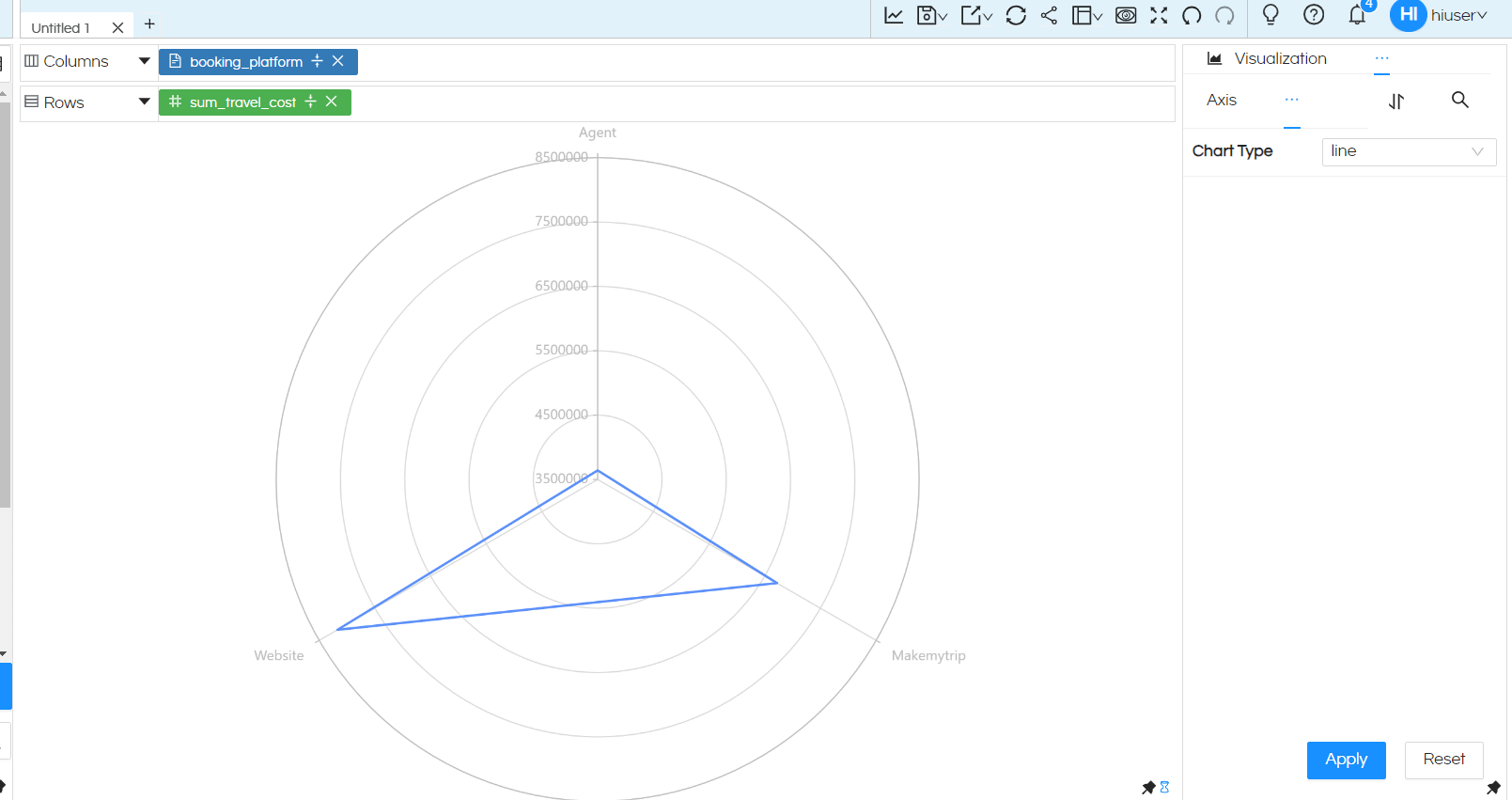
6. RADAR CHART:
For creating a Radar chart, we need one dimension in column and one measure in rows or vice versa.
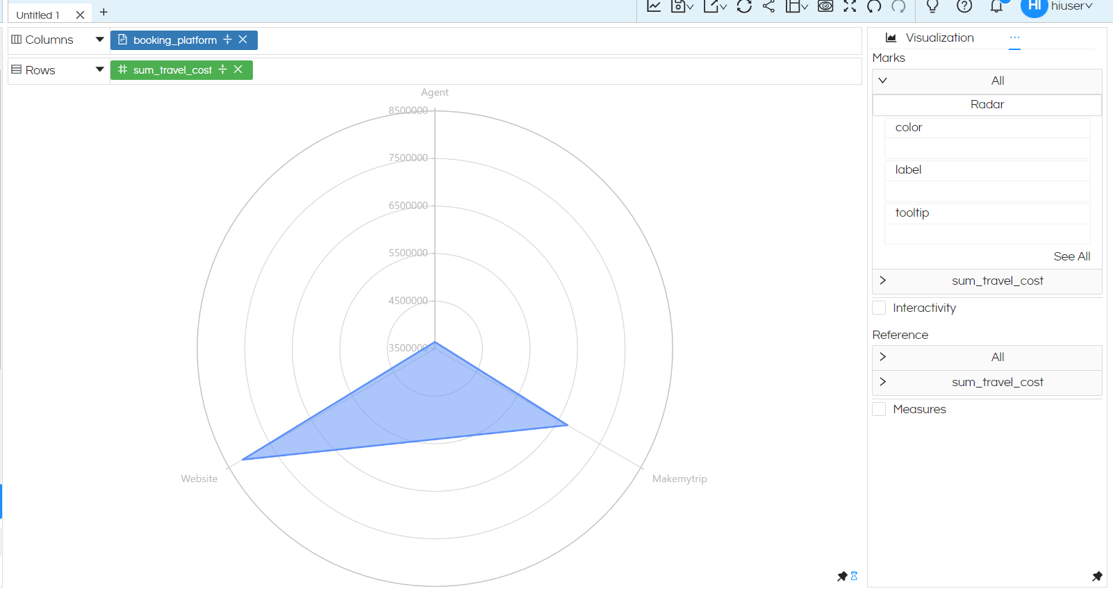
Other features like Color, Label, Tooltip etc can be used like other charts wherein a dimension or measure can be dragged from metadata fields.
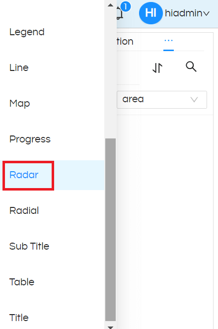
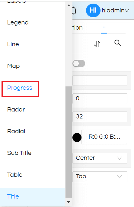
By default radar chart is generated in an area format. In the chart properties, we can change the type to either a radar line or an area chart. For doing that click on the 3 dots, then go to Properties, navigate to Radar option, then you can switch from Area option or Line option in the Radar Chart.
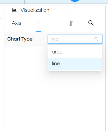
Now the radar chart will get generated with lines (rather than Area).
7. WATERFALL CHART:
Waterfall chart is a type of data visualization that helps to show the incremental changes in a value from a starting point to an ending point, often used to illustrate how various factors contribute to a total change. It is especially useful for financial statements and similar data where you need to understand how different segments affect the overall total.
Only 1 dimension and 1 measure is required to create Waterfall Chart. Below we have used dimension mode_of_payment and measure travel_cost into columns and rows and then selected Charts and select ‘Waterfall’ from Marks. Added the mode_of_payment column to the Colors to enable color-wise differentiation.
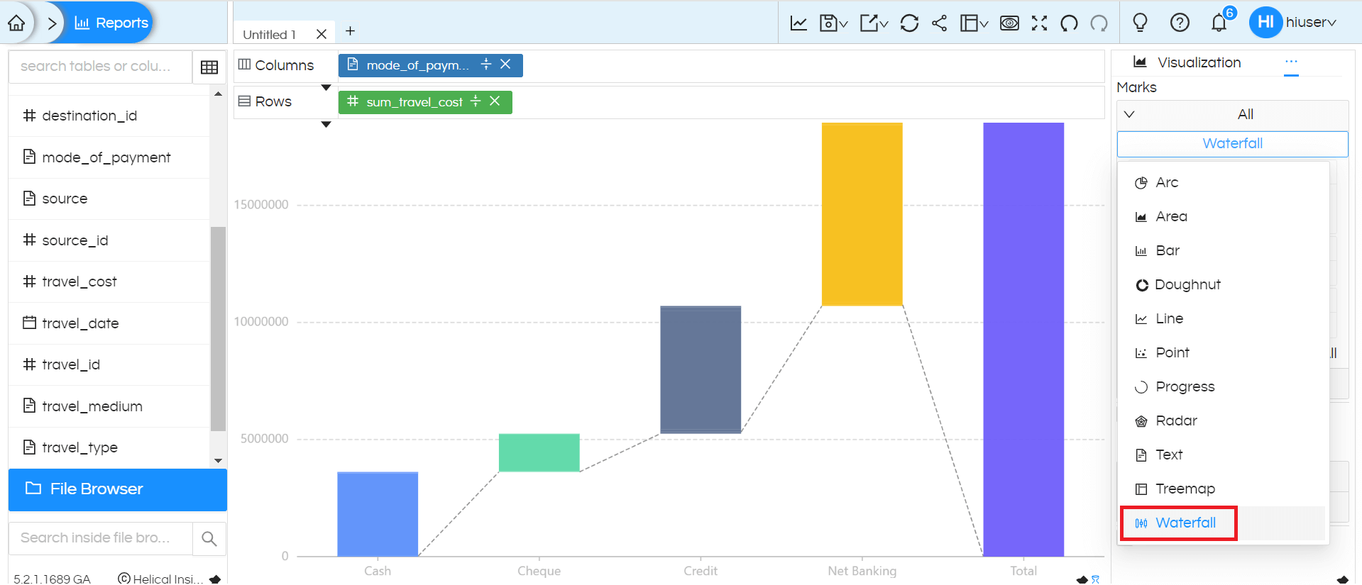
Note: Since the data contains only positive values, the chart displays only incremental bars. If negative values are present, the chart will show decremental bars as well.
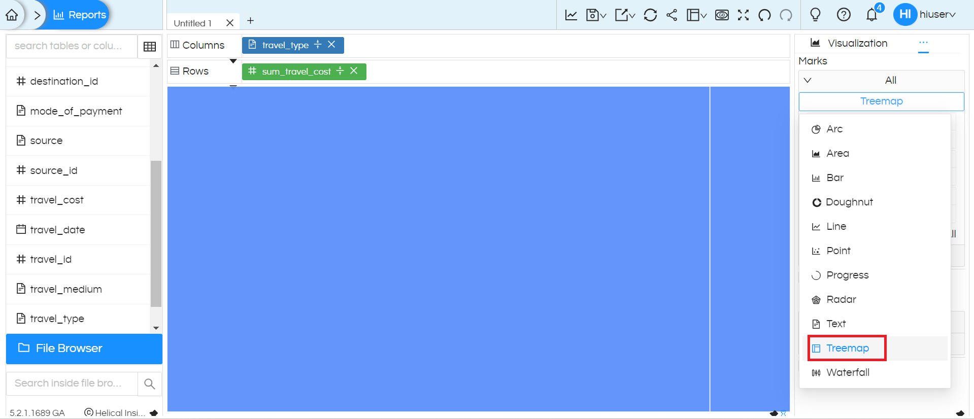
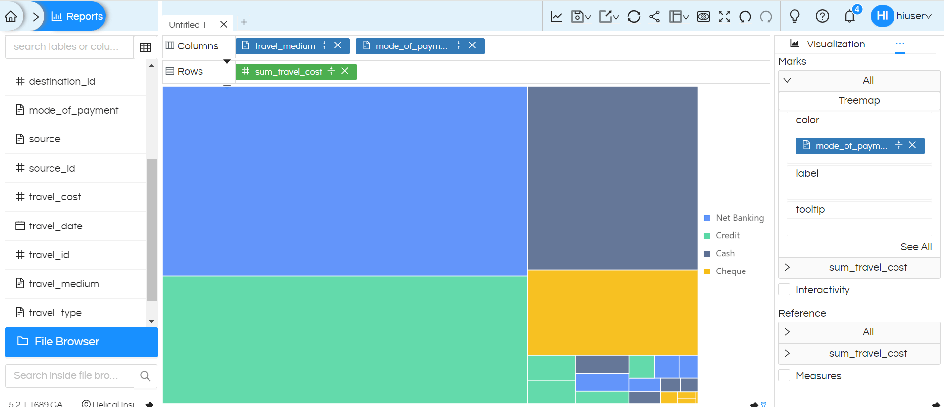
8. TREEMAP CHART
Treemap chart is used for visualizing hierarchical data.
Each node is represented as a rectangle. The size of the rectangle typically corresponds to the value of the node, and its position and nesting reflect its hierarchical relationship within the tree
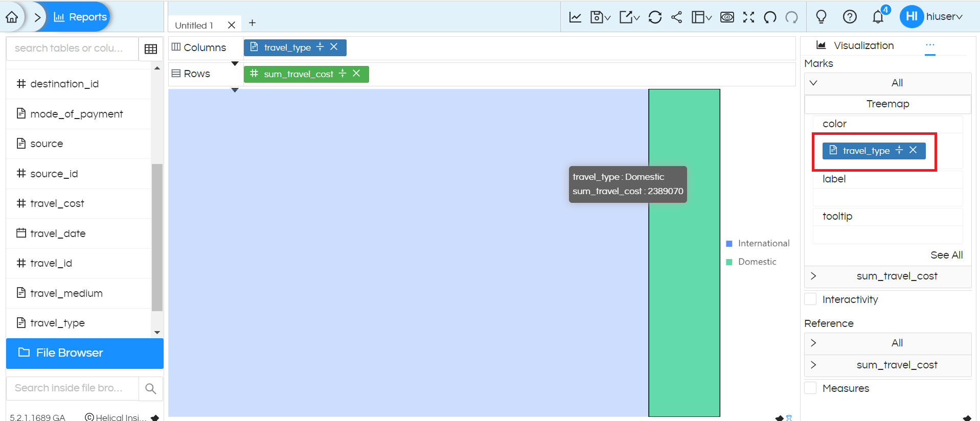
Minimum 1 or more dimensions and 1 measure is required to create Treemap Chart. Below we have used dimension travel_type and measure travel_cost into columns and rows and then selected Charts and select ‘Treemap’ from Marks. Added the travel_type column to the Colors to enable color-wise differentiation.
We can add travel_type to the colors to clearly differentiate the nodes.
Treemap with 2 dimensions and 1 measure
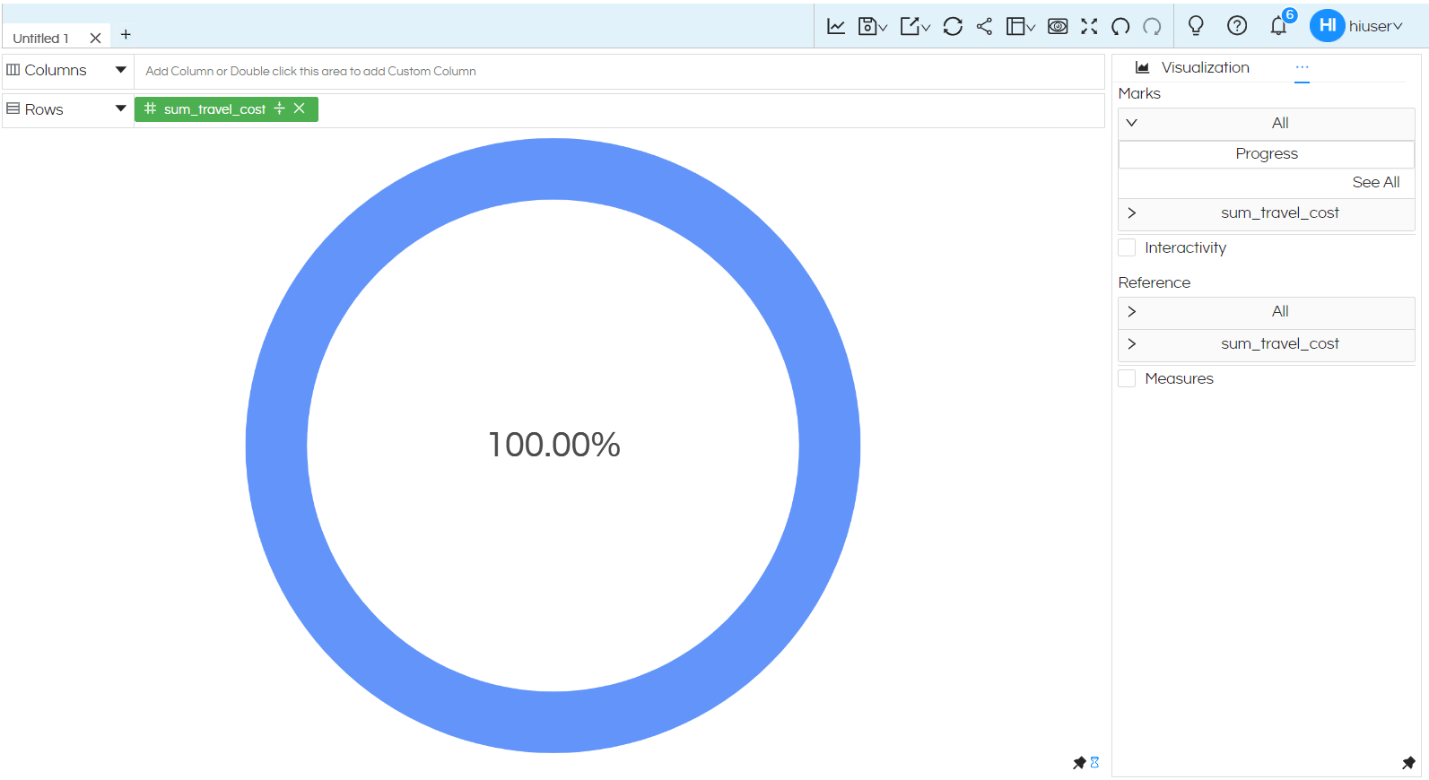
9. PROGRESS
A progress chart is added which can be further configured and changed to Gauge, Progress or Bullet chart. Below we will explain how to do the same.
By dragging a single measure into either rows or columns, you can then go to Charts, click on Progress in the Marks and create Progress chart.
By default the progress bar created is 100% wherein the current value and target value is same (as shown below)
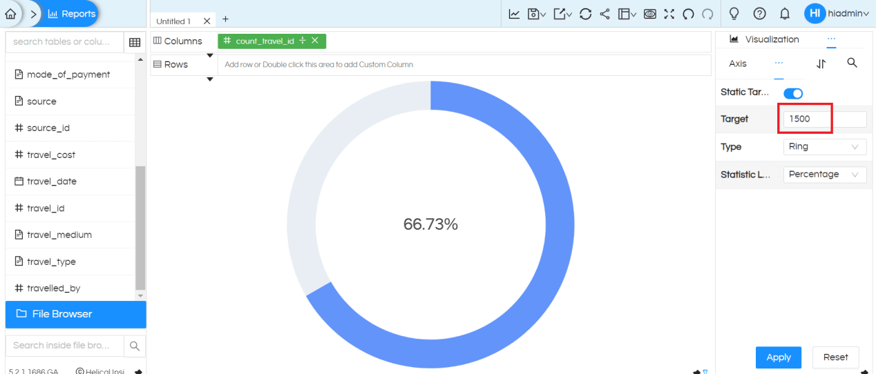
In order to specify the “Target” for calculating percentage, go to Properties section (by clicking on 3 dots), then can further see 3 dots where click on it and select Progress
We can provide target value in the place holder, this target value can be static or dynamic. Then click on Apply so that chart will display the percentage based on the target value.
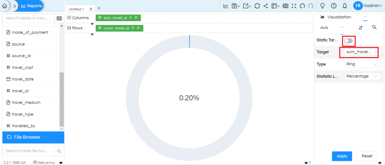
If we want to choose target value as any column from the report pane, then we need to drag that column also in either Rows or Columns place. Then choose the column by disabling Static Target, then from Target dropdown select the column which you would like to use as a Target.
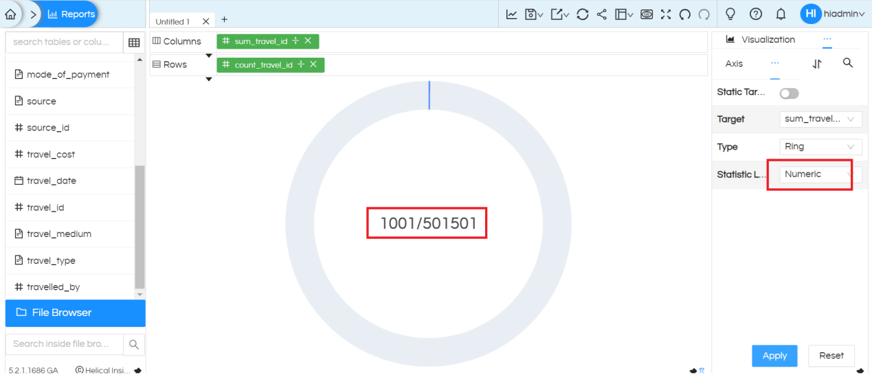
We have option to display numeric values instead of percentage
We have three categories of progress charts: Ring, Gauge and Bullet. By default, it generates with Ring.
See the same chart with the type ‘Gauge‘ . It gives the option to provide different colors for percentage breakdown
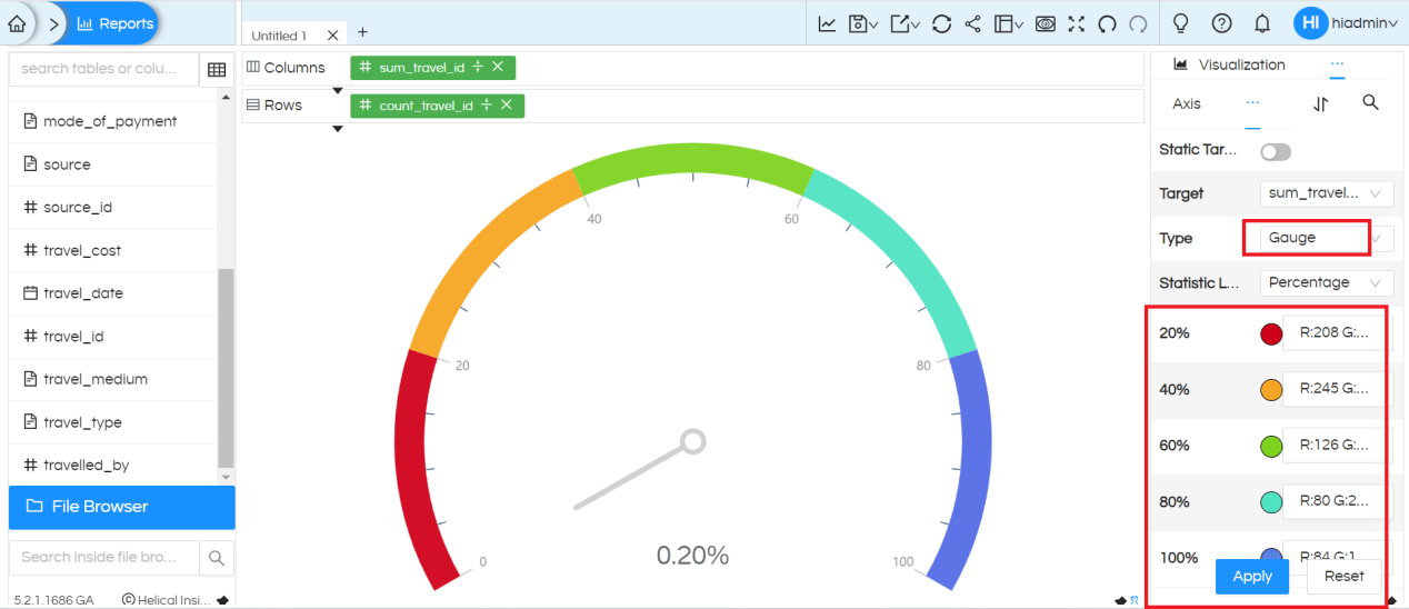
It gives the option to provide different colors for target value breakdown
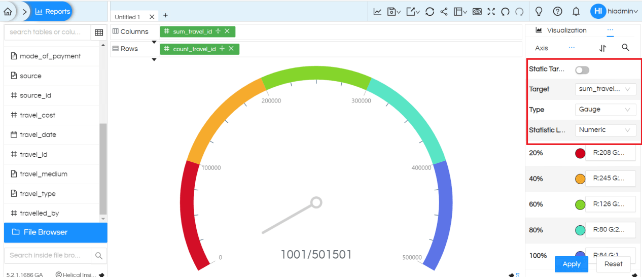
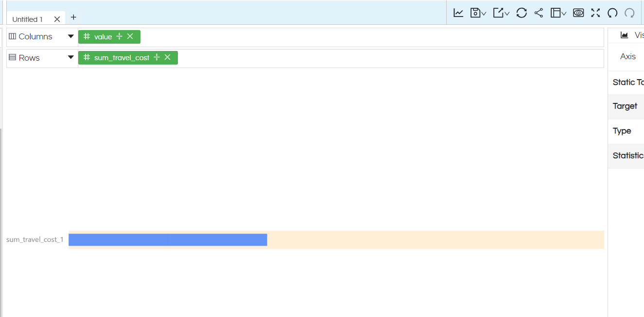
See the same chart with the type Bullet. Statistic Label Type will be Numeric (not percentage) for this chart type.
NOTE: For all the charts Interactivity, filters and other options works fine. There are options which are there in Marks like Color, Label, Tooltip, Size, Shape etc on which a dimension/measure can be dragged and used. Based on the kind of visualization being used, those respective options will automatically get enabled.
Thank You,
Helical Insight
