In this blog, we will learn how to create Bar chart in open source BI product Helical Insight.
To create a Bar chart in Helical Insight, you need at least one dimension and one measure. In this example, the dimension mode_of_payment is placed in the Columns section and the measure sum_travel_cost is placed in the Rows section. After selecting the Bar option under the Chart section in the Visualization panel, the system generates a vertical bar chart.
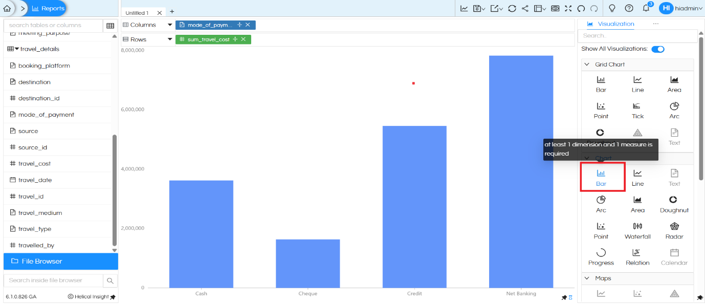
Each bar represents a payment mode (Cash, Cheque, Credit, Net Banking), and the height of the bar indicates the total travel cost for that category. This provides a simple and clear comparison across payment modes.
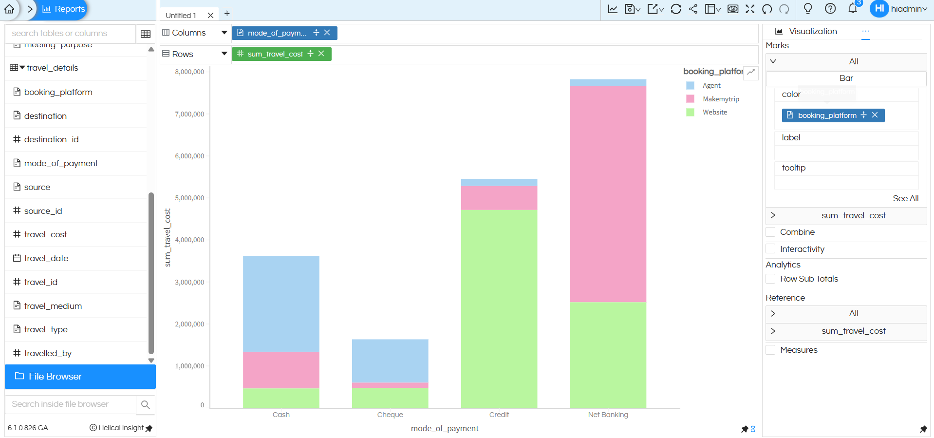
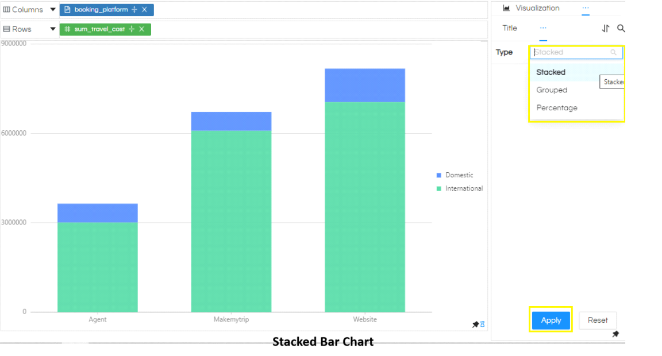
Using Color (Marks Section) to create Stacked Bar Chart:
Right now all the bars are of the same color. We can drag a dimension into the Color section of Marks. This converts the chart into a stacked bar chart based on the values of dimension dragged in color.
Grid Style Bar Chart – Grid Chart Section
In the third example, additional dimensions such as booking_platform and travel_type are added along with the measure sum_travel_cost, and the Grid Chart Bar option is selected.
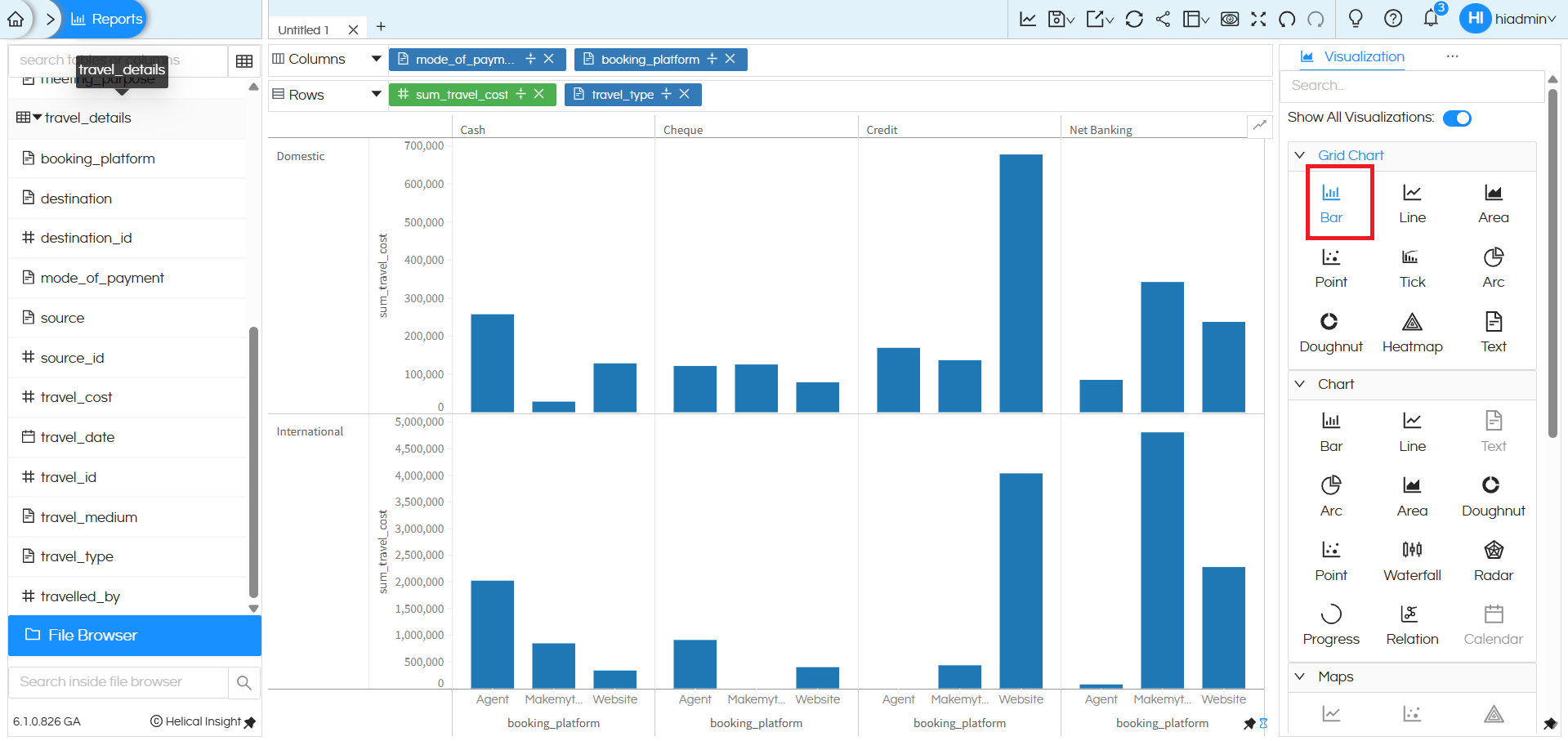
This creates a grid-style layout where the chart is divided into separate panels (for example, Domestic and International). Within each panel, grouped bars are displayed for different booking platforms across payment modes. This type of multi-level grouping and sub-chart creation is supported when using the Grid Chart Bar option.
However, when using the Bar chart from the standard Chart section, it supports only basic dimension–measure plotting and limited grouping. For advanced multi-dimensional analysis with separate panels and hierarchical grouping, the Grid Chart Bar option should be used.
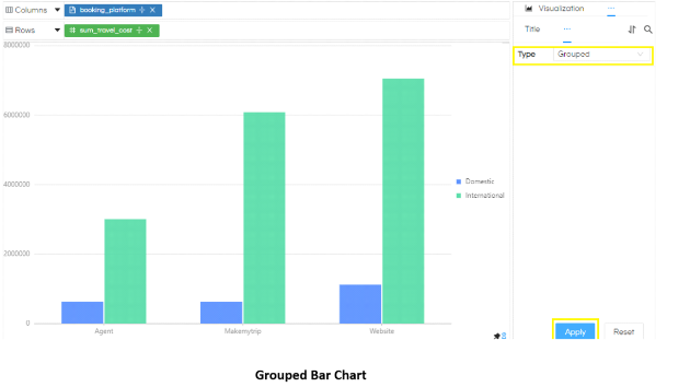
This created stacked bar chart can be converted into Grouped Bar chart (wherein each color instead of stacking with each other will be present next to each other) you can refer to this blog. We have also explained how to convert this stacked bar chart into 100% stacked bar chart.: https://www.helicalinsight.com/selecting-the-type-of-bar-charts-in-helical-insight-5-0/
There are a lot of other customizations like color palette, data format, caching, axis, drill down, drill through etc which can also be used. You can refer to our other blogs to learn about the same.
Reach out to us on support@helicalinsight.com in case of any more questions.
