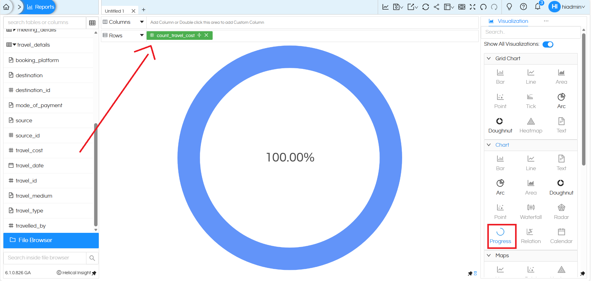
A progress chart is added which can be further configured and changed to Gauge, Progress or Bullet chart. Below we will explain how to do the same.
By dragging a single measure into either rows or columns, you can then go to Charts, click on Progress in the Chart section and create Progress chart.
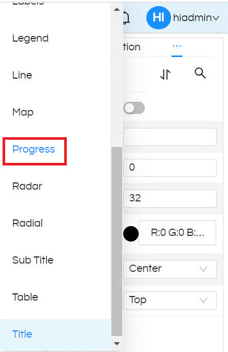
In order to specify the “Target” for calculating percentage, go to Properties section (by clicking on 3 dots), then can further see 3 dots where click on it and select Progress
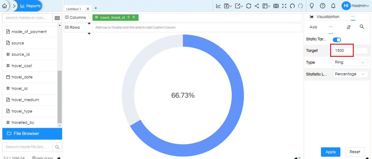
We can provide target value in the place holder, this target value can be static or dynamic. Then click on Apply so that chart will display the percentage based on the target value.
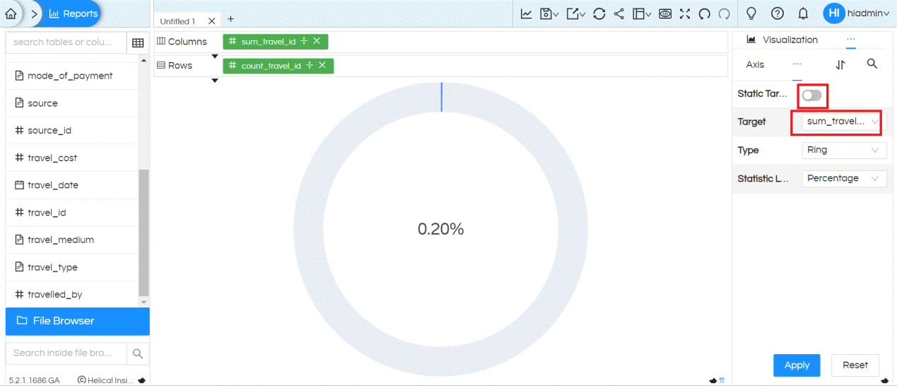
If we want to choose target value as any column from the report pane, then we need to drag that column also in either Rows or Columns place. Then choose the column by disabling Static Target, then from Target dropdown select the column which you would like to use as a Target.
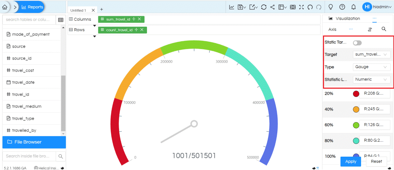
We have option to display numeric values instead of percentage
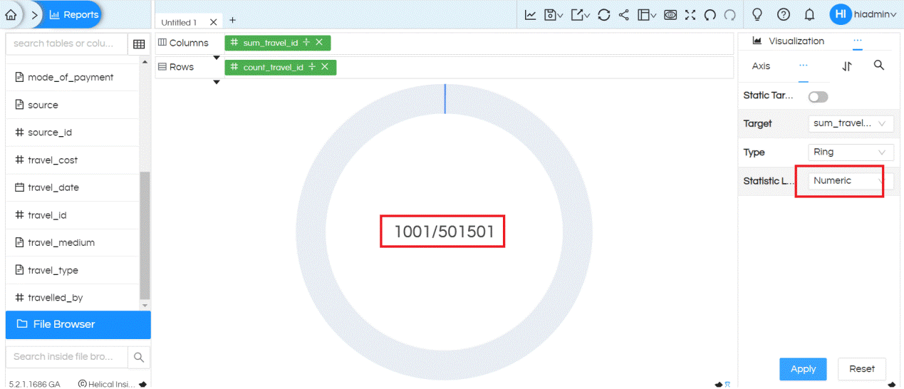
We have three categories of progress charts: Ring, Gauge and Bullet. By default, it generates with Ring.
See the same chart with the type ‘Gauge‘ . It gives the option to provide different colors for percentage breakdown
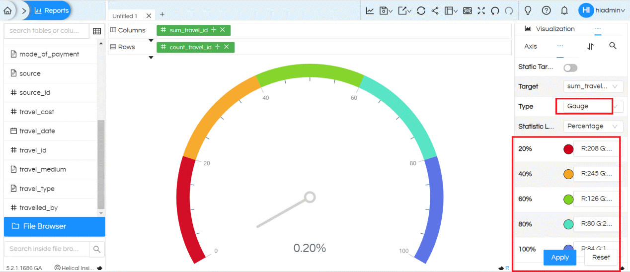
It gives the option to provide different colors for target value breakdown
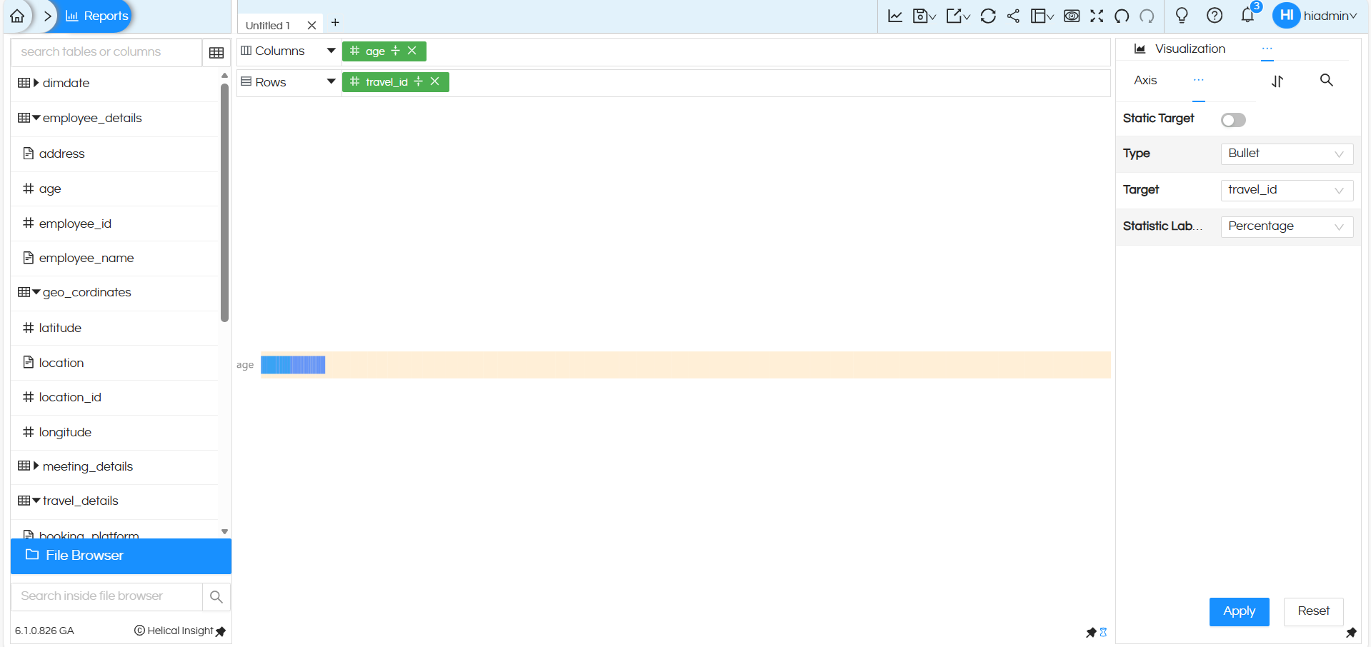
see the same chart with the type Bullet. Statistic Label Type will be Numeric (not percentage) for this chart type.
NOTE: For all the charts Interactivity, filters and other options works fine. There are options which are there in Marks like Color, Label, Tooltip, Size, Shape etc on which a dimension/measure can be dragged and used. Based on the kind of visualization being used, those respective options will automatically get enabled.
By default the progress bar created is 100% wherein the current value and target value is same (as shown Above Image)
Visualization: More Charts – Helical Insight need to update this In above thing else is same
Reach out on support@helicalinsight.com in case of any more questions.
