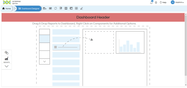
In this blog we will cover Dashboard Designer Overview.
Top Panel:
The following buttons are present on the top panel of the dashboard designer:
- Save: This button is used to save the dashboard to the desired location in the file browser.
- Save As: Saving the dashboard as another copy.
- Preview: Click on this button to get a preview of the dashboard. Once in the preview mode there is a close button at the right.
- Refresh: This button refreshes the dashboard and all its components. All changes made will be effected on refresh.
- Presentation Mode: Click on this button when you want to see the dashboard in Presentation mode (full screen mode).
- Grid Lines: By clicking on this button, user can toggle the appearance of grid lines on the dashboard. This mode should be used when we would like to align panels.
- Toggle Toolbar: The toolbar menu will appear/disappear on clicking this button.
- Grid Mode: Grid mode allows things to be put in a grid (with no overlay). This setting is not to be changed. In order to be put things as overlay we need to put it into a single group and then enable group-overlay within that group. That is created in details in other blogs (link of other blog).
- Enable Grouping: In the free flow mode, one can group the components together to make them one unit. To learn more about grouping, click here. (link to grouping blog)
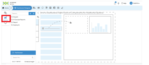
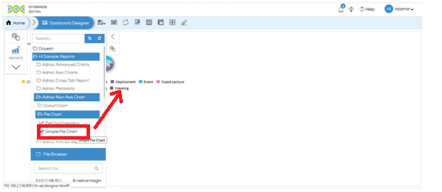
Adding Reports in Dashboard:
- Click on the report button in the Toolbar menu. You will be able to see all the folders.
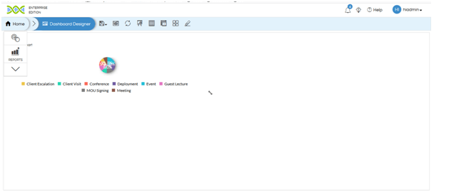
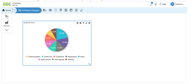
- Browse to the report that you want to add. Double click on the report name. The report will be added to the dashboard. You can only see the reports/folders which either you have created or has been shared with you.
- In order to resize a report, press the resize button and drag to resize.
- Click on the report and drag anywhere in the dashboard space in order to move the report on the screen.
Adding Variables to the Dashboard
Dashboard is having the concept of listeners and dashboard variables. Panels listen to the variables and as soon as any of the dashboard variables gets changed the panels associated with that report gets changed.
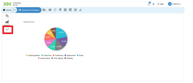
- Click on the downward arrow on the toolbar to reveal Developer Mode tools.
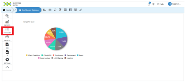
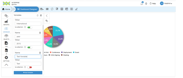
- Click on Variables button below Reports
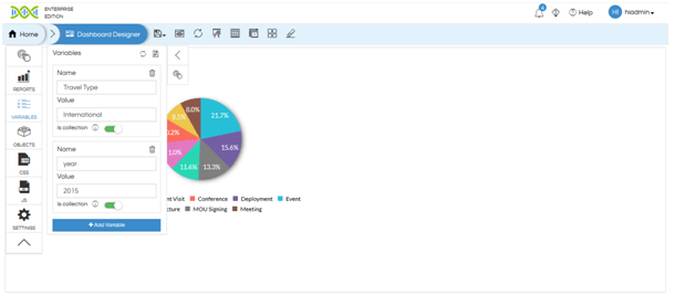
- By default, all the filters which are present in the reports (which have been dragged into dashboard) will appear as variables. In order to add new variable, click on Add Variable button.
- Enter the name of the variable in the Name field. In the Value field, enter the default value that the variable should have when the dashboard is loaded. If it is a set of values, toggle the Is Collection button to Green and then you can enter multiple values to that variable.
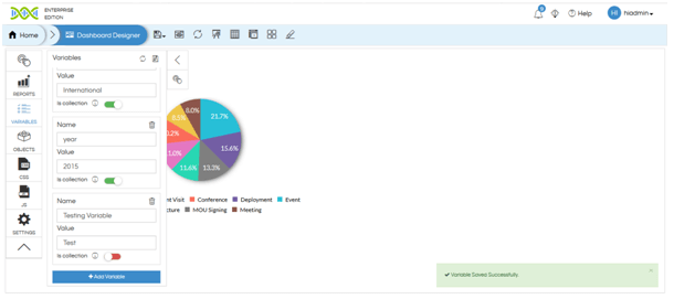
- Click on the Delete button next to the variable name to remove a variable from the list.
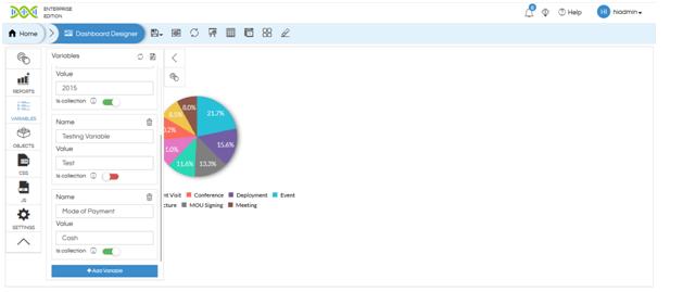
- Click on Save button in order to save the modifications made to Variable list.
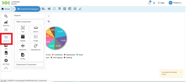
Adding Objects:
- Click on the “Objects” button below Variables. You will see a list of Web Components. You can add button separator and HTML script to the dashboard by selecting the specific component from this list. In order to add text, image, header, background, HTML, CSS it is advisable to use the right click component of dashboard designer and not the components present in the web components.
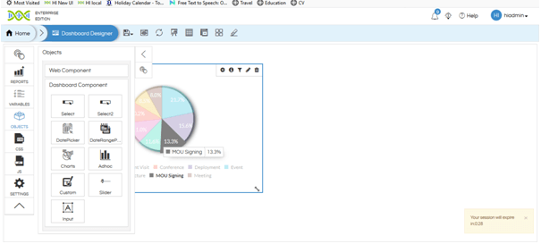
- Click on Dashboard Component. Here you can add select (input parameter), select2 (searchable input parameter), dropdown list, date picker, slide, input and multiselect checkbox components to the dashboard by clicking on the respective button.
Refer Here for Changing the printing options of the dashboard
Adding Filters/Input Parameters in Dashboard Designer:
- Create a report with Filters and drag it on the dashboard.
- Hover on the report. You will see a filter icon on the top right of the report panel. Click on that. You will see the list of filters that have been applied on the report.
- Select the filter that you want to use as an input parameter. The field will be added in another panel.
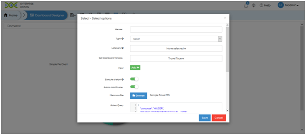
- Hover on the panel of input parameter and click on Edit button.
- Set the Dashboard Variable as the parameter selected. You can also set the other parameters such as Execute at Start and Adhoc Datasource.
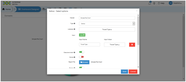
- In order to have a panel respond to change in the input parameter, click on Edit button on top right of the report panel.
- Set the input parameter and listeners to the filter name.
- You can enable Execute at Start. This will load the report with the values corresponding to the default value of the filter.

Alternatively, you can right click on the report panel and hover on “Filters” option to see the list of filters.


Alternatively, right click on the filter panel and hover on “Settings” option. Click on Edit.

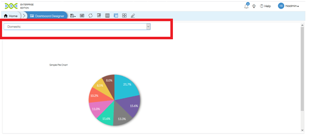
Result after applying the filter values:
Right-Click Option
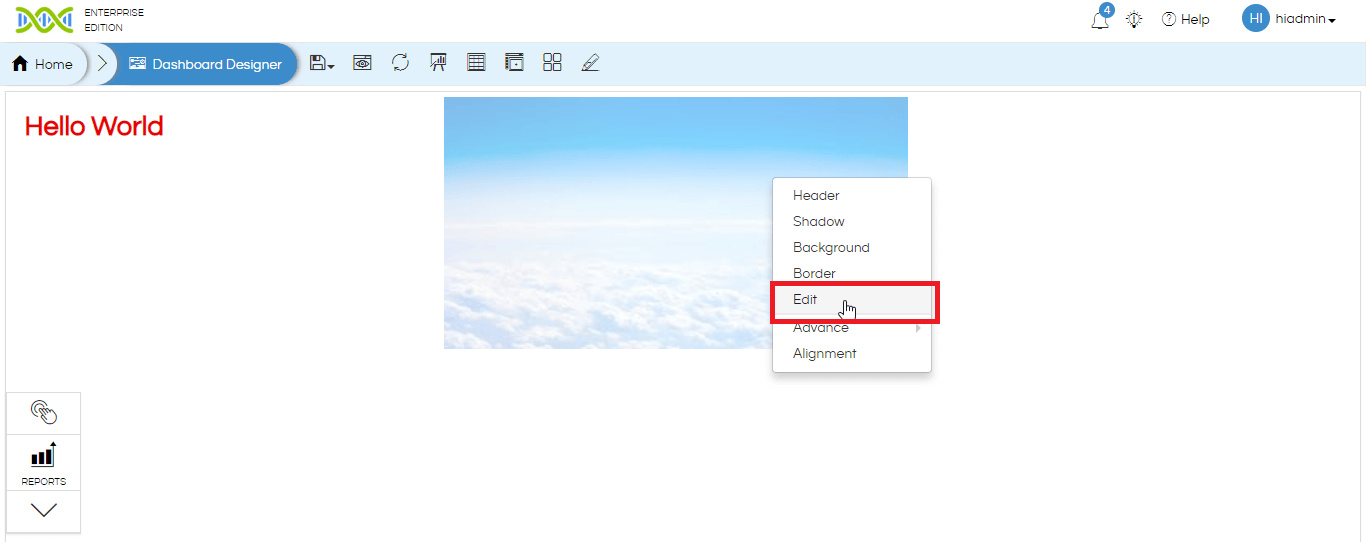
On the dashboard designer page there are multiple operations and functionalities which can be done on right click. Now on whatever component the right click happens, the functionality/UX changes get applied to that specific component. For instance, the components can be added report, added image, added text box, a group.
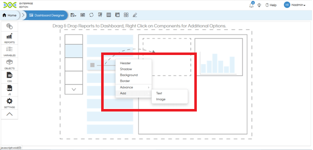
Please note that some of the options may/may not appear on right click based on the kind of component we have clicked on. For example right-clicking on dashboard designer page allows an additional option of “Add” allowing you to add image or text box. Right-clicking on image or text box allows you to edit it. In a group (in overlay mode) when right-clicking it also allows you to define what goes to the front and what goes to back.
Below we have explained the various options of right click.
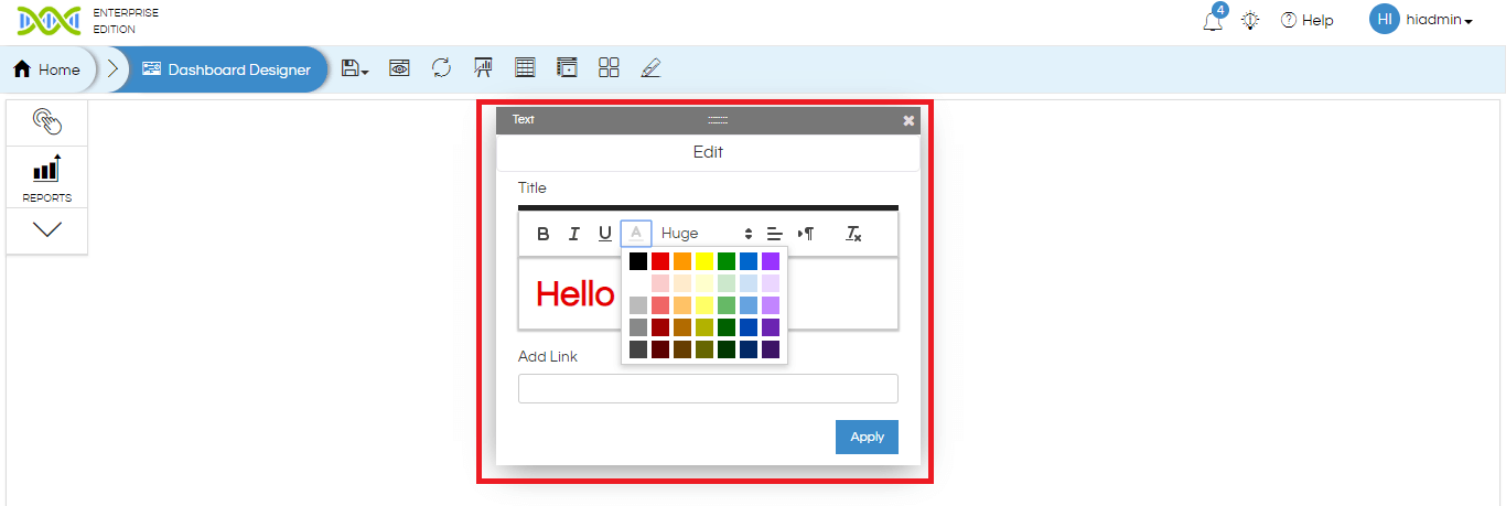
Add Text: When we right-click on the dashboard designer page there is also an option of adding a text box.
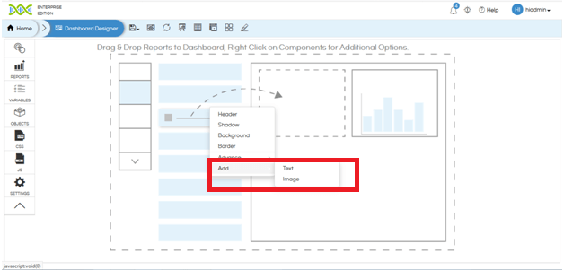
If we select “Add Text” it gives a modal window allowing us to enter the required text. It is also having various kind of UI driven formatting options like font color, alignment, font size, bold, italic, underline etc. It also has got the option “Add Link” wherein you can enter any web link which makes the text clickable.
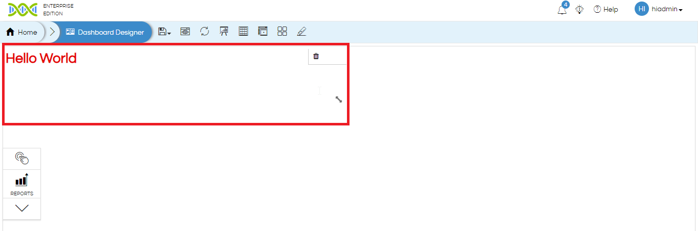
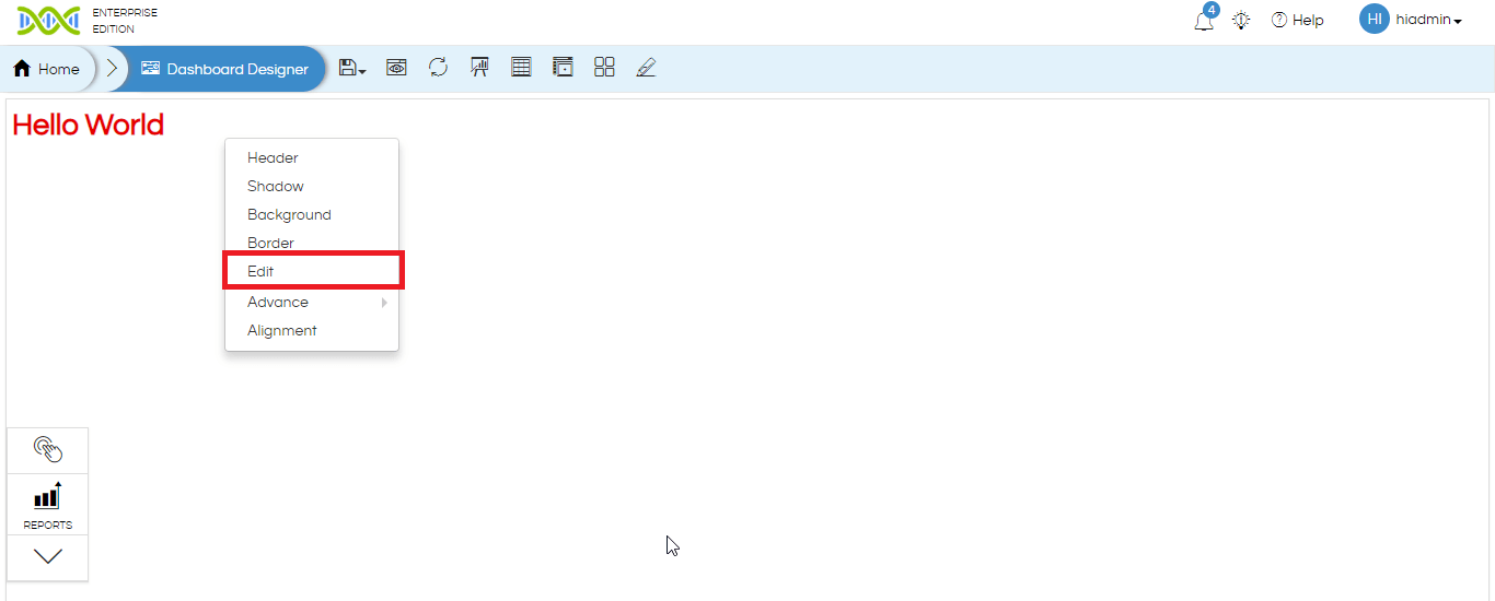
Now if you want to edit the text box content you can right click on the text box which gives
“Edit” option allowing you to edit the content. Hovering over the text box will allow you to delete, resize, clicking and dragging allow’s repositioning of the box.
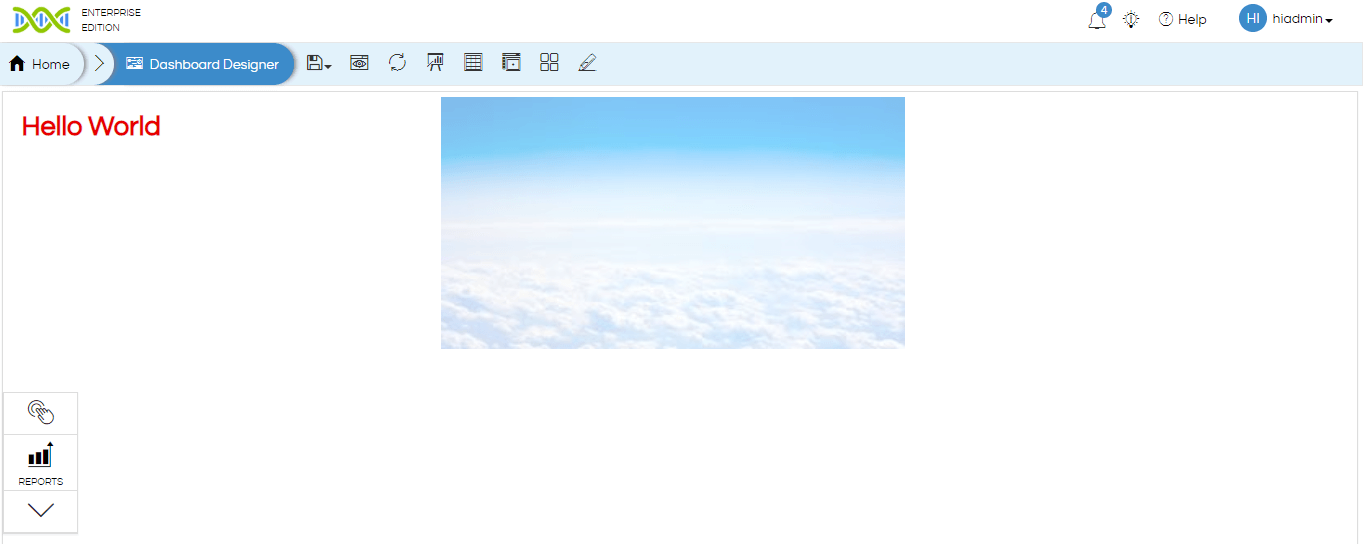
Add image: Similarly, you can also add an image. The image URL needs to be put here. The image can be saved locally on the server or it can be fetched from internet also. “Image opacity” can also be defined wherein 0 means completely transparent and 100 means completely opaque.
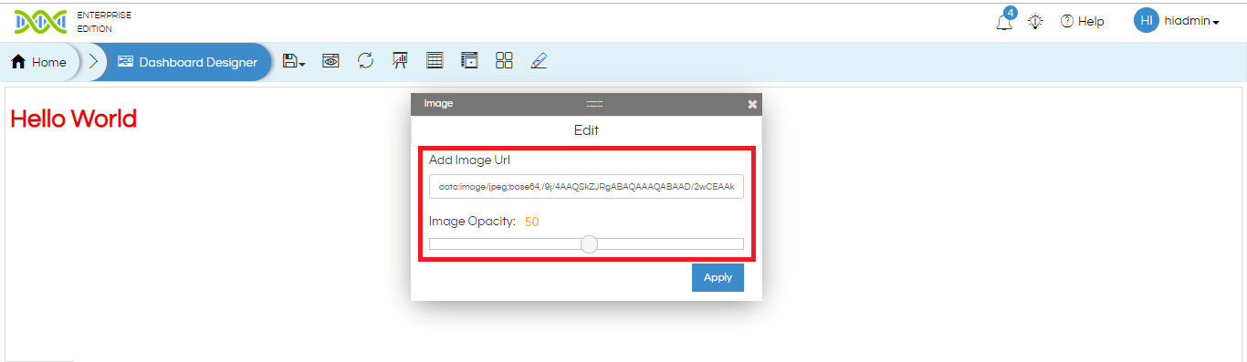
You can right click and use the edit option to edit the image URL and opacity. You can also delete, resize, reposition and use other right-click operations by right-clicking on the image component.
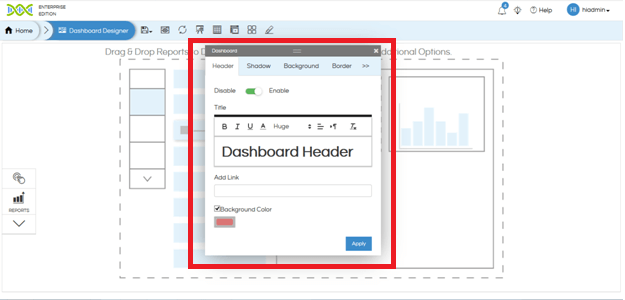
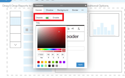
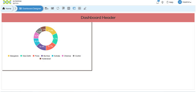
Header: Header option allows to give the entire dashboard or individual components a header. When clicked and enabled it allows you write content for the header and format it like size, color, alignment etc. The header component also allows you to add a “clickable link” to the header as well as define the “background color”.
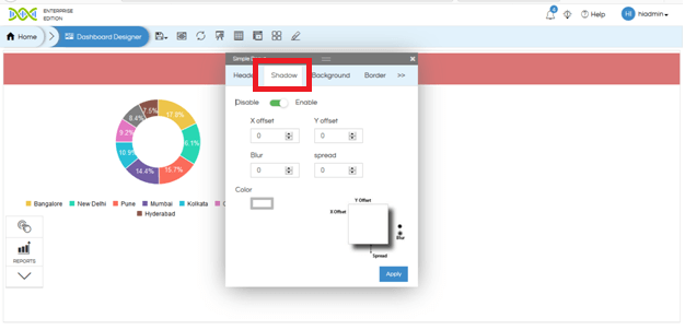
Shadow: Shadow allows you to give shadow to a component or entire dashboard. You can define the X-offset, Y-offset, Blur, & Spread. Then decide the color as well as its transparency.
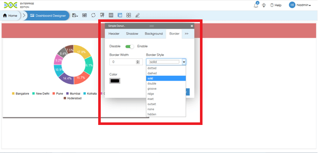
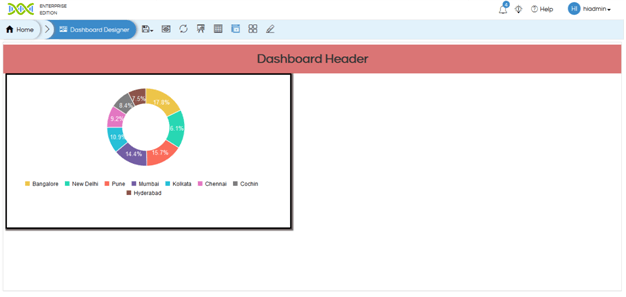
Border: Border allows you to give a border to a component. You can select the border width, Border Style, border color from the popup box.
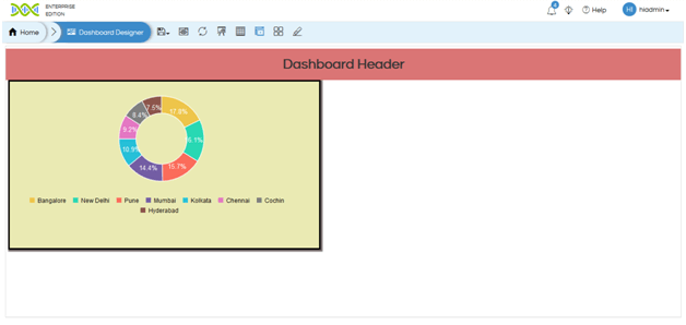
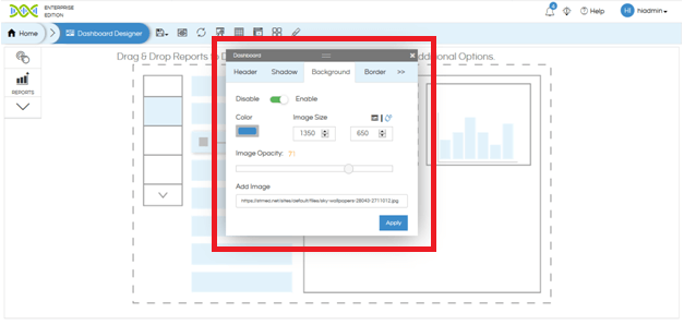
Background: Background option allows you to give a background to a component or to entire dashboard. The background can be either a color or an image also. You can give color to the background by clicking on color and specifying the required color. Please click on refresh dashboard icon at the top ribbon in case if the image as the background is not reflected.
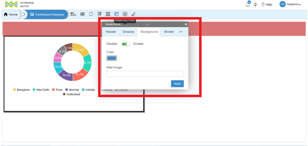
You can also give an image as a background. Provide the URL of the image (from local server or internet) in the “Add Image” section and press “Apply”. Once apply is clicked few more options will appear which will allow you to define the image opacity and size. Image size can be selected from one of the presets (auto, cover, contain) or click on the other option allowing you to define the dimensions of the image.
Settings: From version 4.0 GA onwards, on right click on a report panel, you see “Settings” option. On hover, you see the following options:
- Edit: To edit the report settings, add listeners, change the report and other settings for the report panel.
- Delete: To remove the panel from the dashboard
- Enable Export: Enable Exporting options for individual report panel when dashboard is being viewed.
- Enable Edit Report: The report can be opened in edit mode for the user to edit.
- Maximize: To open the report in full screen.

Filters:This option is added on right click from version 4.0 GA onwards. When you hover on this option, you will find a list of filters that are present for the report.
Click on the filter name to add it to the dashboard. To know about input parameters on dashboard, refer this blog.

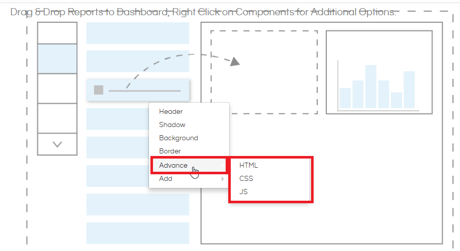
Advance: Helical Insight dashboard designer also allows you to inject your own code at entire dashboard level or individual report level. On right click it has got HTML CSS JS options as well. Again, as mentioned earlier, on whichever component you right click, the code will get applied to that specific component. Below we have covered examples of inserting code in a report component.
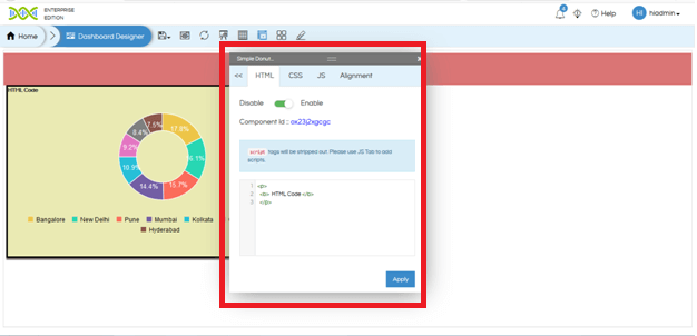
For example, in below image you can see we have inserted a text in bold via HTML code into the report.
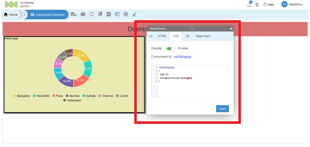
In the below image you can see that we have inserted a CSS code and given a background color to the component. The component id (on which we have right clicked) is also mentioned in the popup box.
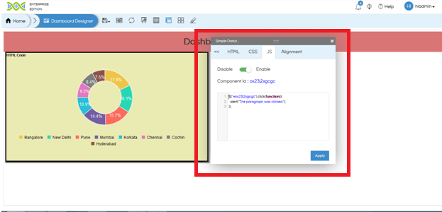
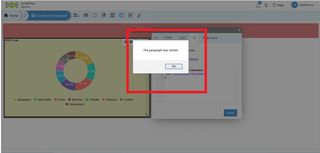
In the below image you can see that we have inserted a JS code. We have defined an on click function via JS code.
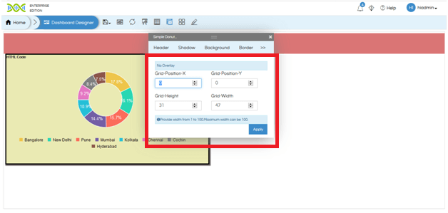
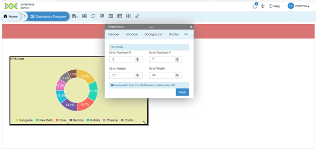
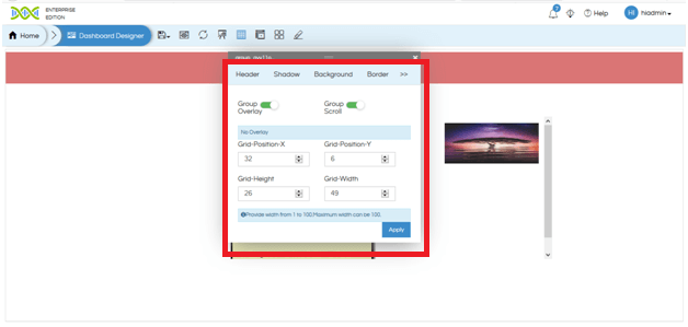
Alignment: Alignment option only appears when we right click on any component and not on dashboard background. Alignment option allows you to define the position of the panel (using Grid-Position-X and Grid-Position-Y) as well as the size of the panel (Grid-Height and Grid-Width). After you resize the panel you may have to click on refresh dashboard to remove the scroll which might appear at panel.
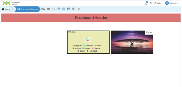
Grouping: Grouping allows you to make multiple components and make it part of one group. This allows multiple benefits like allowing you to have things as overlays (covered in detail later),
In order to use grouping place the components next to each other. Then click on “Enable Grouping” option at the top.

Then using mouse pointer make a selection across the panels which has to be part of the same group. Then those components will become part of one group.
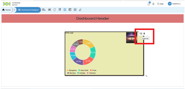
If you hover over the group you can “delete” the entire group, “ungroup”.Ungroup only deletes the groups but not the child elements.
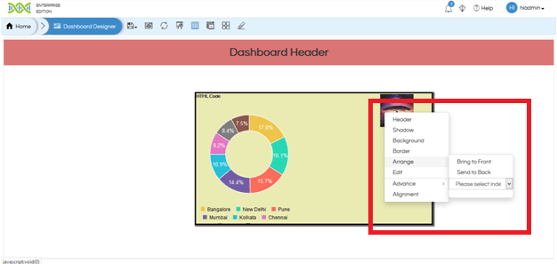
By right clicking on the group you can define the property of the entire group like background color, border etc. You can also reposition the entire group, resize the group etc. The individual panels also you can resize within the group.
Overlays: In certain cases in a dashboard we may want to make components on top of each other as overlays. For example company logo should be on top right of the report panel etc. In order to make components as overlays make them as part of one group as demonstrated earlier. Then right click on the group (not on any of the components inside the group) and navigate to “Alignment” option. If you enable “Group Overlay” then that will allow you to drag and reposition group components on top of each other.
When components have been put on top of each other inside a group and then if you right click on any individual component with a group, it gives an additional option called as “Arrange”. Arrange will allow you to define which component goes to the top and what goes to the back.
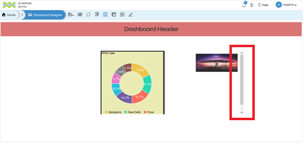
Group Scroll: In certain cases you may keep the size of the group smaller as compared to the elements. In that cases if the Group Scroll is false then the extra size of the panel will get cut. Whereas if it is enabled then a scroll will appear.
How to add interpanel communication in dashboard from table to other panels
How to add interpanel communication in dashboard from charts to other panel
For More Info, Contact us at support@helicalinsight.com
