In this blog we are going to cover the best practices which you should follow while creating a dashboard using dashboard designer of Helical Insight so that by default it looks professional and aesthetically appealing:
- On right-click on any component on the dashboard, a user gets option to change the header, background, alignment of the component as well as give border and shadow as required. You can also add your own CSS/JS to the component. Add images to the dashboard to add variety. Make judicious use of header, border, shadow etc to make good looking dashboard.
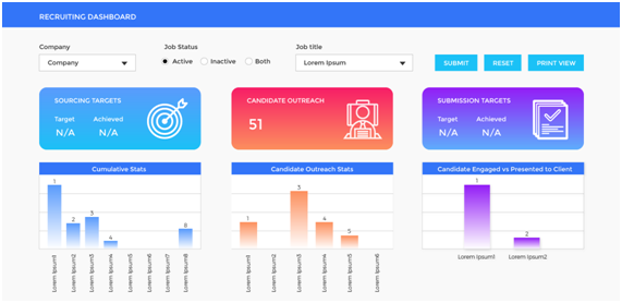
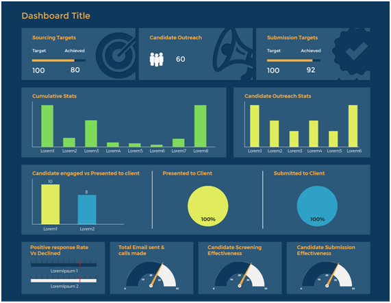
For example
- A card generally comes with header from the report level itself. Hence it is ideal that the dashboard level header should be removed
- Panel color and entire dashboard color, often having different/slightly different gives a better view
- Colour and Contrast
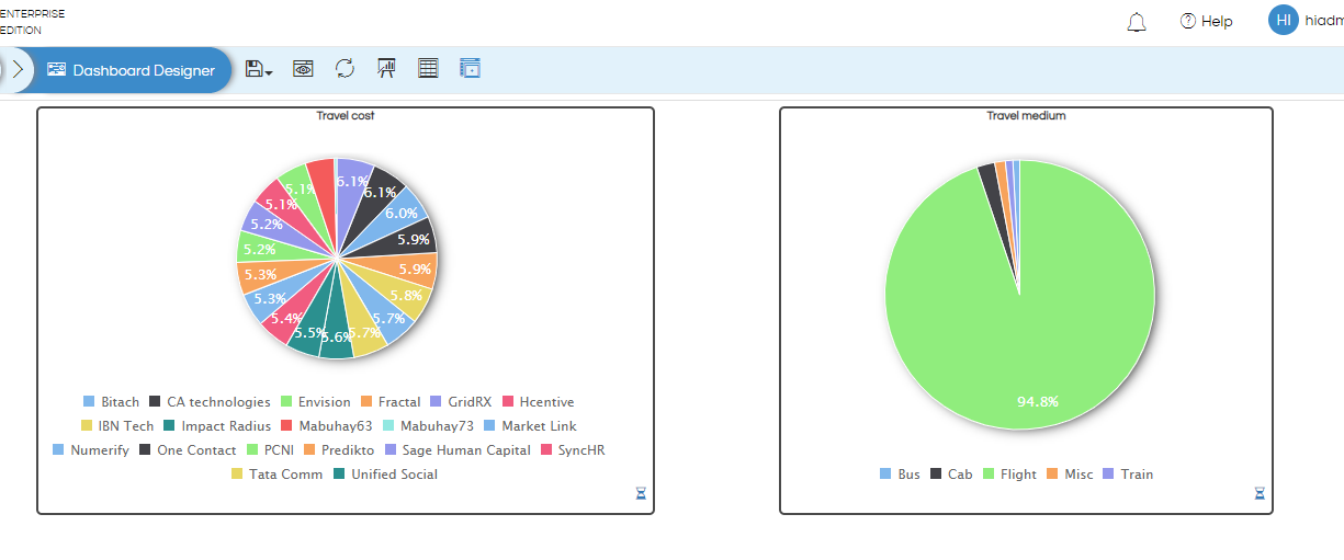
- Don’t create a dashboard with MANY colors as it will not look good and consistent. All the charts in the dashboard should have the usage of similar kind of colors. Our version 5.0 onwards is having the support of many color theme which can be used. Further, you can also create your own color theme as well. Read about color themes usage here.
- Select a color theme for the dashboard. Use 2-3 colors for the entire dashboard. This will give uniformity to the dashboard. Do not use a lot of colors.
- In order to select colors, you can use a color wheel available. You can also use one of the below links: https://color.adobe.com/create
- You can also select colors being used in your company logo or presentations.
- Select colors that contrast with each other and are also soothing to the eye. You can apply the same color theme to reports as well.
- If you are giving a background to the headers, ensure that the text color is contrasting.
- It is preferred that the background color for the reports be kept white when using a coloured background. You can use a transparent background or disable background for panels when using a white background.
- Alignment: A properly aligned dashboard looks well organized and less cluttered, even if there are a lot of reports/components on the dashboards.
- Components on the dashboard can be resized and aligned by dragging them to the required position. You can use grid lines to properly align different components.
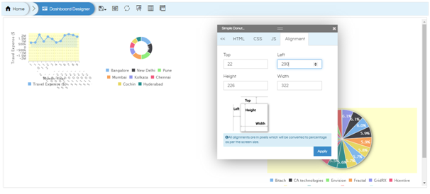
- When you right-click on any component on the dashboard, you will see the Alignment option. This is given to achieve pixel-perfect alignment.
- The entire dashboard width is considered as 100%. You can give the width of different components considering this fact.
- It is advisable to give a lesser width to card widgets and more width to charts.
- You must allow for 1% space minimum between 2 components on the dashboard. This will make the alignment better and the dashboard will look better when you add border or shadow to the components.
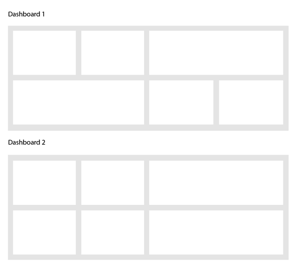
- The alignment should be such that the spacing is equal between all the components. Also, components in the same row should have similar height so that there is a grid structure formed.
- Similar sized components should be placed one below another. In the below example, dashboard 2 looks more defined and neat.
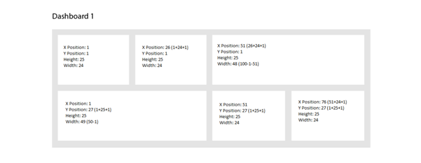
- For example, let us say that you have a dashboard which has 3 reports to be placed in a row and all should have equal width. We require at least 2% for space between the panels. So, we will calculate width per panel as 98/3=32.66. In order to get a whole number, we can keep 4% for space between panels. So, each panel will width will be 96/3=32. We can utilize the 4% as 2% between any 2 panels or 1% from page border on either side and 1% between each panel.
- The below image shows how to calculate the alignment for components.
- Minimum Height and Width
- Minimum Height: Often when we create a dashboard, you may want various components to have specific minimum height. This is especially useful when we are create cards as cards will have only 1 value generally and there will be white space visible (in case if it is not a trend card or a card with subchart option). That can be set using the minimum Row Height Option. Read here how to do that. It is advisable not to keep it below 20.
- Minimum Width: Similarly, by default the width of a component is generally 1/12th of the current screen size. We can not reduce it further than that. Hence, if you would like to be able to reduce the width further than that, you can do it using Columns Count option of Grid Settings. Read here of how to do that.
- Filters/Input Parameters:
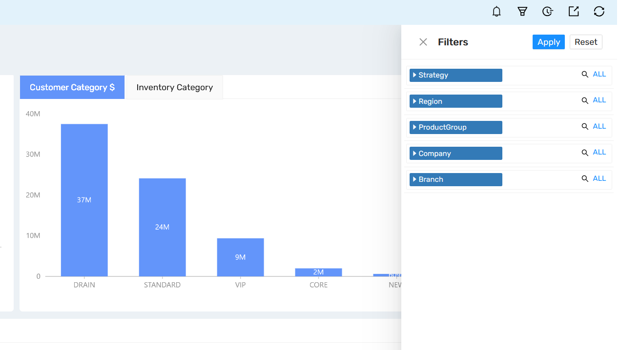
- Filter can come as a popup from Right, Left, Top or Bottom. It is best to use as a popup from Right side, especially if you are using Helical Insight in an embedded mode. This helps in saving the real estate space, more and more of it can be specifically used for the viewing of reports and analysis.
- We are also having a free float option which can be used in case if you are interested in having the filters as part of the dashboard always visible. Read here.
- Usage of Tabbed Views:
- Grouping and Overlays
- Grouping is used when:
- Similar elements need to be aligned or moved together. In the below example, all the input parameters have been grouped together.
- For overlaying images, text, charts etc. to get better aesthetics.
- To learn how to group elements and overlay them, please refer to these blogs.
Usage of group: https://www.helicalinsight.com/making-report-groups-in-helical-insight-5-0/
Usage of overlay: https://www.helicalinsight.com/overlay-functionality-dashboard-designer/ - Components should be grouped first and then aligned within that group. If you align the components and then make a group, the alignment will be lost when added to the group as it will take default alignment.
- You can also give the entire group a border so that you know where the group is located.
- Within a group, the alignment options are pixel-based and not as a percentage of group width.
- The entire group can be given a header, background, border, shadow-like other components on the dashboard. For this, hover on the group. On the left-hand top corner of the group, you will see ungroup and delete options. It is better to right-click here so that any element is not selected by mistake.
- You can use group overlay and group scroll enable and disable options while aligning different elements inside the group. So, if any element is not visible within the group as it has moved out of viewing space, you can scroll and see it and realign it if required. This is helpful when you do not want to disturb other components on the dashboard.
- Borders and Shadows
- Border and shadow options are available when you right click on any panel, you will get these kind of options with many sub options. Read more here : https://www.helicalinsight.com/right-click-operations-in-dashboard-designer/
- These can also be applied via CSS also, however the right click UI driven option is more preferred.
- Borders and Shadows can be used to segregate different panels on the dashboard and to give a clean effect.
- Select shadows that complement the background as well as the panel color.
- Slightly rounded borders to the various panels makes it look better.
- Text and Images
- Images can be added to the dashboard to add to the beauty. You can upload images to a separate folder and give the URL to the images. You can also use vectors and images from sites like freepik, flaticon, etc.
- While using card widgets, if meaningful images are used along with it, then the meaning and beauty of the dashboard increases.
- Ensure that you use the same font and text size for all text serving the same purpose. For example, select the same font and size for all headers. You can change the font and size for legends, axis labels, other text on the dashboard. This will give uniformity to the dashboard.
- Responsiveness
The above link will allow you to select the number of colors you would like to use (like single color shades, triad, monochrome, complementary colors, etc) and accordingly it will suggest the colors to be used along with their hex code with further customization options.
Before we start designing the dashboard, it is important to specify and do this setting. If not done, it might require some minimal rework at the dashboard level
From version 5.0 onwards, Helical Insight filters allows couple of different options
From version 5.2.2 of Helical Insight, tabbed view option has been added. If we put lot of panels in the dashboard, it affects the performance as all of them are loaded as well as it looks uncluttered and not properly organized. This tabbed view option allows you to add many panels in the dashboard without affecting the performance as well as be able to more clearly categorize panels. Read about how to implement tabbed view here.
Also, you can even add CSS also to change the look and feel of the created tabbed view. Refer to one example here.
By default the images and text are non-responsive. In order to make the image responsive, give the following CSS at dashboard level.
@media (max-width:750px){

.img-responsive{
width: 85% !important;
height: 99% !important;
}
}
Now all the images will be responsive on mobile devices (whose max width is 750 px). To make the images responsive for larger screens, you will have to specify the max-width and min-width after @media tag.
Similarly, to make text responsive you can define the size of text as viewport and not a pixel. The viewport is responsive and pixels are not responsive.
You can refer to the below code for reference for Header text responsiveness.
.ql-align-center{
font-size: 1.1vw !important;
}
